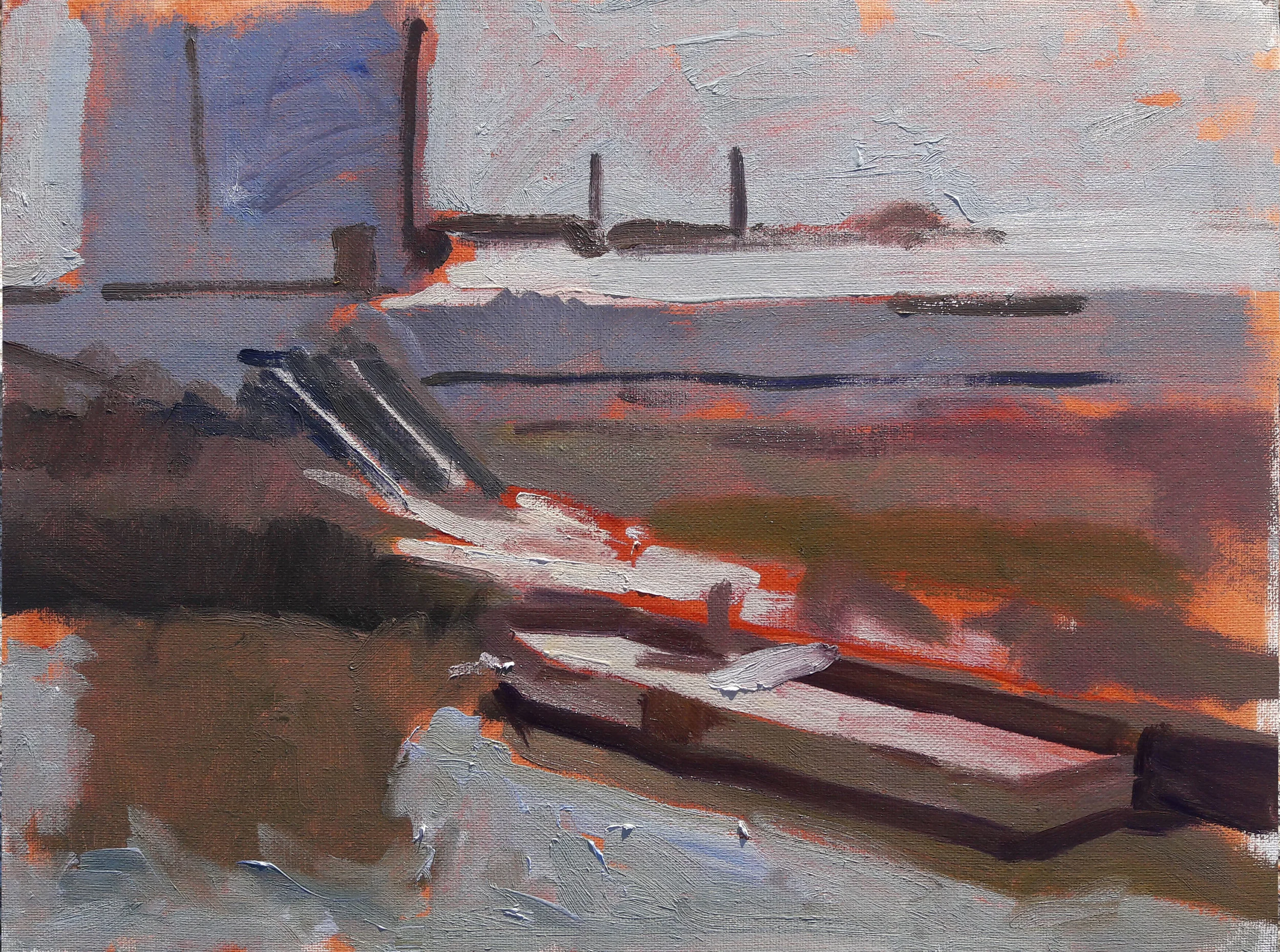
The Theory of Mosaics

We talked briefly about mosaics yesterday. They're one way of looking at painting, and how one does not paint things but rather areas of hue, value and chroma which, viewed together, form the sensation of reality.

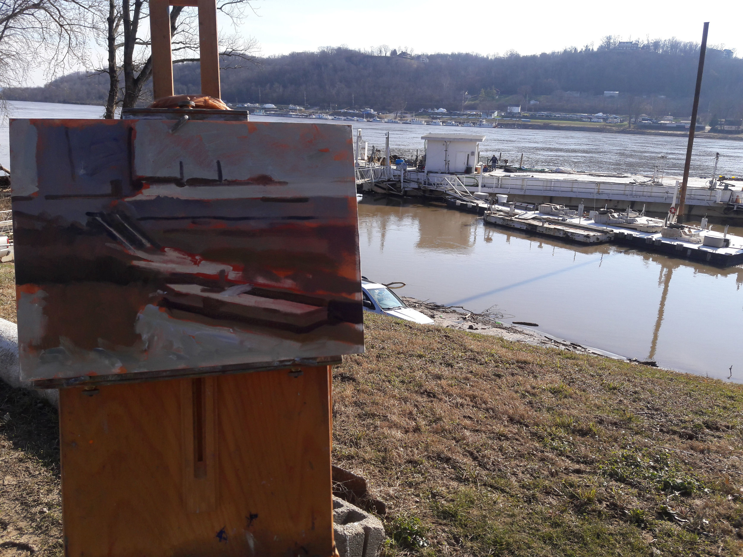
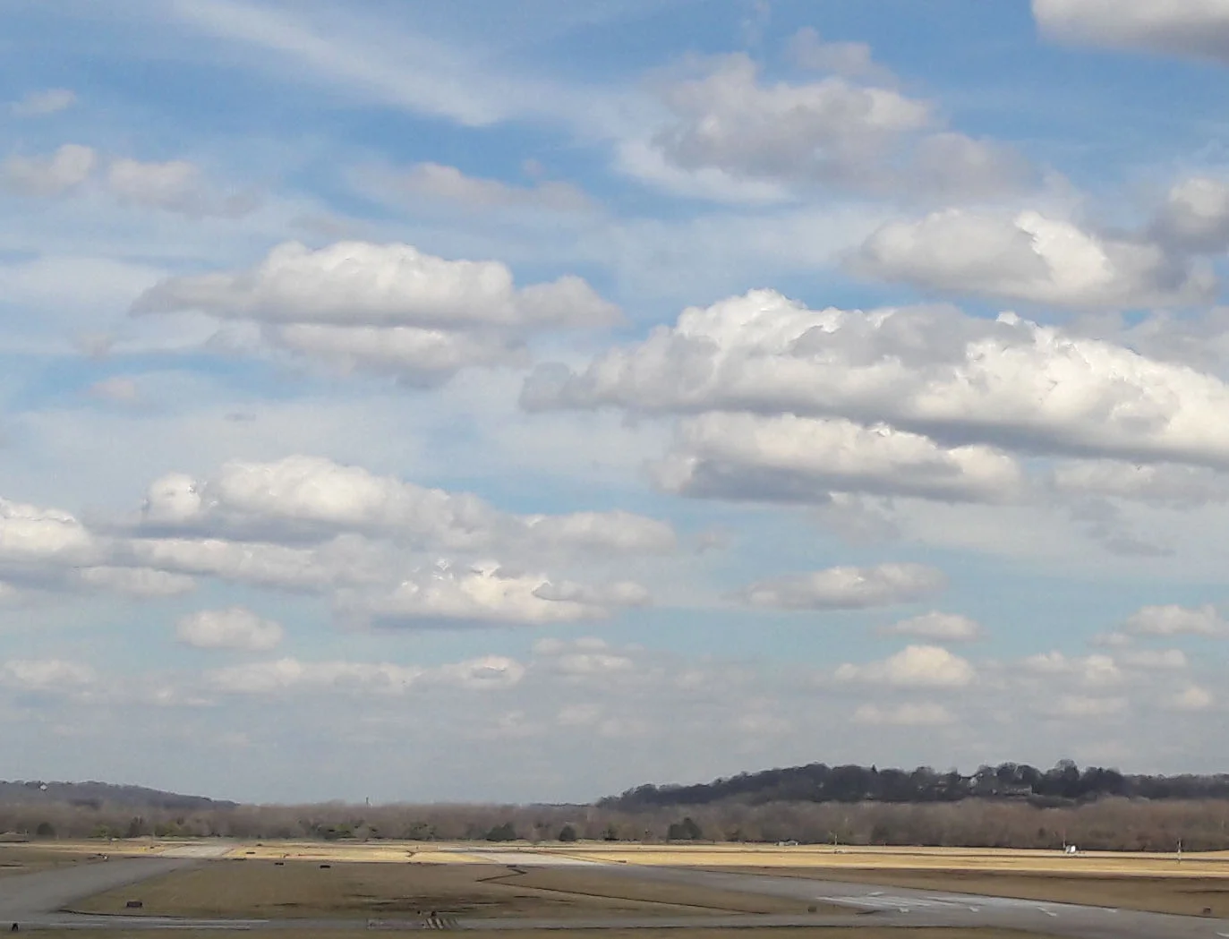
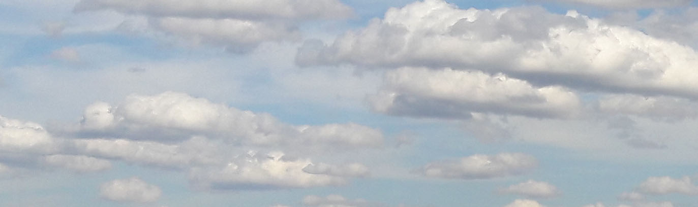
Look again at the motif from 3/10 and 3/15:

motif.jpg

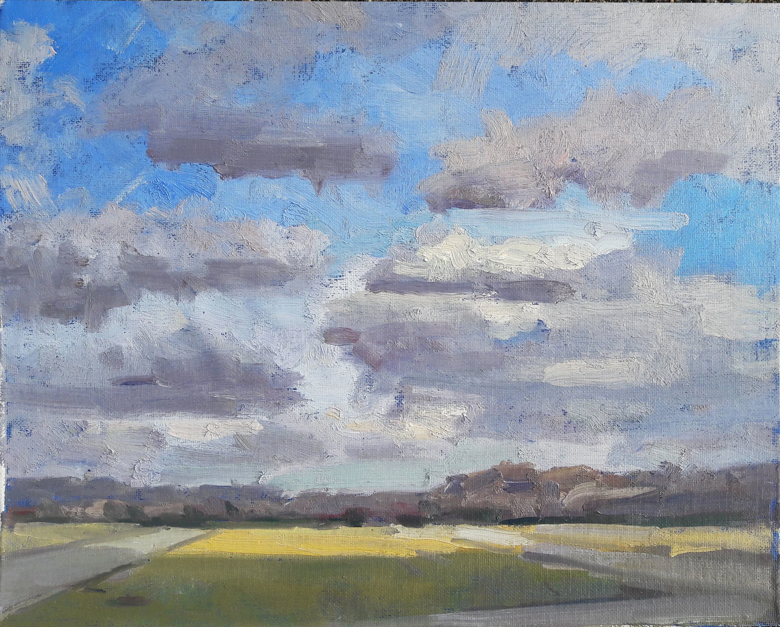
There are dozens of small objects visible in the photograph, and one might simply choose to trace each one, transfer its outline to canvas, and fill it in with color, like a paint by numbers set. This was essentially the procedure in the Medieval period and the early Renaissance, and the PreRaphaelites used it as well. Minus, of course, the availability of photography. A lot of stuff was seen. The medium was egg tempera, a material as well suited to detail as a hard lead pencil. Come the fifteenth century, glazes of oil paint came to be laid on top of tempera underpaintings. It's a lost art, and a lost science. Jan Van Eyck's glazed paintings look as fresh today as they did centuries ago, while a lot of Maxfield Parrish's works are falling apart after seventy or eighty years.

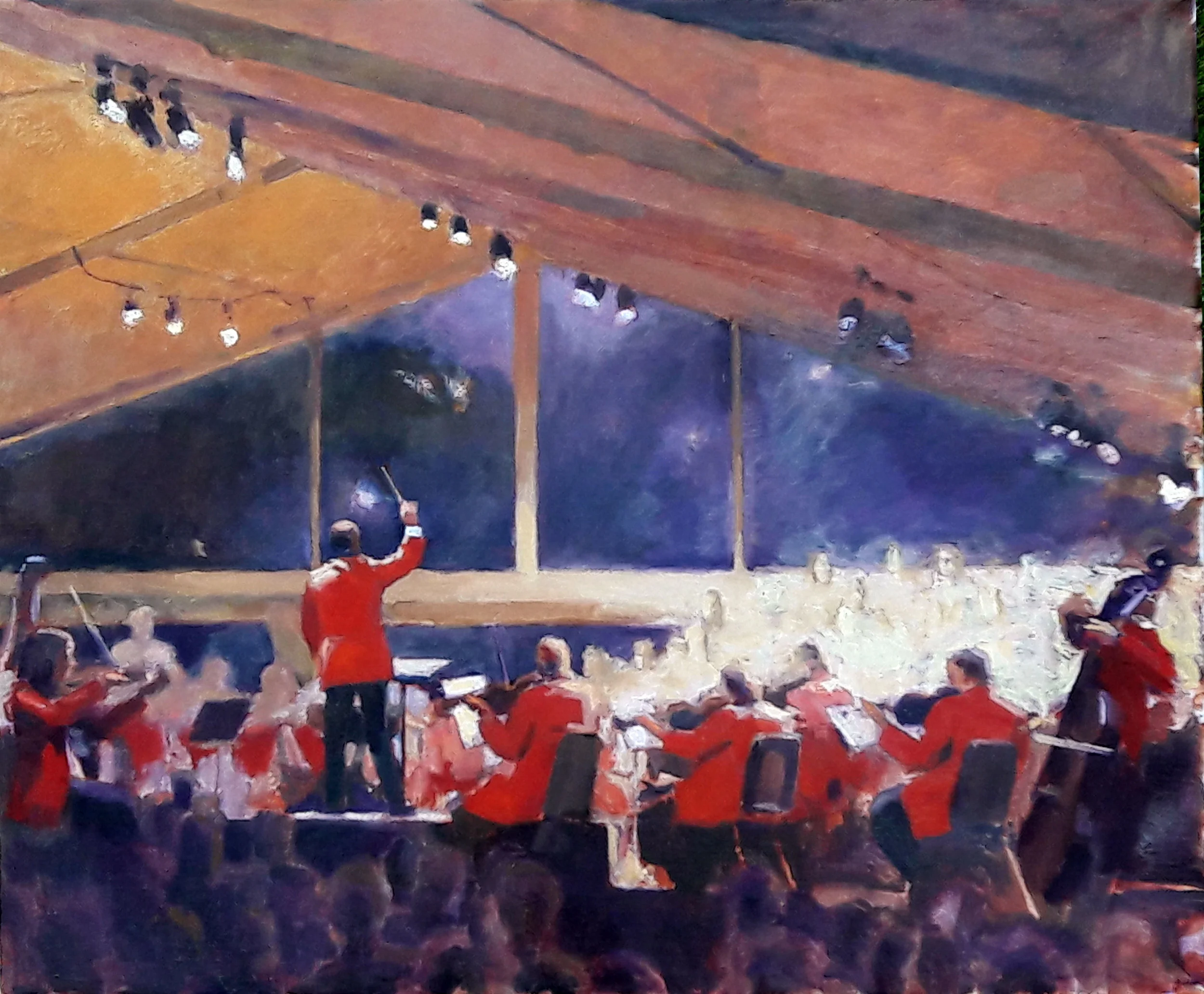
But there's another way to take in a scene like this. Supposedly it was Velasquez who first introduced direct oil paint, without any tempera underpainting. He is sometimes credited with inventing the procedure of taking in the whole scene at once as a pattern of light and shade on the retina of the eye, rather than a series of piecemeal details. We call the practice impressionism. He and Vermeer are perhaps the greatest impressionist painters.

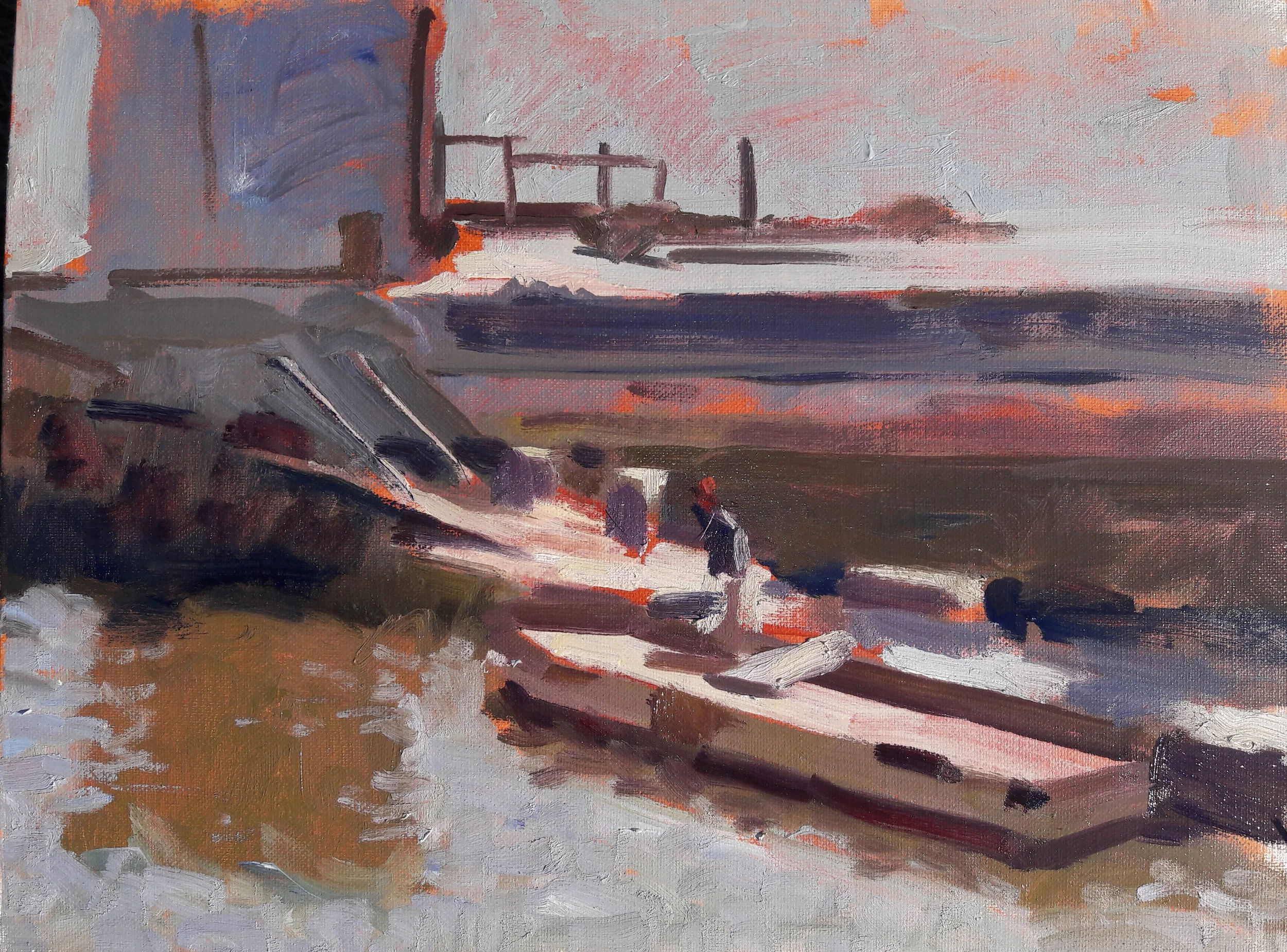
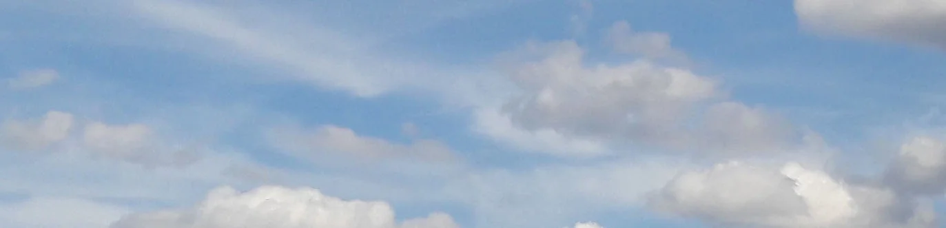
The above photograph can be viewed in this fashion, breaking it up into individual squares, each one containing the averaged out hue, value and chroma for that area enclosed. If there are a lot of such squares, the image will closely resemble the photograph:

mosaic1.jpg

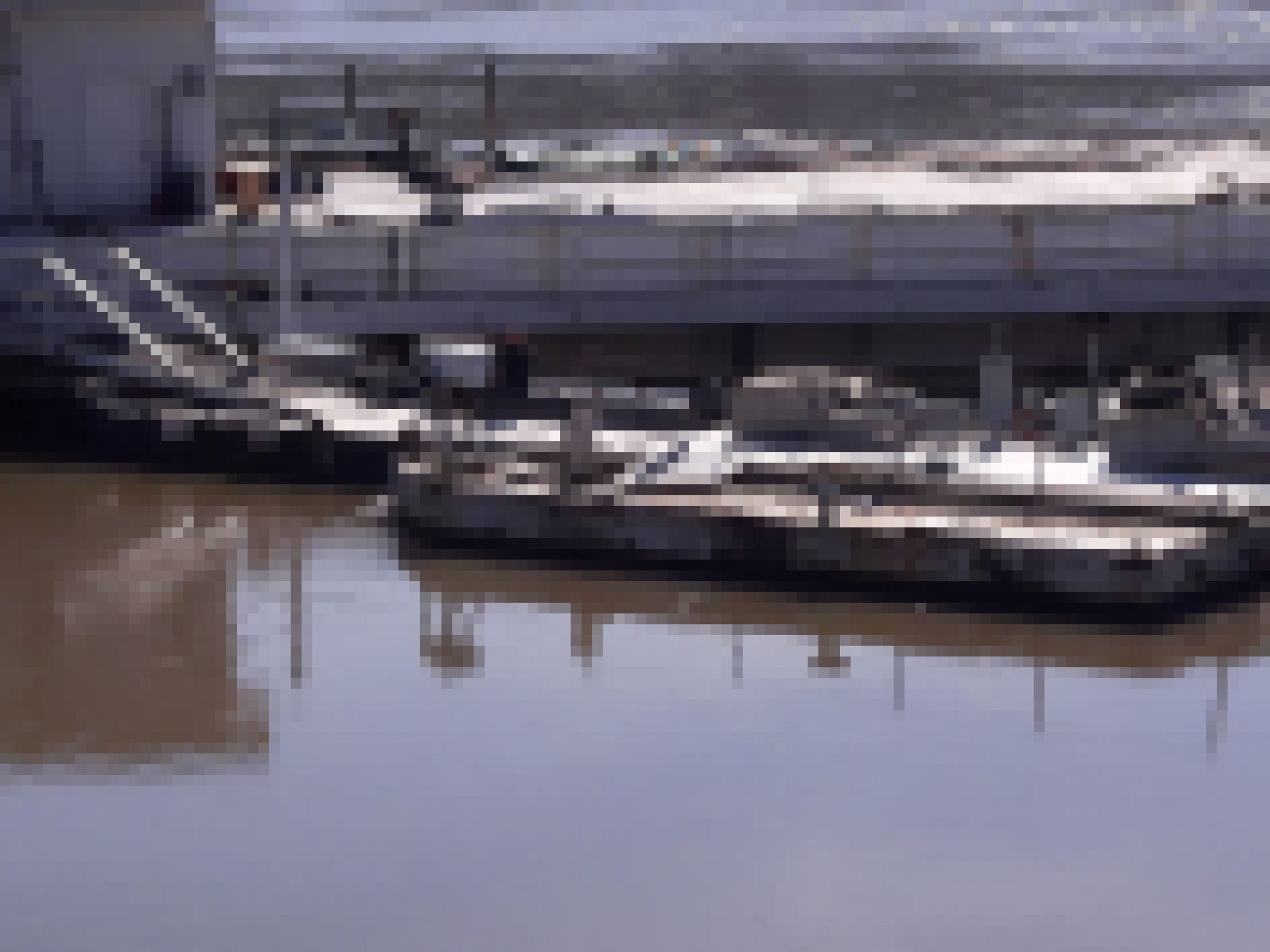
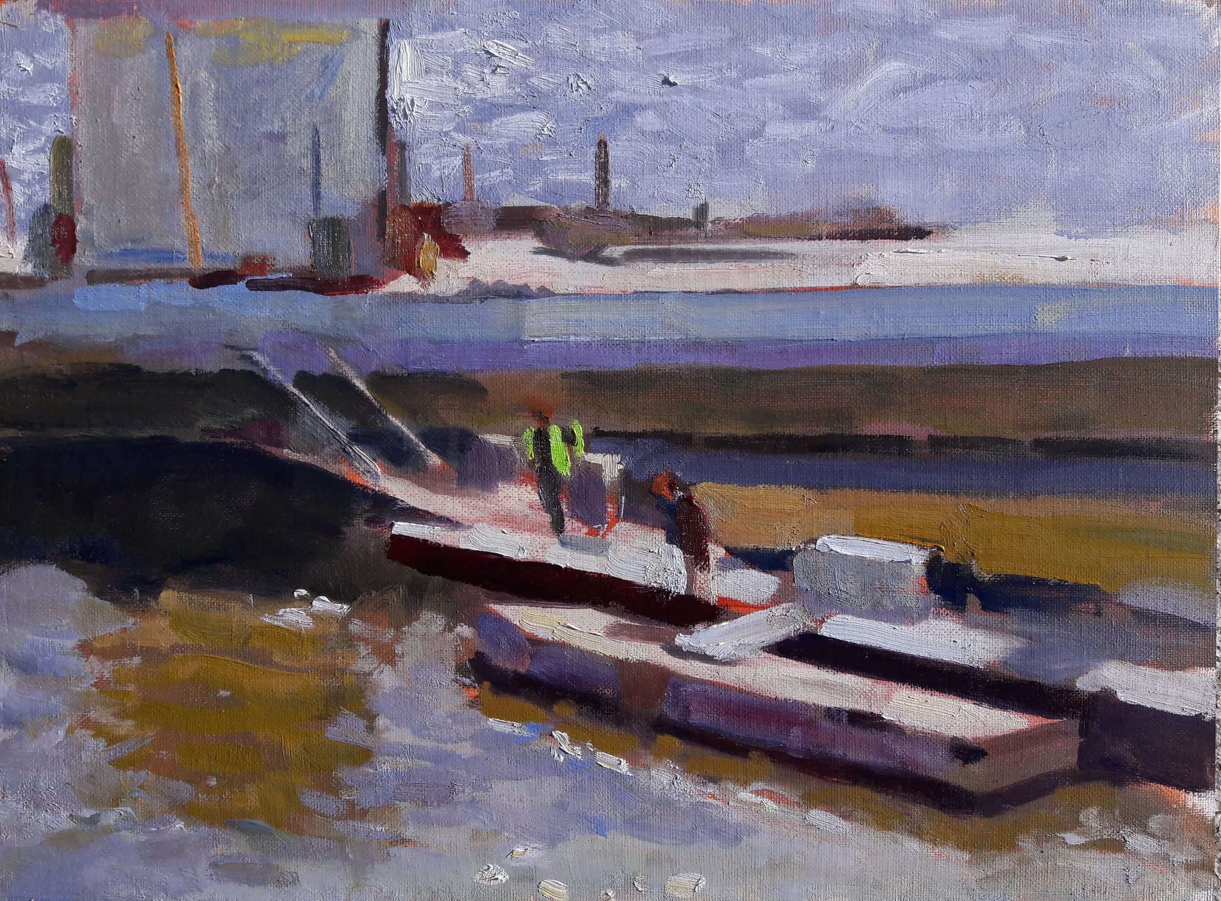
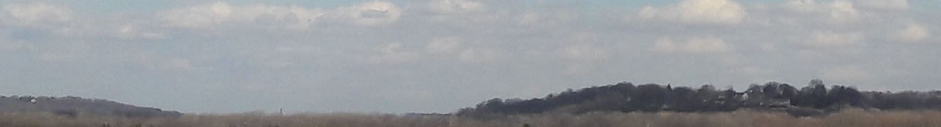
Although the image is now broken up into tiny squares, the equivalent of brushstrokes, its subject matter is recognizable enough. We can view the scene even more broadly if we wish:

mosaic2.jpg
mosaic3.jpg

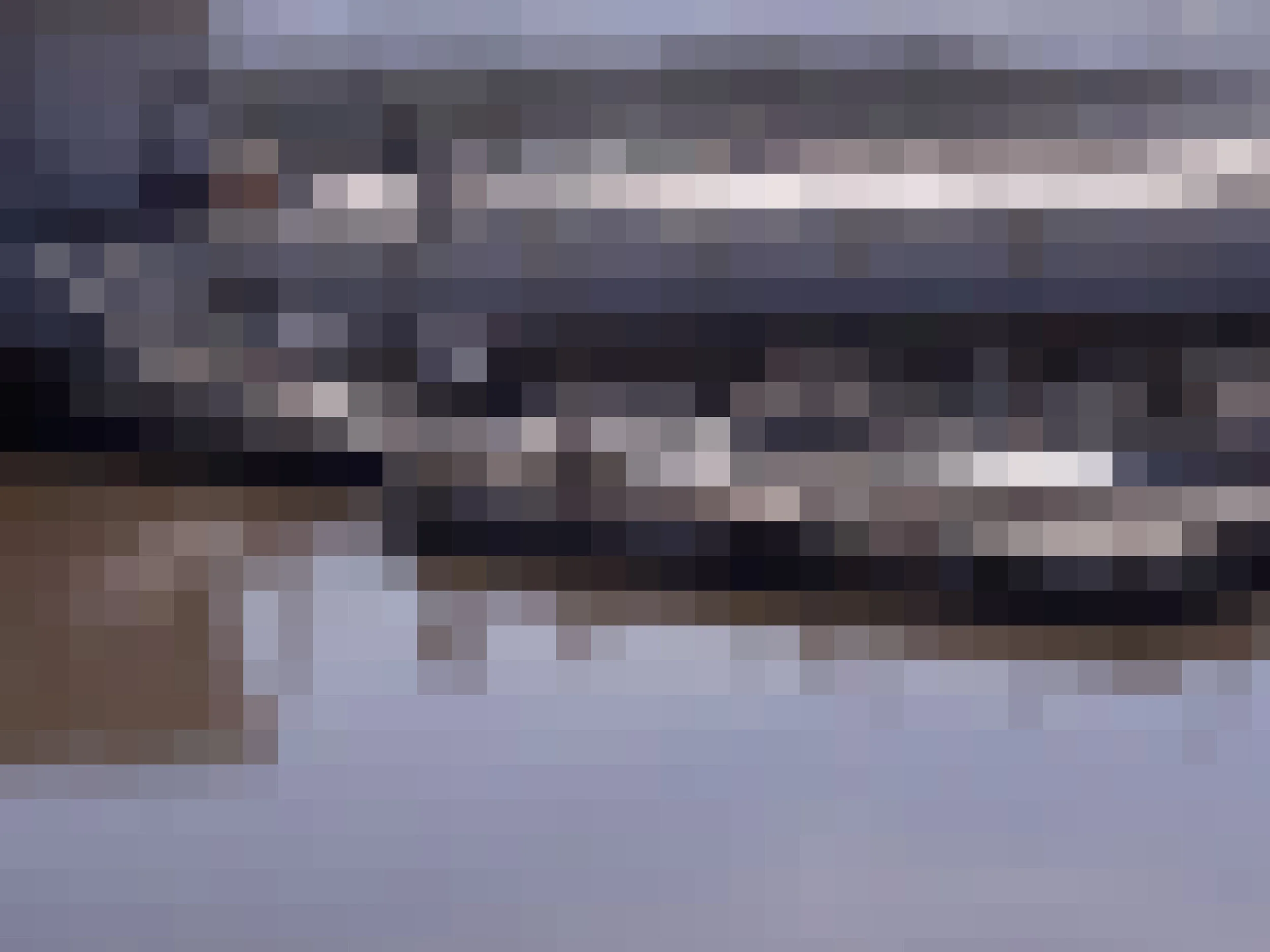
Given ever larger squares, the motif becomes less and less recognizable (although if you squint hard, you can still see the original subject matter). Additionally, contrast is lessened. This is because tiny areas of highlight or darkness are averaged out into their surrounding area. Some painting procedures demand one begin in this fashion, grasping the entire scene without any focus. In subsequent sessions, the broad areas of color are subdivided. This is often referred to as coming out of the fog.

A painter is not required to limit himself to equal sized areas of color, or a homogenous lack of focus. Much to the contrary, he can hit certain edges crisply and let others be lost. He can finish small areas, and let others go. Best of all, he can hit the extreme lights and darks. But the notion of mosaics as a way of seeing the whole motif, without getting strangled by its detail, is a very useful one.

Anything is Paintable

If your mission is to paint stuff — sun-dappled water, piers, workers, tools, and so on — the process is quite dreary. There's just too much stuff. Makes my head hurt.

But if you believe what my father told me decades ago, that a painting is just a pattern of lights, darks and colors on the retina of your eye — then suddenly anything can be painted, regardless of the prolixity of its detail. It is a lesson which, after some 45 years, I am pushing myself to learn.

The idea is simple enough. A painting's a mosaic, formed of brushstrokes instead of tiles. A big mosaic formed of very small tiles could give the illusion of great detail. A smaller mosaic, formed of larger tiles, would tell the same story, but with less information. Either way, each tile, or each brushstroke, would need to be the same value, hue and chroma that falls on the retina of the eye, and it must be in the right place. By that reckoning, anything is paintable.

For example, this view of a marina down by the Ohio River, which I happened upon last Saturday:

motif.jpg

Oodles of stuff there. What's a fella to do? Well, you've got to start somewhere…

So I started with an 11x14" canvas, the cheap kind you get at Hobby Lobby. Might as well not use a surface which is expensive and intimidating. Plus, cheap canvas panels are easier to paint on than lead-primed linen, at least for me, and at least on the first day. You've just got to cover the stupid acrylic priming with something that'll accept oil paint. Here, the panel had been rubbed down with a thin layer of burnt sienna. This may or may not have been the best choice for this particular subject, but it made the surface easier to deal with.

There are people who can do this a lot faster and more accurately than I can, at least at this point in my life. But one does the best one can. Here, I broke down the scene into a pattern of darks and lights, as best I could.

The canvas, as you can see, is in shadow. This is helpful. Were the full blast of the sun to hit the canvas, it would make me think the picture in progress was a lot lighter than it actually was. The effect might be okay outside, but when you bring such a picture inside the house, it becomes much darker than one would like. William Merritt Chase is the exception to the rule: he favored getting as much light on his canvas as possible. Which is fine if you know going in that such a procedure is going to push you toward the dark side of the spectrum. I adore Chase, but his plein air pictures are rather darker than those of his contemporaries.

3_10_2018_day1b.jpg

"G'wan, paint into it!!" my irascible teacher Robert Phillipp used to yell when I felt intimidated trying to work into wet pigment. The sooner one learns how cooperative wet paint really is, the better. There certainly could be a limit to the amount of finesse one can put into a single session of painting, but few of us ever actually reach that limit.

Cold wind and the fast-moving afternoon sun shut me down.

3_10_2018_day2.jpg

Here's today's work. Yeah, anything is paintable. The question isn't the amount of stuff you render, but the skill with which you see and paint each chunk of the canvas. Given the right mixture of paint, aimed in the right place, ropes, tools and all sorts of stuff will explain themselves as they do in real life, as a pattern on the retina of one's eyes. My friend Luschek and his art school buddies used to try to do a whole picture with a set number of brushstrokes. Can you tell the story with fifty? 100? 500? It might be an exercise worth trying.

In the meantime, here's to the memory of my wonderful father, and all the colors and values which, for almost 98 years, played over the retinas of his eyes.

Painting for the People

Considering the amount of time required to produce a good picture, it can be tough to convince people to buy them for anything resembling a fair price. One does nobody any favors by working at a loss. Still, pictures are supposed to be seen, not stored away.

One solution to the problem is selling good quality reproductions. By that standard, this is a very good time to be alive. Today's technology makes it possible to sell prints at a reasonable cost, prints which are virtually indistinguishable from the original, unless you are interested in the surface quality of oil paint. Thus far, nobody's managed to reproduce that, although with 3D modeling programs, i wonder if that day is very far away.

Here is a painting I did last summer, of the Cincinnati Pops performing under a tent at the Green Acres Arts Center:

august concert.jpg

It was a major production, and a large one. I priced it accordingly, but there were no takers, until one viewer inquired about purchasing a print.

Suddenly the stratospheric price tag came within reach. Too much so, in fact; when it's all said and done, the only ones who will make money on the deal are the printmaker and the gallery. But that was a matter of poor judgment on my part. Had I asked enough to ensure a profit for me, the buyer would have given it. The giclee was printed onto canvas, stretched to the exact size of the original. All the buyer needs is a frame.

There are cheaper processes than the giclee shown here, and I wonder if these might hold a better promise. If a picture such as this one were reproduced onto canvas with a little of its contrast muted, perhaps highlights and darks could be directly painted onto the print surface in oil. This would add the desired surface quality to the picture, and make each reproduction an original of sorts.

It's not the same as the real thing, but it's close. Ultimately I'd like it both ways, with originals finding their way into the hands of people who would enjoy them and pay for them, and reproductions for those who can't see fit to plunk down thousands of dollars for a picture. The point isn't money, except for me. The point is adding something to the lives of other human beings. If giclees can make this possible, why not?

Acutance and the Three Zones of the Sky

Acutance is a term generally applied to photography; I've never seen it used in reference to landscape painting. But the word can be pressed into service in describing the characteristics of the daylight sky as one's attention descends from its zenith to its horizon.

2_20_2018_1_motif.jpg

Here is a motif I painted this afternoon. While it doesn't pay to get too formulaic about things, there is one characteristic of a cloudy sky which, in my experience, has never been violated — not by nature, and not by painters seeking to replicate nature. It involves today's magic word. Acutance can be defined as the sharpness of an image, although that doesn't really capture the essence of the word. It's not necessarily sharpness of edge, although that can be involved. Nor is it necessarily a matter of high contrast, although that also can be involved.

Acutance is more a matter of detail in the various values which make up an image. A black and white photograph with high acutance will show a full range of values, rather than generalizing them into one or two values.

Back in the days of silver nitrate emulsions, the film most renowned for its acutance was Eastman Kodak's Panatonic-X. It was terribly slow, with an ASA rating of 40, as opposed to Tri-X Pan's 400. No photojournalist would mess with it. But its acutance was a wonder. You could liken it to what Jimi Hendrix could do with a guitar, hitting twenty notes in between each note on the scale. With Panatonic-X's range of value and crispness, it was the Rolls Royce of black and white film, if you didn't mind having to use very slow shutter speeds or wide apertures to compensate for its slow speed. Not very contrasty, but you could bump up contrast when you printed. Acutance was the stock in trade of the great black and white landscape and portrait photographers: David Vestal, Ansel Adams, and so on. They'd use Panatonic-X, or the midrange Plus-X Pan or, in a pinch, the speedy Tri-X Pan, but holding its 400 ISO rating back a stop to 200 by cutting its developing time to 3/4. Acutance was a commodity weighed against other factors. If you wanted to capture action in a dark-lit situation, the smart move was to open your lens wide, use fast film, and if necessary, give it a few minutes extra in the developer. Whatever acutance strategy you chose, however, it held for the entire image. Having low acutance in one zone and high acutance in another was beyond the range of the material, and its technology. And here lay a key distinction between what can be captured by the photographer, his processor and his printer, and that of which is seen by the human eye, and painted by the human hand. Look at anything with your own two eyes, and particularly any scene which takes in a wide range of vista, and any kind of equality of acutance becomes a pipe dream. In fact, the whole concept of homogenous acutance finds itself at variance to human perception, and to any picture making scheme intended to resemble human perception. Acutance, like seating on buses in the 1950s South, is segregated. Like it or lump it, the rules change the higher in the sky one gazes. You can ignore that reality, on philosophical grounds, and you may be right as a humanitarian, but your pictures will not resemble what we see in the sky. What you choose to observe and record is your own business, but it's hardly a good example of nature depicting homogeneity.

In the sky, acutance is not equally parceled out. The zones of the sky are separate and unequal. The lower middle area of the sky tends to hog the acutance, leaving the rest of the sky a mush. This asymmetry of acutance is one of the salient characteristics of the sky. The painter ignores it at his own peril.

For purposes of discussion, we'll divide the sky into three zones. The upper zone goes from the zenith to maybe 60º above the horizon. Here it is on the photograph:

Upper.jpg

The upper portion has some contrast, but not a whole lot of acutance. As one looks upward to see the clouds of the upper portion, what is visible is their gray undersides. There is not a great range of value in the clouds viewed from below. The blue of the sky tends to be darker, as you are looking through less atmosphere than one sees in the other two views. On the whole, the upper portion has little acutance and a range of values that hugs the darker side of the sky scale. The blue sky and the gray undersides of clouds are often just about the same value, which makes this area even more nondescript in comparison to what one sees looking lower.

lower.jpg

The bottom portion of the sky, from the horizon upward to about twenty degrees, has still less acutance, and much less contrast. Viewing it, one is looking through the maximum quantity of atmosphere; you're seeing clouds, even if they're so distant that you can't make out their shape. The color of clouds and of sky are very close to each other. It's a mush, although some very subtle and beautiful rosy hues can often be found just above the horizon.

But it's in between these two zones, somewhere in between twenty and sixty degrees above the horizon, where the real excitement is.

middle.jpg

This middle portion gets the acutance, all of it, which translates into clearly visible cloud shapes and the highest contrast. At these middle levels, you're likely to see one or two clouds catching the full blast of the sun, producing a stark contrast with the cloud's undersides. It is best to remember that even within this middle area, acutance is not equally rationed. One cloud is likely to be the most prominent. Like the queen bee rules the hive, that one cloud rules the sky. Identify it, get its shape and edge right, and let everything else go.

2_20_2018_1_setup.jpg

Another view of the same sky, with my easel perched on the hill. That hill covers the lower portion, but you can see the unevenly rationed out acutance. If there are just a couple of clearly defined clouds, lying perhaps 30º above the horizon, this is the characteristic display of acutance in the sky.

2_20_2018_1_day1.jpg

Here's a sketch I attempted of the scene and its sky. I should paint a few hundred of these this year, just to get chummier with the sky and its proclivities. But what acutance the painted sky offers is all concentrated in its middle levels. As I said, formulas aren't how pictures are made, but some things just happen all the time, and one ought to take note of them.