ASYSTOLE, or the Art of Designing Type for Comic Books

I began lettering comic books professionally in 1977, for Gold Key Comics, then DC, then Marvel, and in the years since pretty much every publisher except Archie. Had I known back then that I'd still be doing this sort of work in my sixties, I wouldn't have been happy to hear it. Whether it was the optimal outlet for my energies, it's helped pay the bills and at its best, it's an awful lot of fun.

Thirty years ago it became clear that eventually computers were going to replace human beings with ink pens. The early digital lettering wasn't much to look at, but its advantages loomed over every letterer's head. It takes ten years to learn to letter well by hand, but anyone with a computer and some decent software can do it at least passably. Marvel was the first major company to really embrace the technology. DC, a company which has always been more finicky about the way stuff looked, held back, As late as 2001, the Vice President at the Vertigo imprint of DC Comics told my wife that there was little danger of my work, and that of my hand lettering colleagues, ever being replaced by digital lettering. Hand lettering just plain looked better, flowed in harmony better with hand-drawn pictures, and had an elegance lacking in even the best computer work. There simply was no comparison.

It was two years later than this same Vice President had to spend the day phoning every freelance letterer in her rolodex with the bad news: In six months, all such work was going to be done digitally, by an in-house staff. I didn't envy her having to make these phone calls, one after another, to a pool of freelancers whom she had treated as friends for years. But that's why she had the corner office, to do the dirty jobs when necessary.

Like most of my colleagues, I'd piddled around with digital lettering, and done a few projects on the computer. I did a graphic novel for Vertigo called Orbiter digitally, and a miniseries for DC called "Death and the Maidens". It was okay. A little sterile, and not a whole lot of fun to do, but workable.

What bothered me about digital was the sameness of the alphabet or, maybe, two alphabets available for lettering. Hand lettering always meant a panoply of different letterforms. If your digital font is all upper case, then you can have two slightly different versions of each letter of the alphabet available, if you care about not repeating characters. If your upper case E is slightly different than your lower case e, and if you have to type the word "glee", then you can type "gleE" or "GLEe" and avoid the obvious repetition.

The two guys who really blazed the trail in making digital lettering viable were Richard Starkings and John Roshell at Comicraft. But part of their business philosophy was that they would make no attempt to make their lettering appear to be handmade. The stuff was digital, and digital was just fine. Comicraft may have put a lot of other guys out of business, but it's hard to fault the quality of its best work. I don't know Richard well, but John Roshell is a friend, and has designed some beautiful type families. After perfecting their process over some years and thousands of pages, Comicraft began selling its type, and the digital lettering market was suddenly open to anyone with some visual savvy, a computer, and a copy of Adobe Illustrator. Nate Piekos, another excellent designer, followed in Comicraft's footsteps, selling comic book type to those who wished to do lettering.

Through some very wise counsel from my wife Lisa, I was able to remain in DC Comics' freelance pool, even after almost every other letterer was let go. How that happened is a story in itself. But once having been accepted as one of the people who would provide DC's books with digital lettering, I had to learn to produce the stuff, and do so in a fashion that would satisfy my own sense of what digital comic book lettering ought to look like.

It took me six years to figure out how to do what I felt must be done; in the years prior to that, I produced a few thousand pages which, to my way of thinking, were rather lifeless. The quest was to find a means of producing lettering with the sense of playfulness which occurs automatically in hand lettering and, for that matter, in any kind of human handwriting.

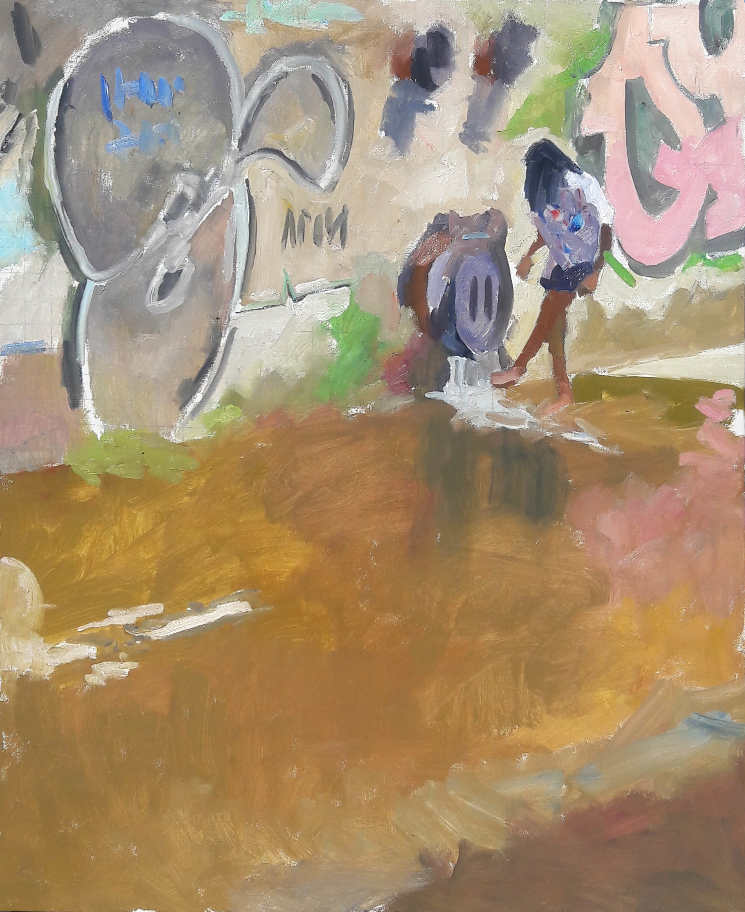
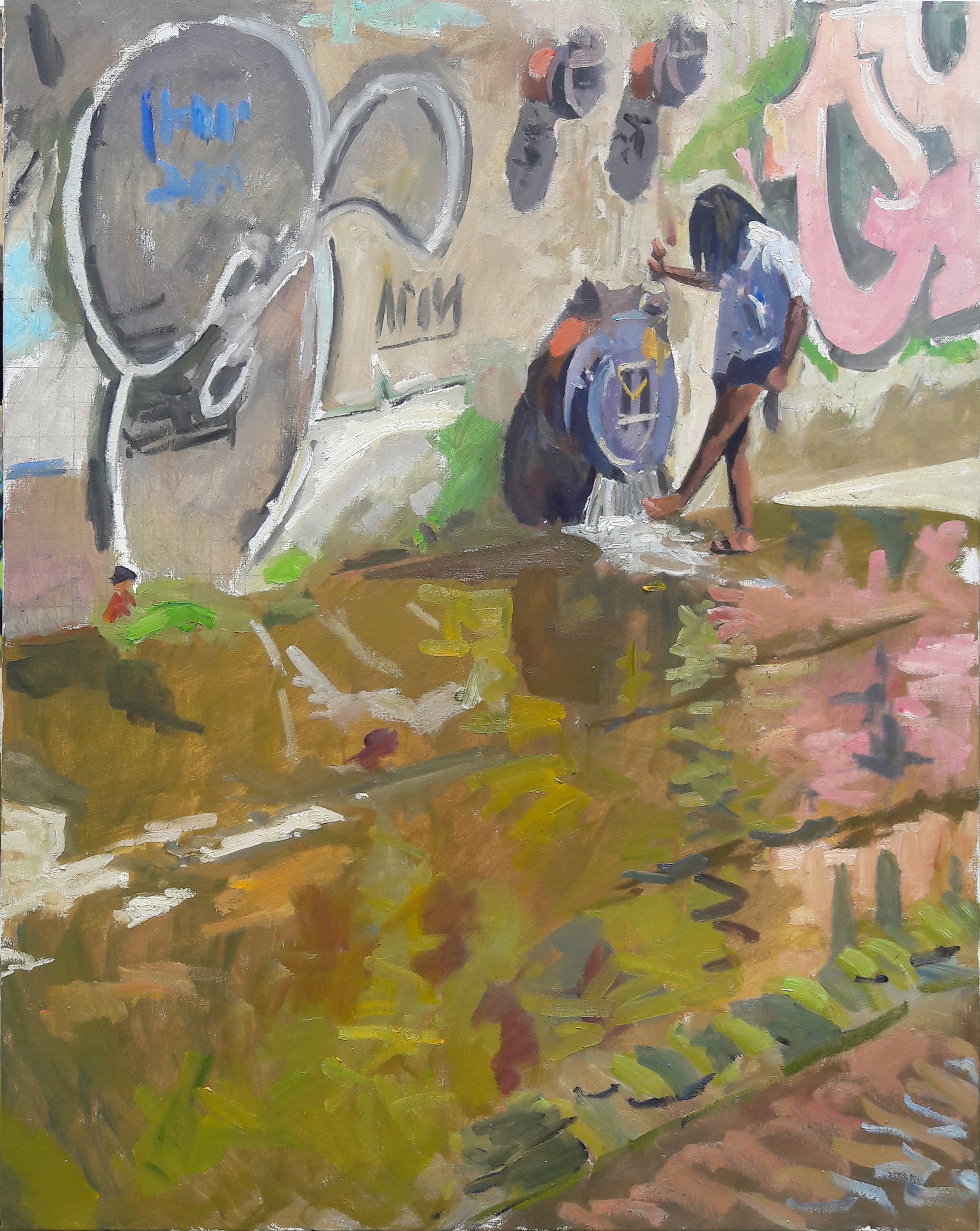
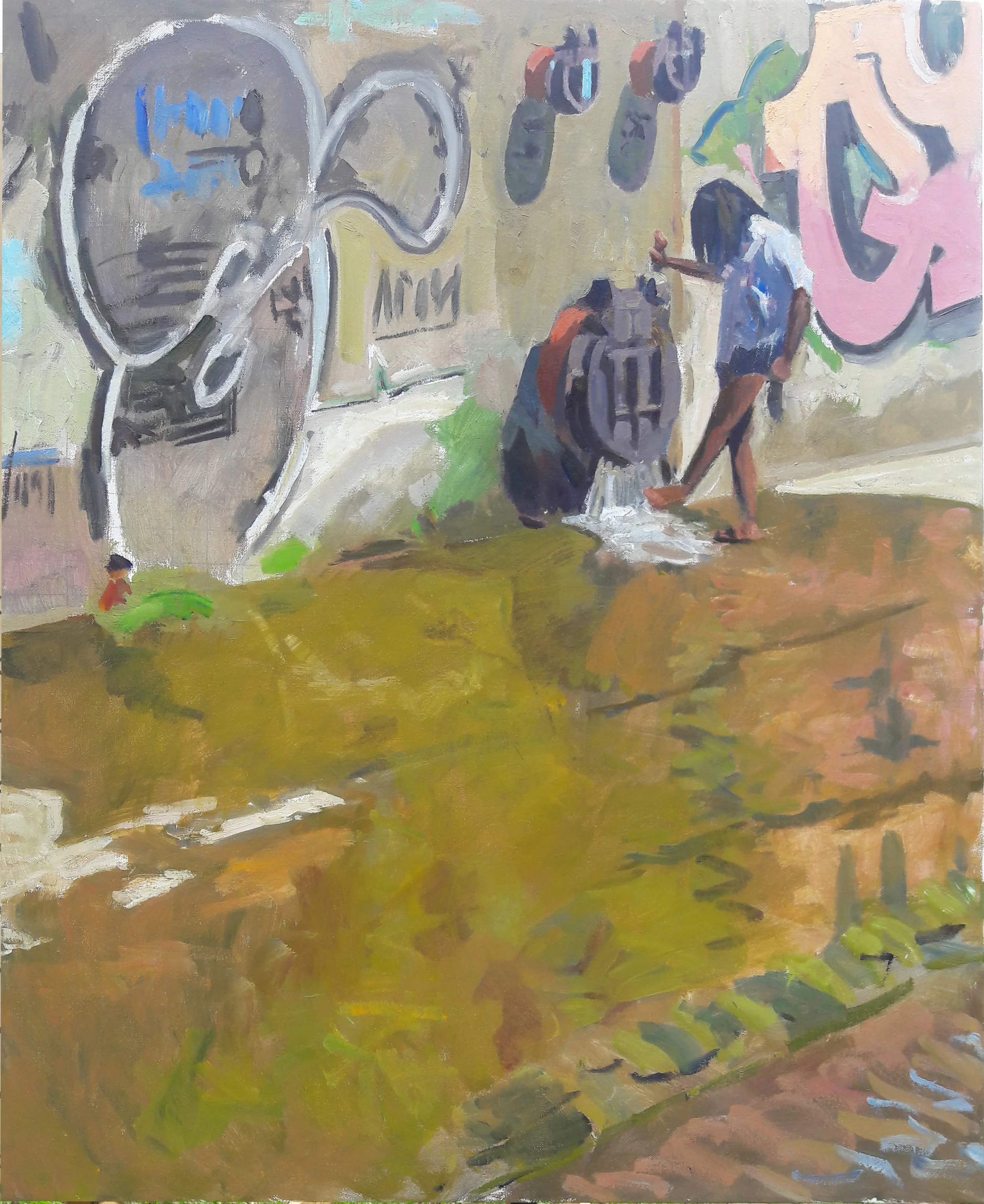
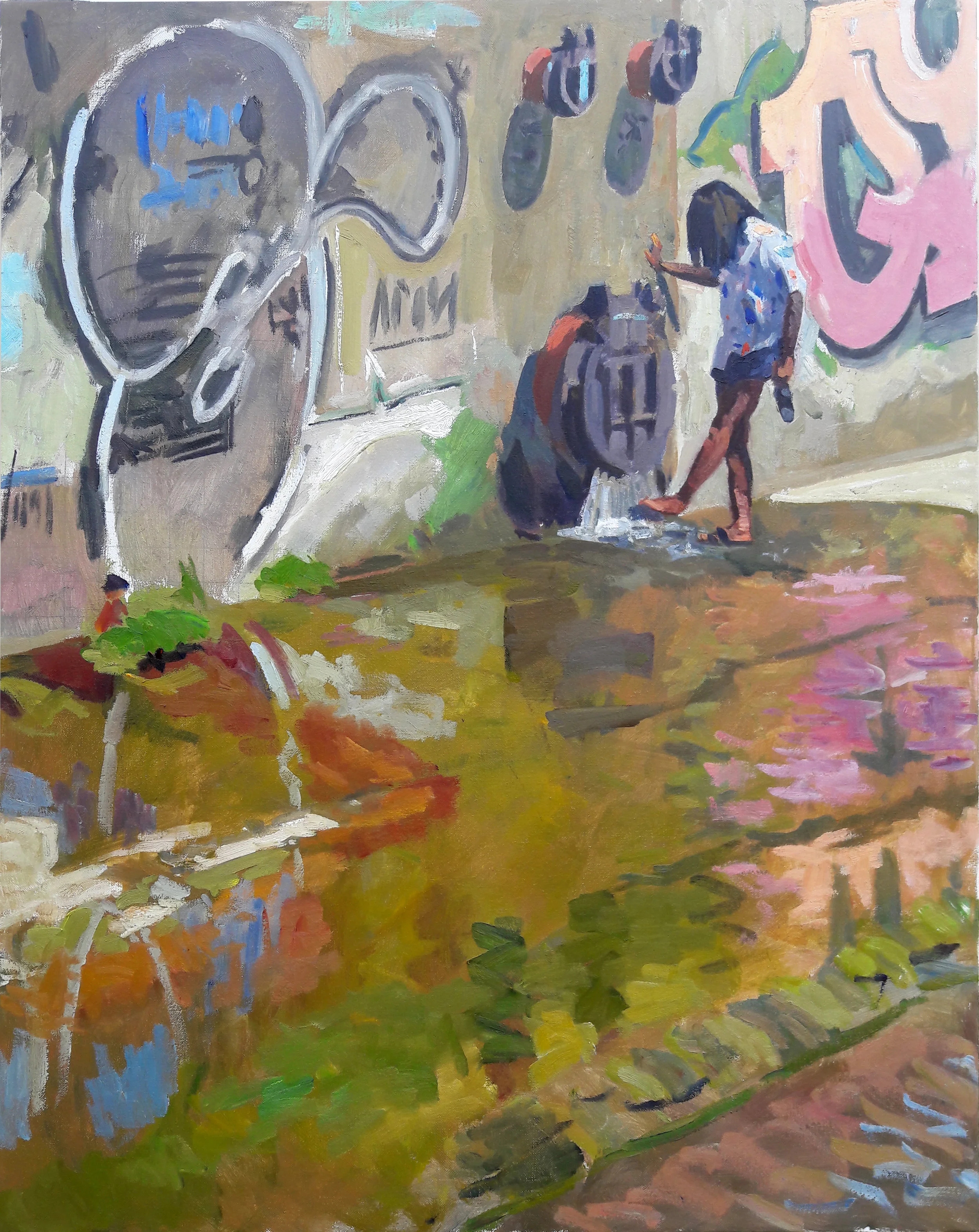
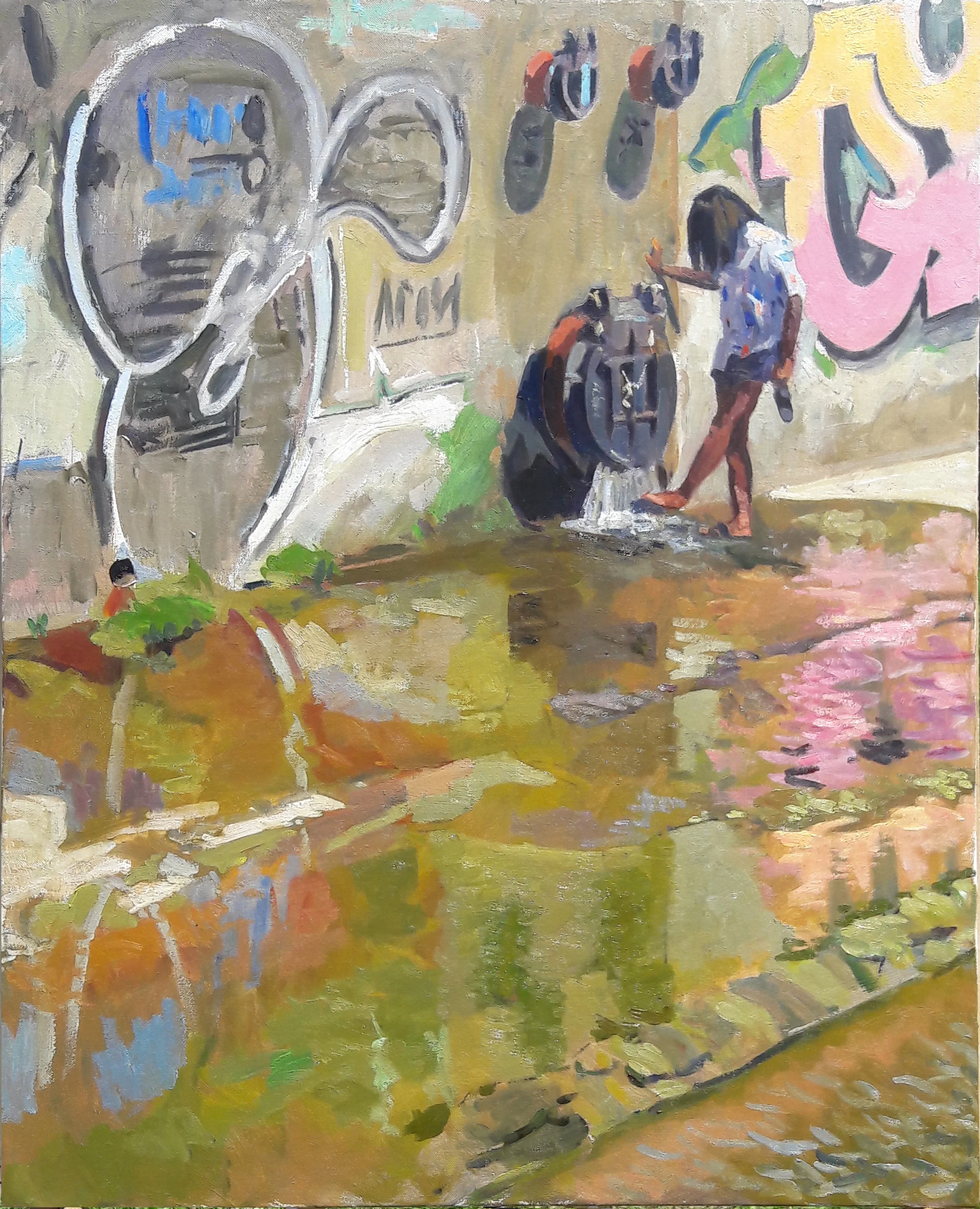
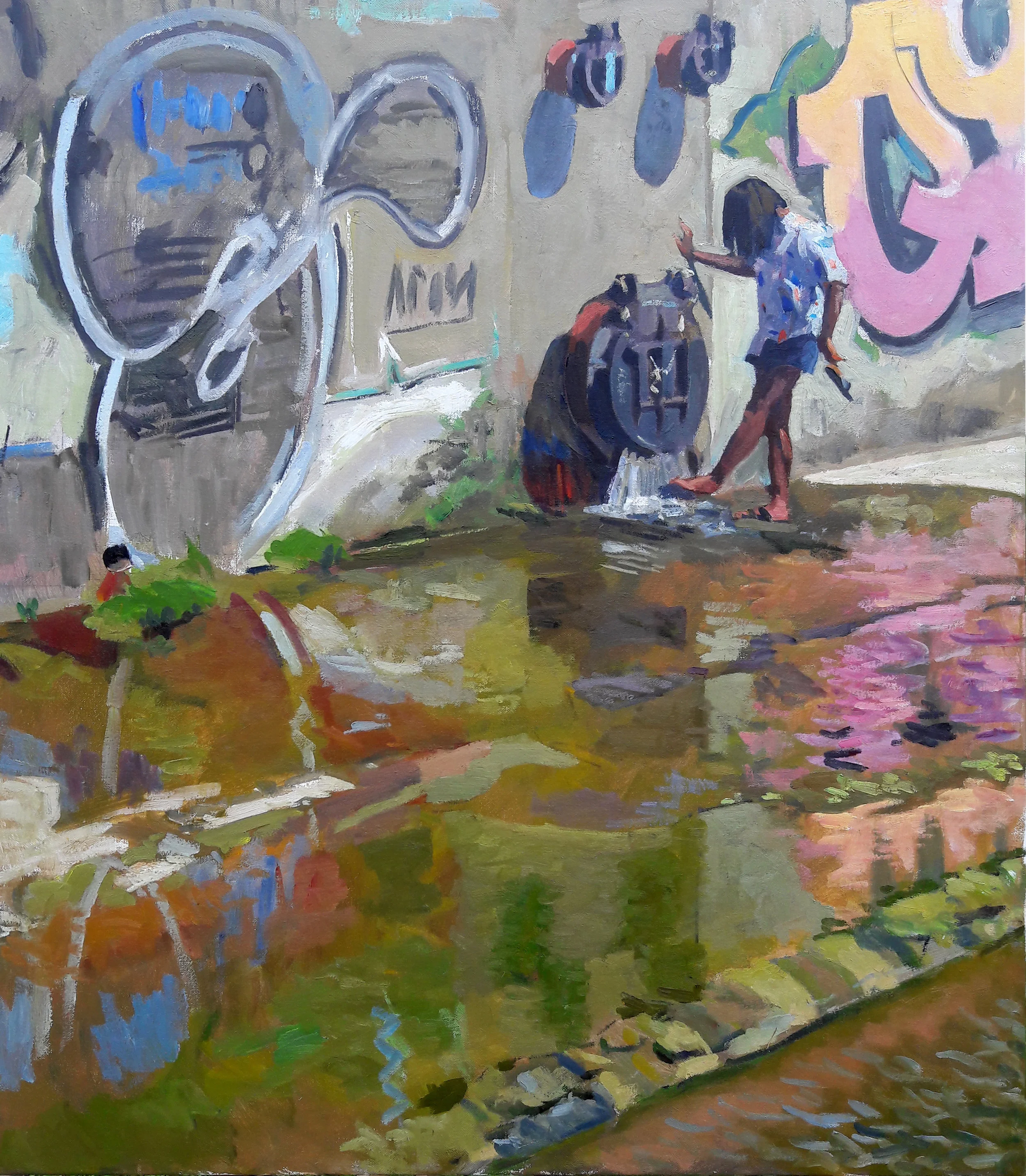
The essence of the problem which has to be solved can be illustrated by one word: ASYSTOLE. Chew on that for a bit, and stop in for Part Two. I'll explain all.

The Spillway Girl Part Two

July's Spillway Girl opus was a design which underwent very little change once its main lines were transferred to the full sized canvas. Having painted the scene once as a small sketch, and having tried various other compositional schemes, I had settled on what it was I thought the picture wanted to be. Its various stages of completion were just refinements. Maybe there's a lesson in that. Abraham Lincoln said that if he were given six hours to cut down a tree, he'd spend four of them sharpening his axe. My sharpening time, chronicled in previous essays here, enabled me to work efficiently and well. And an added bonus, a model who wanted badly for the picture to succeed, was a benefit that's impossible to overstate. When I wanted to stay home and make comic books, she had a habit of calling and asking when I planned on showing up at the Spillway.

The various stages of the picture need little explanation. Here they are:

7_12_2017_day1.jpg
7_12_2017_day2.jpg
7_12_2017_day5.jpg
Living with the picture day after day, I began to crave certain rhythms absent in the initial pose. The above sketch was an idea which I thought would improve the picture. Having a living model, I had the option of making such changes without sacrif…

Living with the picture day after day, I began to crave certain rhythms absent in the initial pose. The above sketch was an idea which I thought would improve the picture. Having a living model, I had the option of making such changes without sacrificing the verisimilitude which one often loses when working from the imagination. The crook in her wrist, and the action of her sandal which amplified it, appeared to be an improvement.

7_12_2017_day6_adj.jpg
7_12_2017_day7.jpg
7_14_2017_day8.jpg
7_12_2017_day10.jpg

It's not exactly a linear progression, in which nebulous forms come out of a fog into sharp focus. Rather, the sharp focus is a matter of my own realization of what I sought. Hard edges are softened, hardened, softened again. Generalized form and color are made very specific, regeneralized, and respecified. What nudges the picture forward? What can be done without? One can't keep going forever, although Degas' clients were rightfully wary of ever allowing him to borrow back pictures they'd purchased from him: likely they would never satisfy him, and they'd never be returned.

That said, after all of these sessions, I considered the picture a success, and I still do.

The Landscape Still Life

Still life is usually painted in the studio, under controlled light. Delacroix did some open air still life, and probably other people, but mostly it's an indoor sport.

Not one of Delacroix's more famous pieces, or even one of his best, but has always had a kind of wild charm. A series of objects more suited to Chardin than the Romantics, but instead of chiaroscuro, painted in plein aire light.

Not one of Delacroix's more famous pieces, or even one of his best, but has always had a kind of wild charm. A series of objects more suited to Chardin than the Romantics, but instead of chiaroscuro, painted in plein aire light.

But once upon a time I was out in my truck hunting for landscape motifs, and blundered into a series of manmade objects which caught my eye, a bunch of nondescript objects lying by a barn in Batavia, Ohio. Most of them I couldn't even name. Nor did I, as I have been taught, rethink their arrangement in abstract terms, and then move them around to suit my fancy. This was a Found Arrangement, and it didn't want any alterations from me.

10_12_2016_motif.jpg

Exactly what I found so charming is hard to put into words, although the preponderance of the three primary colors certainly was a factor. The blue tube — I have no idea what it actually was — had a brilliant highlight I admired. The block of wood's side plane was lit up by reflected light from the ground, although this can't be seen from the photograph. I don't know. I just dug it.

10_12_2016_day1.jpg

It was certainly worth a 16x20" canvas, and I just happened to have one such canvas in my truck. I went at it, although the three primary color notion was lost when I began scribbling in a green for the dying grass.

I loved placing the setup off to the side. I loved the rhythm of the objects, which I did my best not to screw around with. It just seemed peaceful, and pleasing, and in its own humble fashion, profound.

10_10_2016_sketch2.jpg

I generally do better work if I've taken the time to scribble the whole scene in pencil, which I did do here. Hardly a drawing to win a beauty contest, but it captured the melody of the scene, and gave me an idea of what I was trying to accomplish. This sketch was done before the above lay-in.

10_10_2016_day2.jpg

On the second and final day I restated everything, bringing the drawing into a little better focus. And I added the reflected light to the side planes of the wood block, and some in the interior surface of the blue cylinder.

The red object is a spool around which heavy cable gets wound.

Good luck trying to sell something like this, although it does what a good small picture should do: it's a simple, peaceful arrangement of shapes, a little 16x20" oasis of logic and clarity which really ought to be hanging in the home of someone who thrives on clearheaded thinking, and love. Which is exactly what happened. Currently it hangs on the wall in the home of my son Dylan Bell.