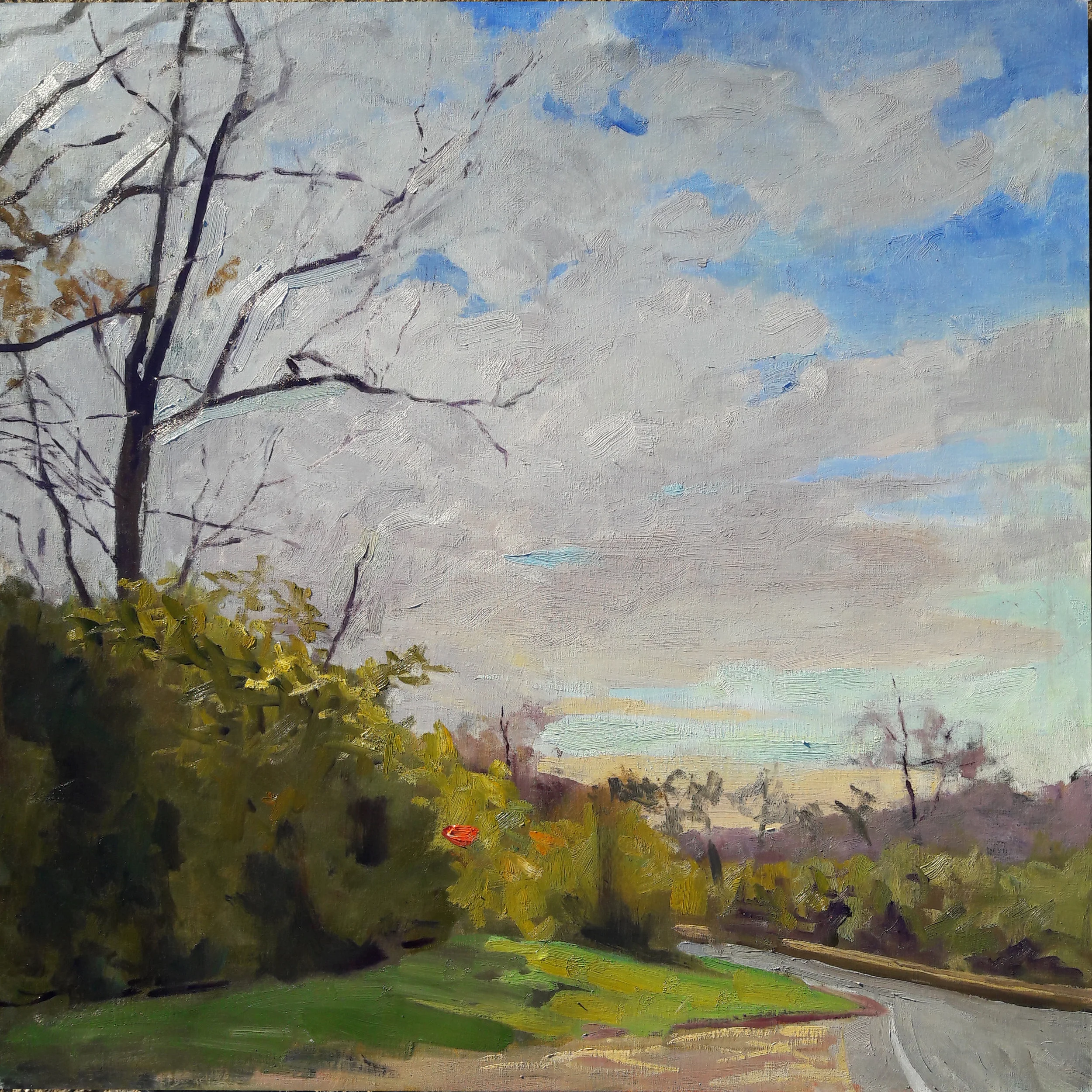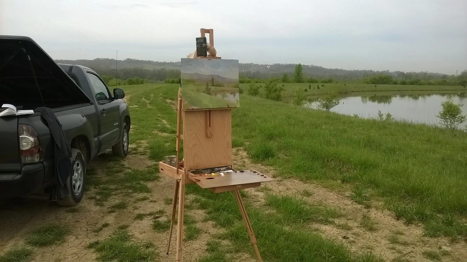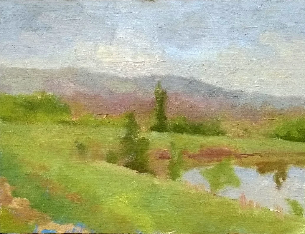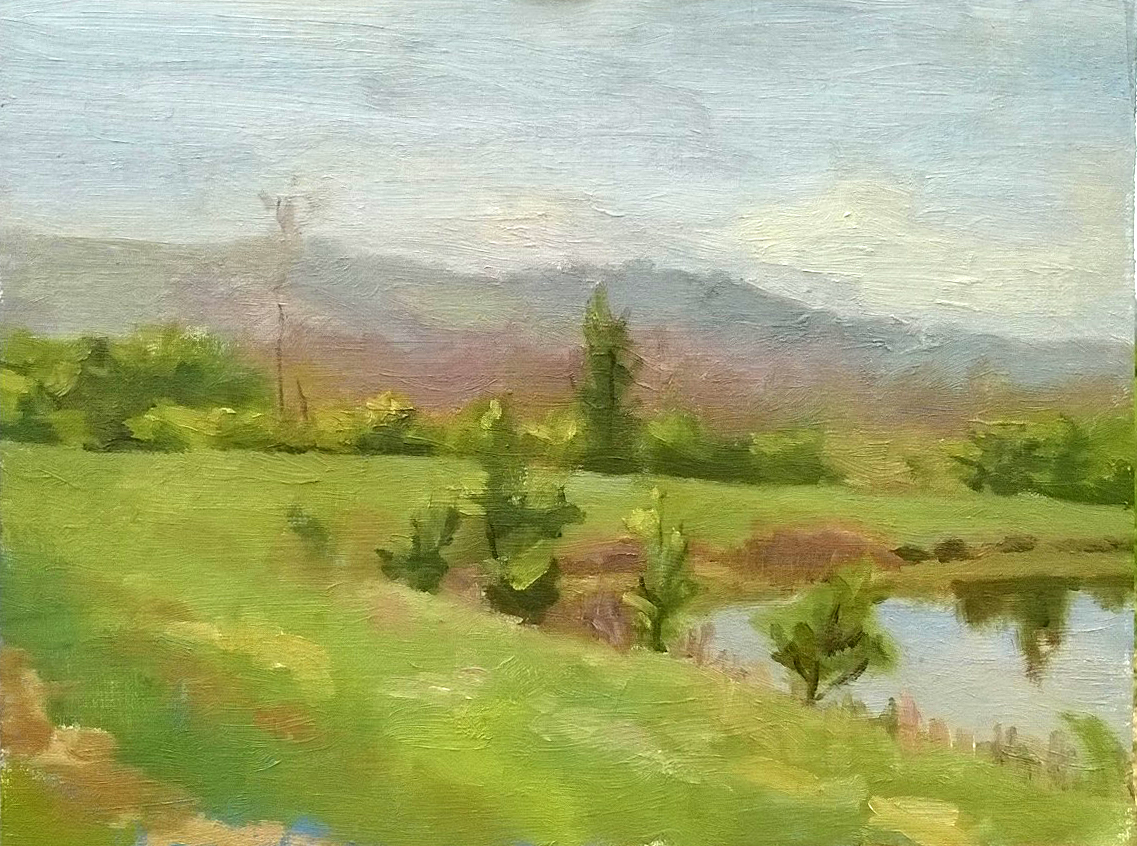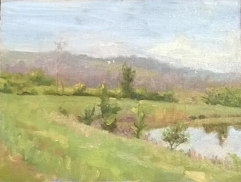
Is It or Isn't It?
My friend Angela Woods posted the following on Facebook yesterday:
"I'm taking a business class, in my presentation I have to answer the question 'Why do we need to buy art?' Please comment 😊 I need feedback." Well, okay, Angela. If you want feedback, here's enough feedback to stuff a whale.
If this is a decent business class, my guess is that it's a trick question. Obviously we do not need to buy art. If we did, it wouldn't be so tough for a lot of people to sell their art.
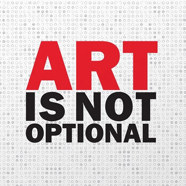
The sentiment was expressed succinctly, chiseled on a block of granite which stands by the entrance to the Art Academy of Cincinnati: "ART IS NOT OPTIONAL". It sounds nice, but again, if art is not optional, why do most people fail to purchase it?
Pithy statements like ART IS NOT OPTIONAL thrive on undefined, or poorly-defined, terms, so let's look closer at the words "art" and "optional".
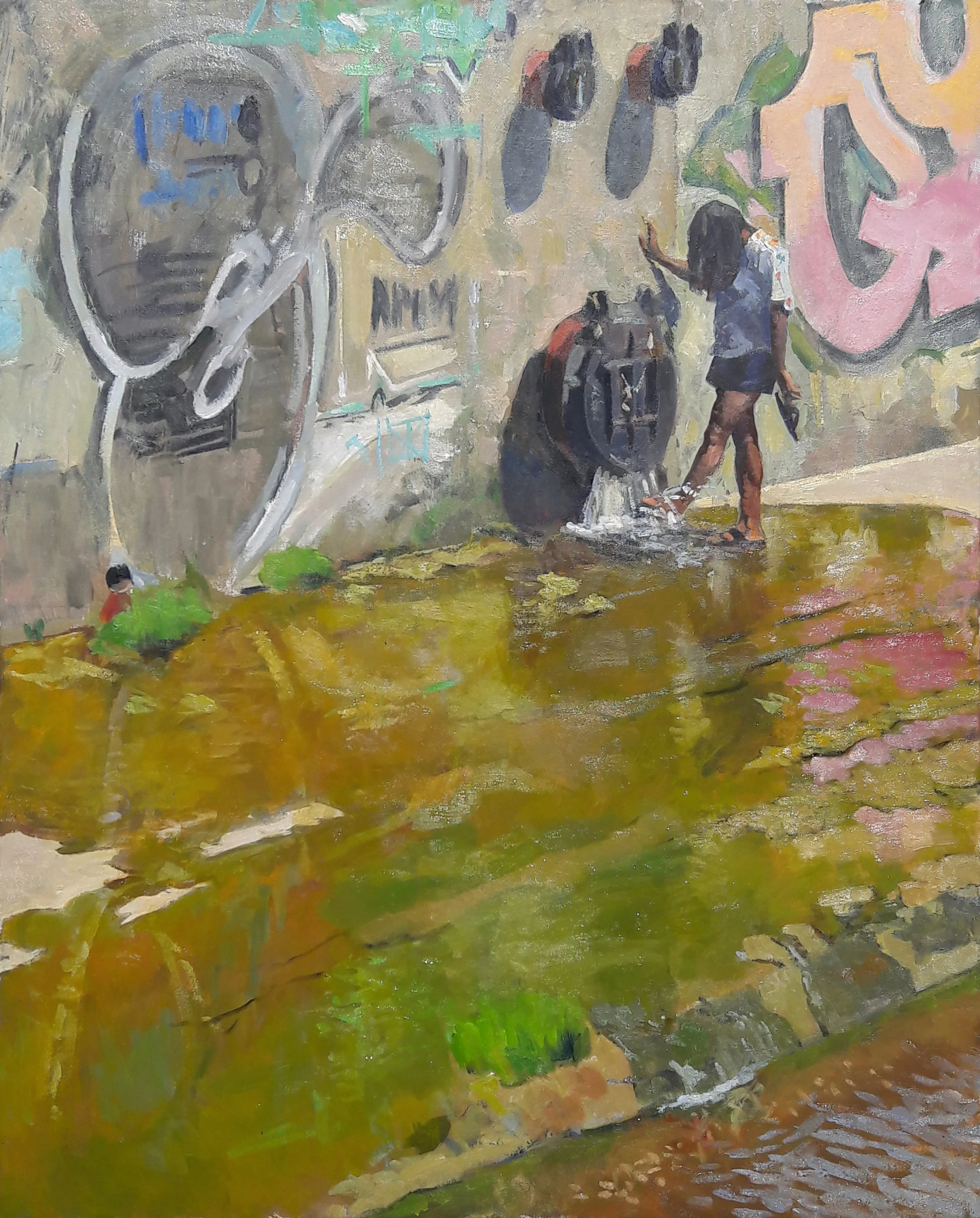
A lot of stuff gets called art. A few years back, an Art Academy student hung a dead fish on the wall, as her "conceptual drawing". It stank to high heaven. Was this art? If so, and if it is not optional, am I not obligated to hang a fish on my own wall, and everybody else's? Would a can of air freshener then also be not optional?
Is art anything that someone says is art?
Personally, I am hesitant to attempt to limit what can and cannot be called art. When I was a kid, my father took me to a design show at the Whitney, and he pointed out an Olivetti Underwood portable typewriter. I didn't get it. "Why is this here?"
"Because it's so beautiful," Pop explained.
But does it follow that because "art" is an elastic term, that anything I choose to call art is not optional for others? The perennial example is Andres Serrano's 1987 opus "Piss Christ" which I have decided not to post. But you've seen it, or heard of it. Is a photo of a crucifix in a jar of urine art? Is it optional?
Actually, we can answer that question. Whether "Piss Christ" is art, or good art, is beside the point. It is not optional. Mr. Serranno crafted his work of art while being supported by a grant from the National Endowment for the Arts. For every taxpayer, then, "Piss Christ" was not optional. I don't get to own it, or proudly display it in my living room, but I am compelled to support it. And perhaps this answers the question of what is art, as well. If art is not optional, then anything which I must support, by the edict of the police power of the state, is art. Conversely, anything which the state does not force me to support is not art.
Not a terribly compelling case. Bureaucrats have a ghastly track record for choosing what is and what is not art.
But if the state is not the sole arbiter of what is art and what is not art, or what is and what is not optional, then who is? And why is it necessary to tell other people what is and what is not optional? By my last count, the new Steven Spielberg film Ready Player One is his 34th feature. His work has garnered more than $10 billion in revenue. Did Spielberg place granite blocks in front of theaters reading "MOVIES ARE NOT OPTIONAL"? Why not?
In the late 1980s, I saw a sign in the window of a print shop which provided typesetting and other graphic services: "I HATE DESKTOP PUBLISHING." I guess everybody is entitled to his own opinion, but exactly why should I care what the owner of a print shop hates or doesn't hate? Around the same time, Richard Starkings and John Roshell were pioneering digital lettering for comic books, a technology which would shortly relegate my own profession as a hand letterer to the ash heap of history. Should I have explained to the world why I hated digital lettering? Again, who cares?
Need, and what is and is not optional, is defined by the individual. If I needed a blood transfusion to save my life, I would suggest that the transfusion was not optional. But some very committed Jehovah's Witnesses might beg to differ. Nor is my morning coffee optional, but try forcing that belief on a Mormon. One man's necessity is another man's option, and nobody is in a position to dictate what is and isn't optional, except the National Endowment for the Arts, and the government whose police power stands behind it.
I'd suggest that if my toilet was backing up, a good plumber would not be optional. Does this make a plumber an artist?
Wait. I said that nobody is in a position to dictate what is and what isn't optional, but that's not entirely true. Jesus Christ stated that "Man shall not live by bread alone, but by every word which proceedeth out of the mouth of God." Apparently, such words are not optional. And there you go. Such words are not only not optional, but some of us would claim that they are the highest form of Art ever fashioned,
How about that, Angela? Tell that to your business professor.