The Phthalocyanine Trap
The phthalocyanine family of pigments were first experimented with in the early part of the twentieth century. There are phthalo greens, blues, violets and others. What they all have in common is their intensity, and their almost incredibly powerful tinting strength.
This would be no problem, except that no other pigments i’ve ever heard of can match them. Alizarin crimson is pretty powerful too, but the phthalo pigments blow it off the map. No red or orange or yellow can rival phthalocyanine.
Exactly why this is problematic is that if no other hue can compete with the phthalo pigments, then your palette will be weighted toward your phthalos. do you really want your greens and blues to be punchier than your reds and yellows?
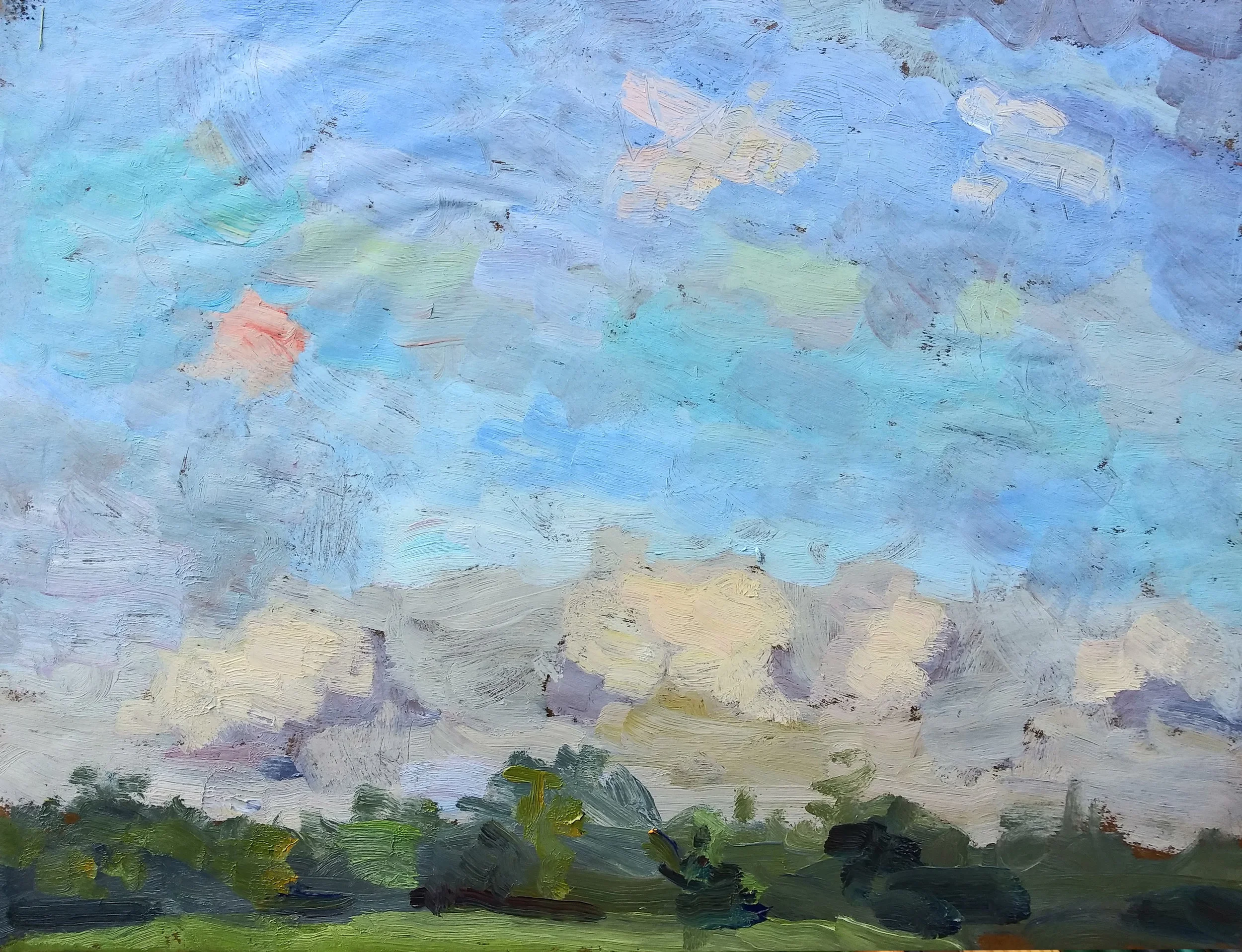
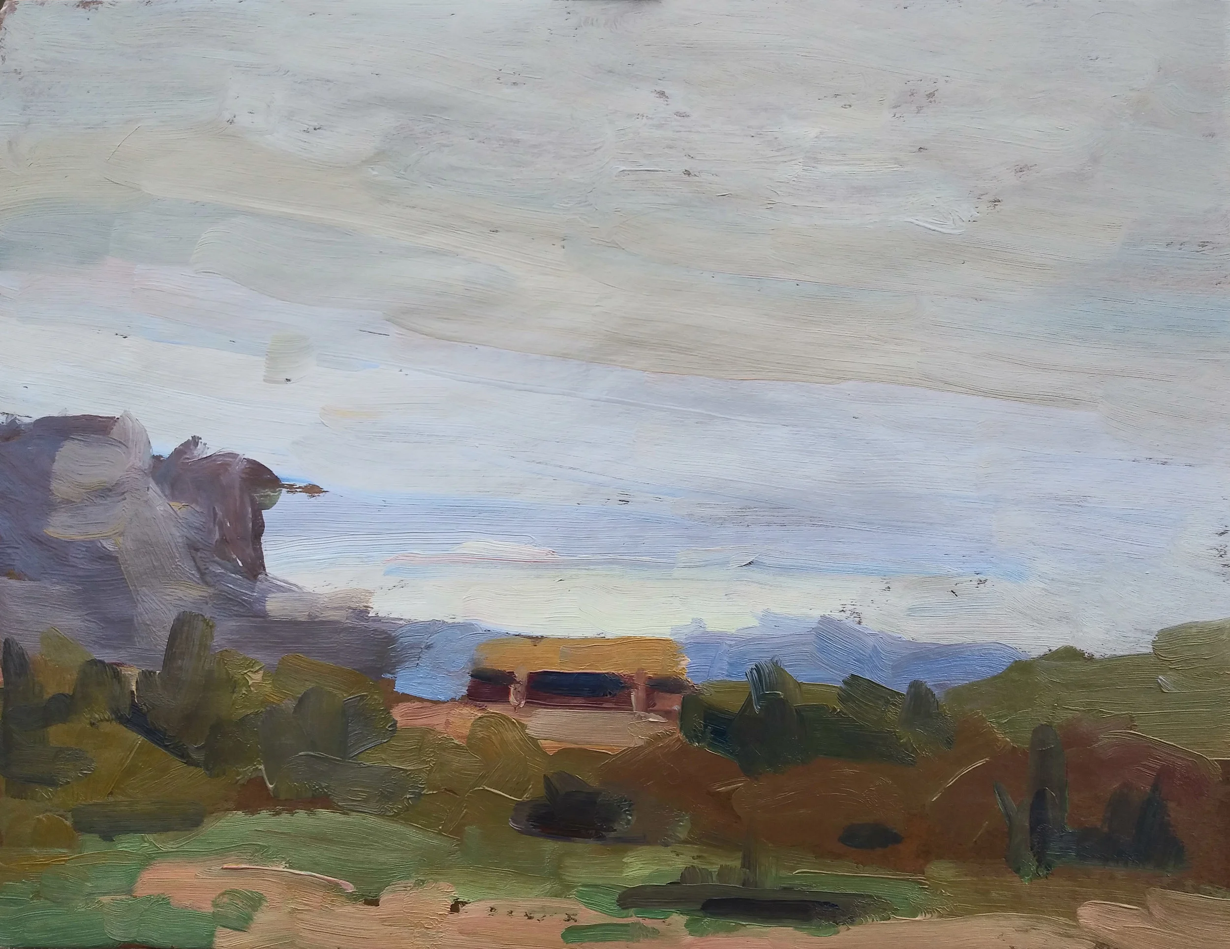
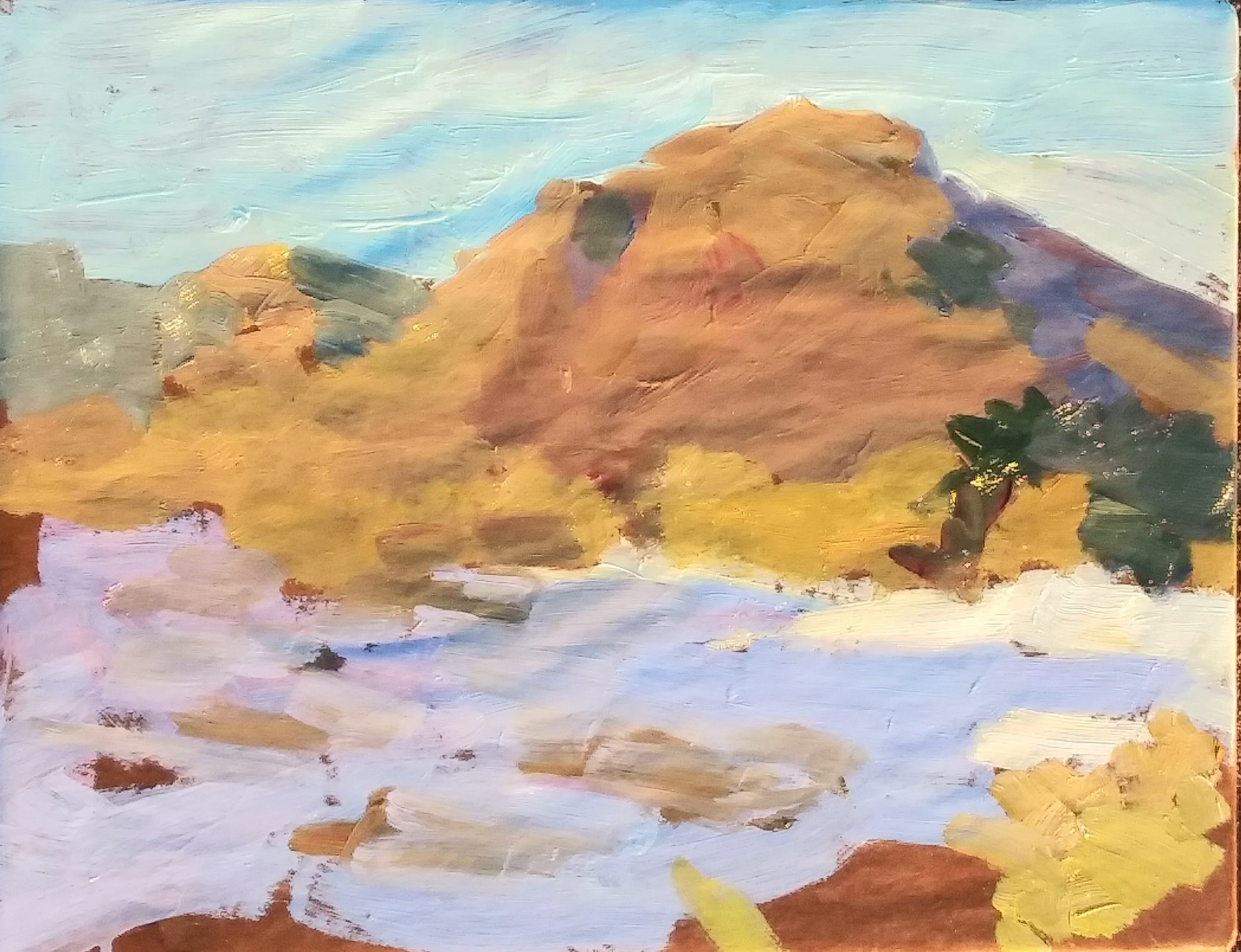
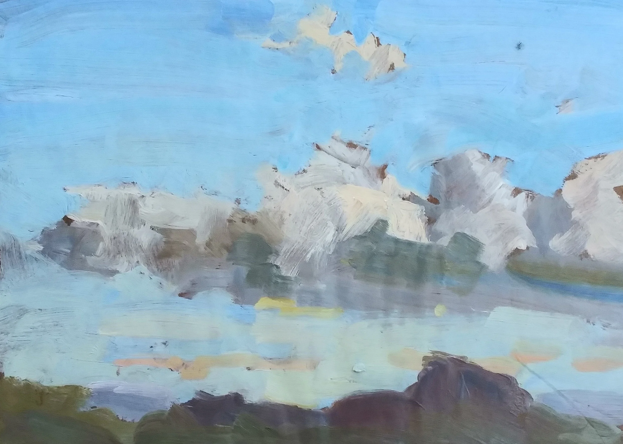
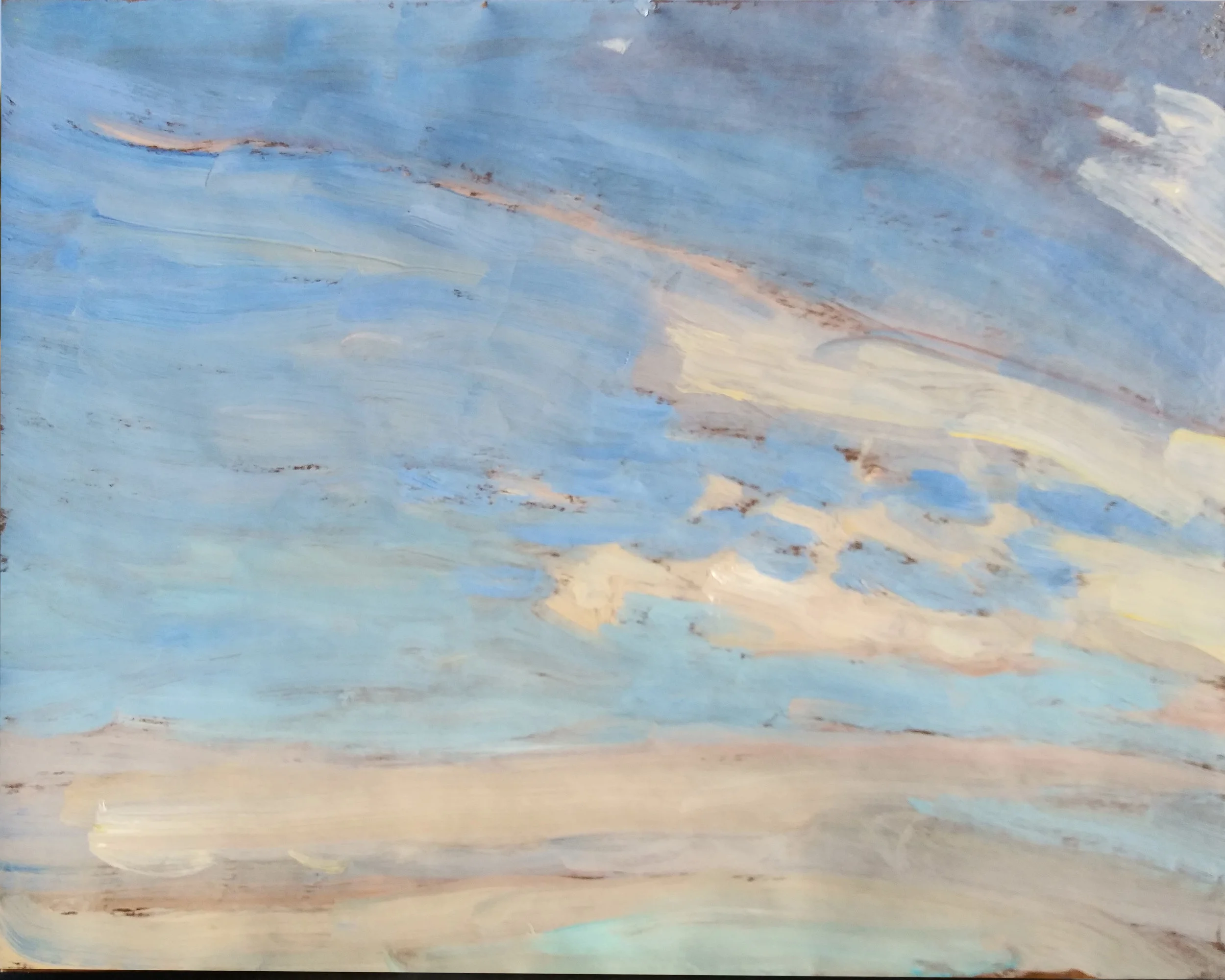
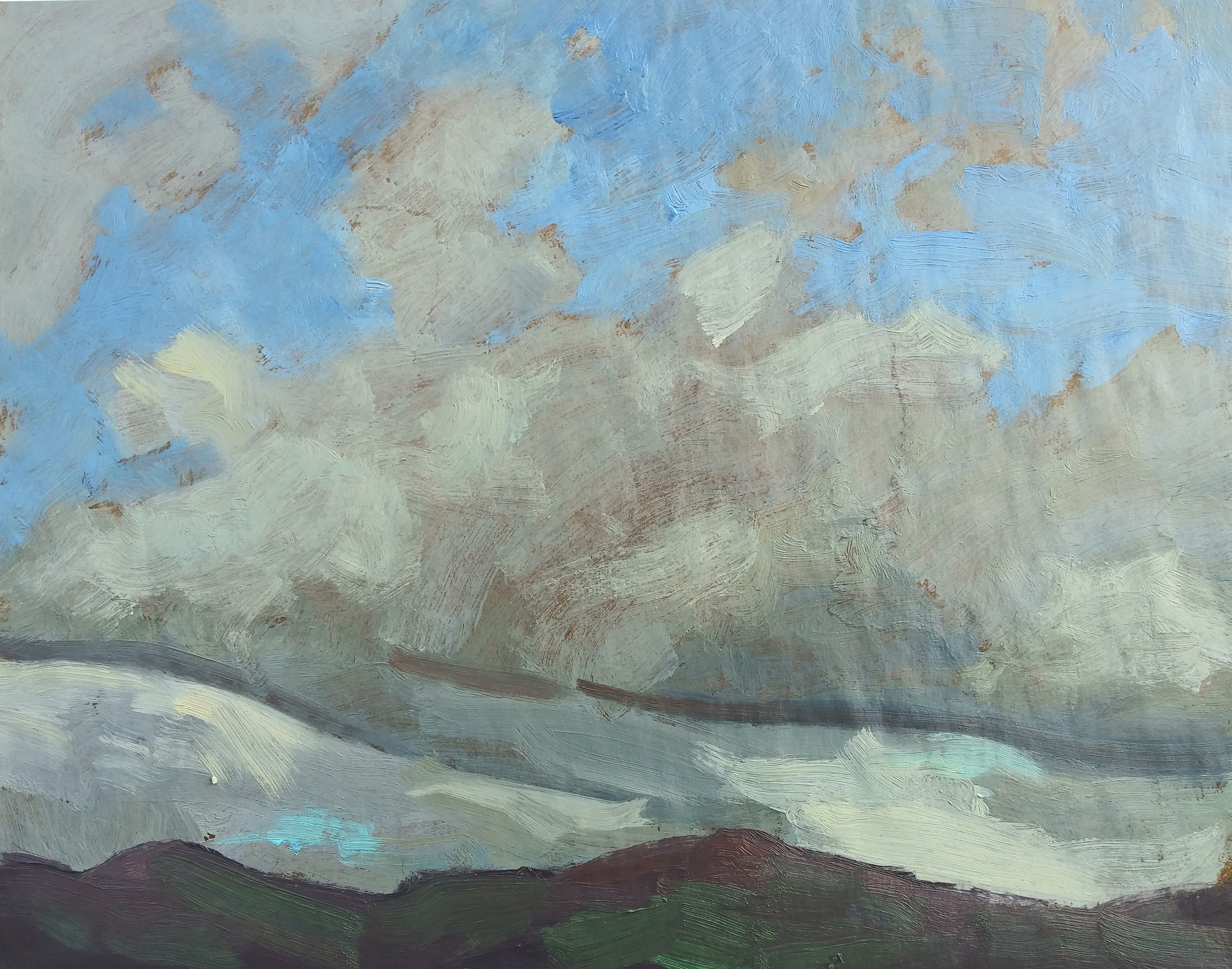
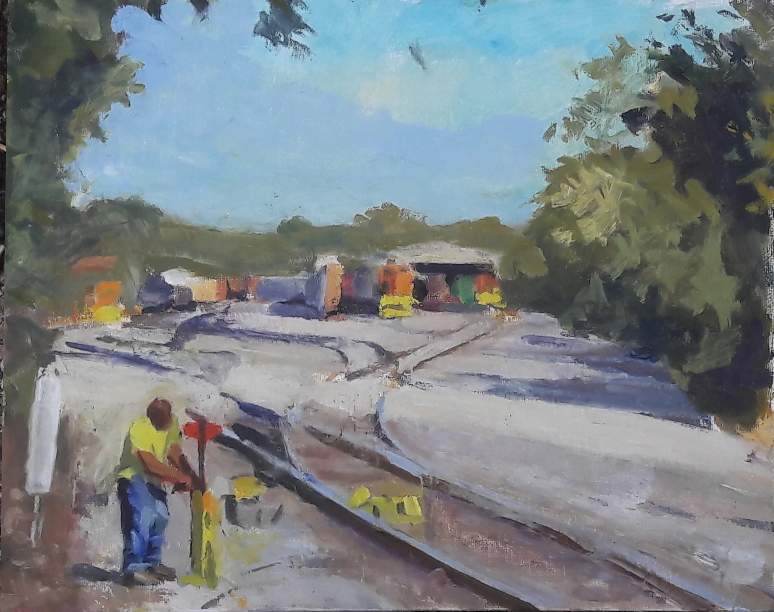
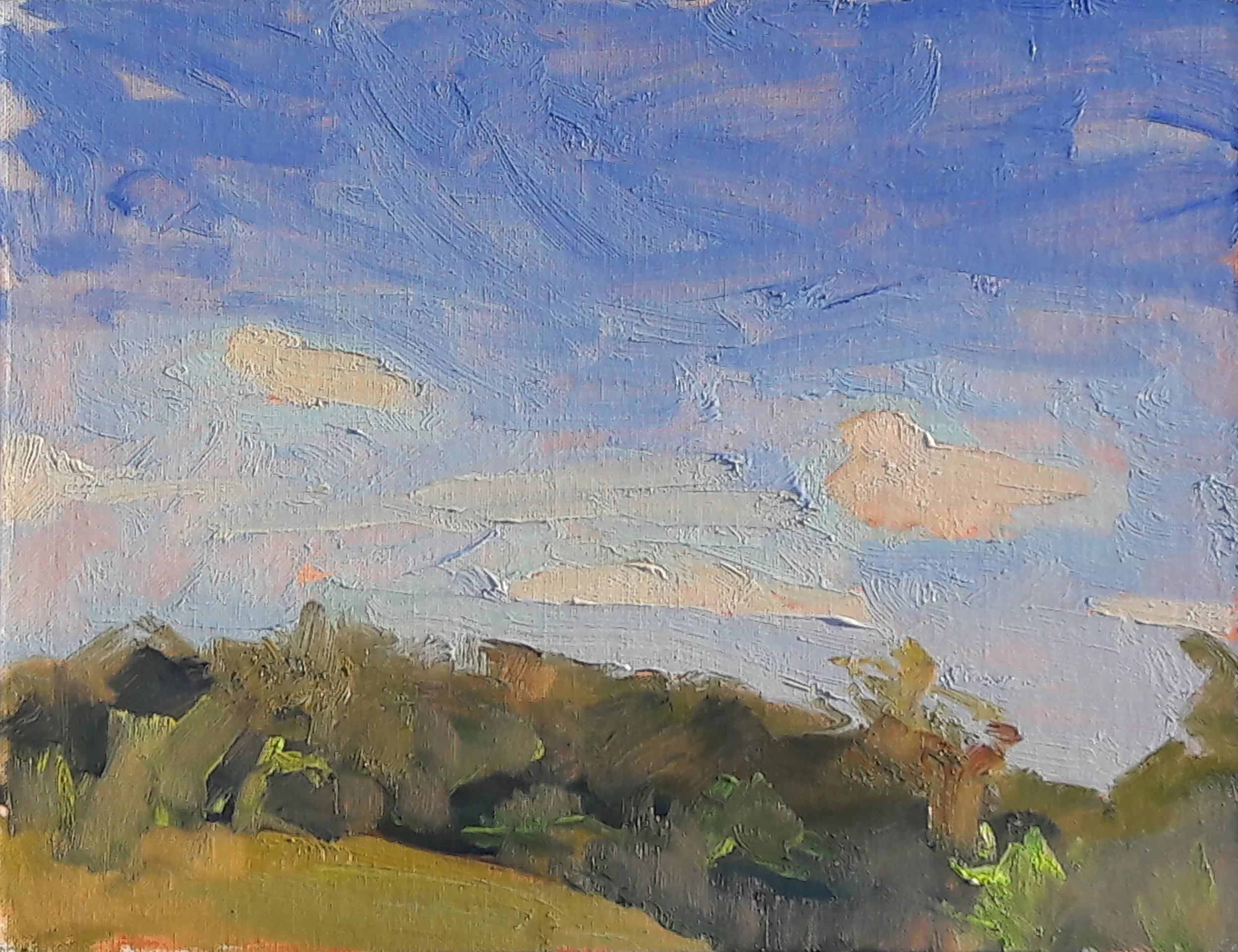
A recent oil sketch which illustrates the trouble a little bit of phthalocyanine blue can bring.
I haven’t used pure phthalo blue in years, but i’ve got a mixture of phthalo blue and white on my palette. it goes by the name Sevres Blue. It’s a lovely hue, and is particularly useful for the lower portions of the sky, where blues tend to veer toward green.
On the other hand, Sevres will dominate the sky, and often the whole picture, if you’re not careful with it. The effect sneaks up on me. All of the sky painted above contains at least a little bit of Sevres blue. Particularly the middle area of the sky. It’s overwhelming, and it does not match what I saw and was trying to record. Worse still, the problem too often doesn’t make itself apparent to me while i’m working.
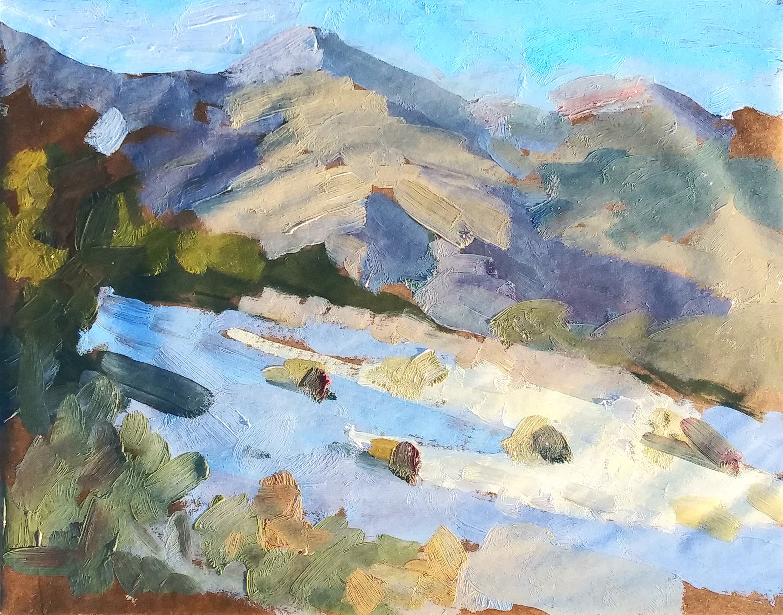
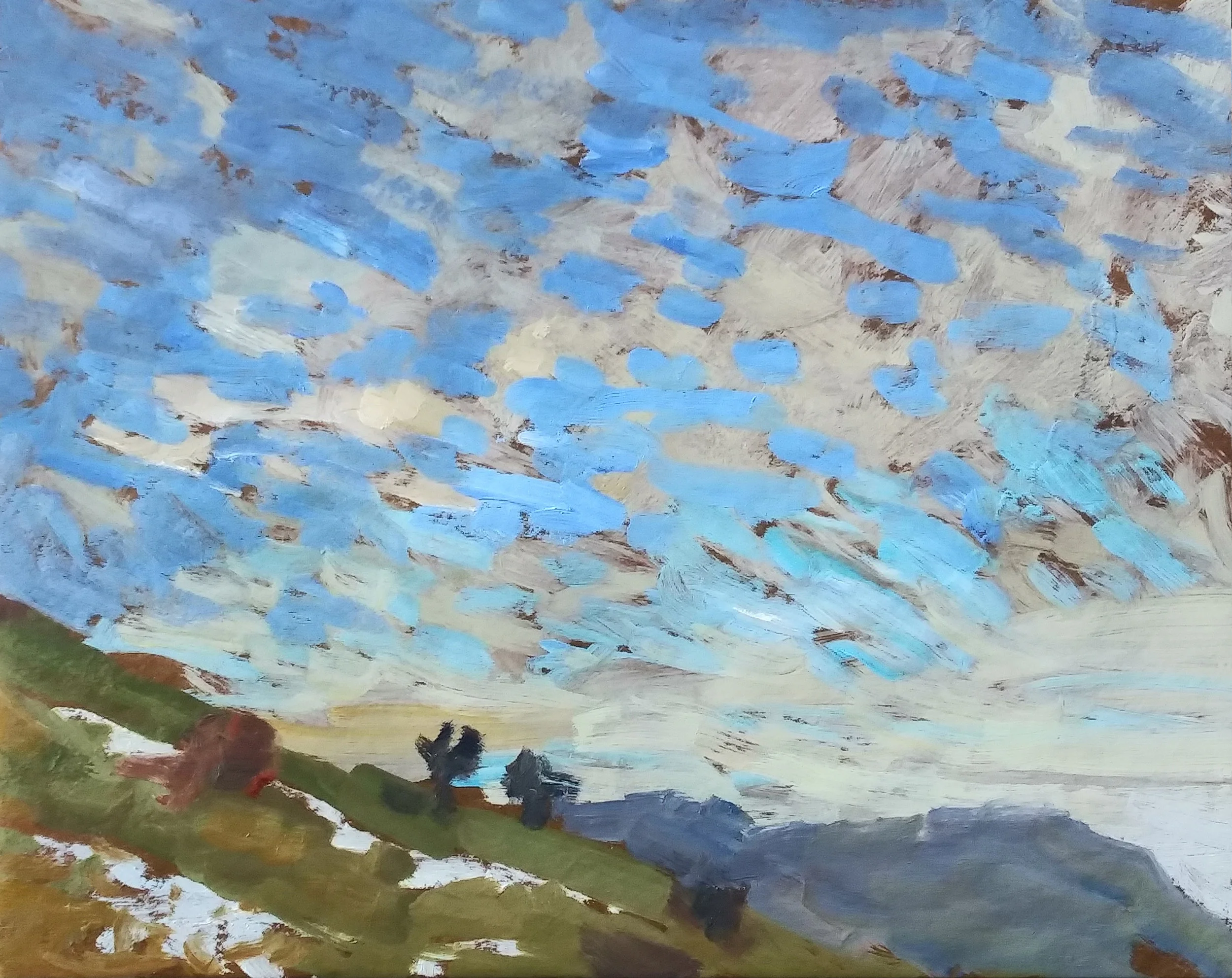
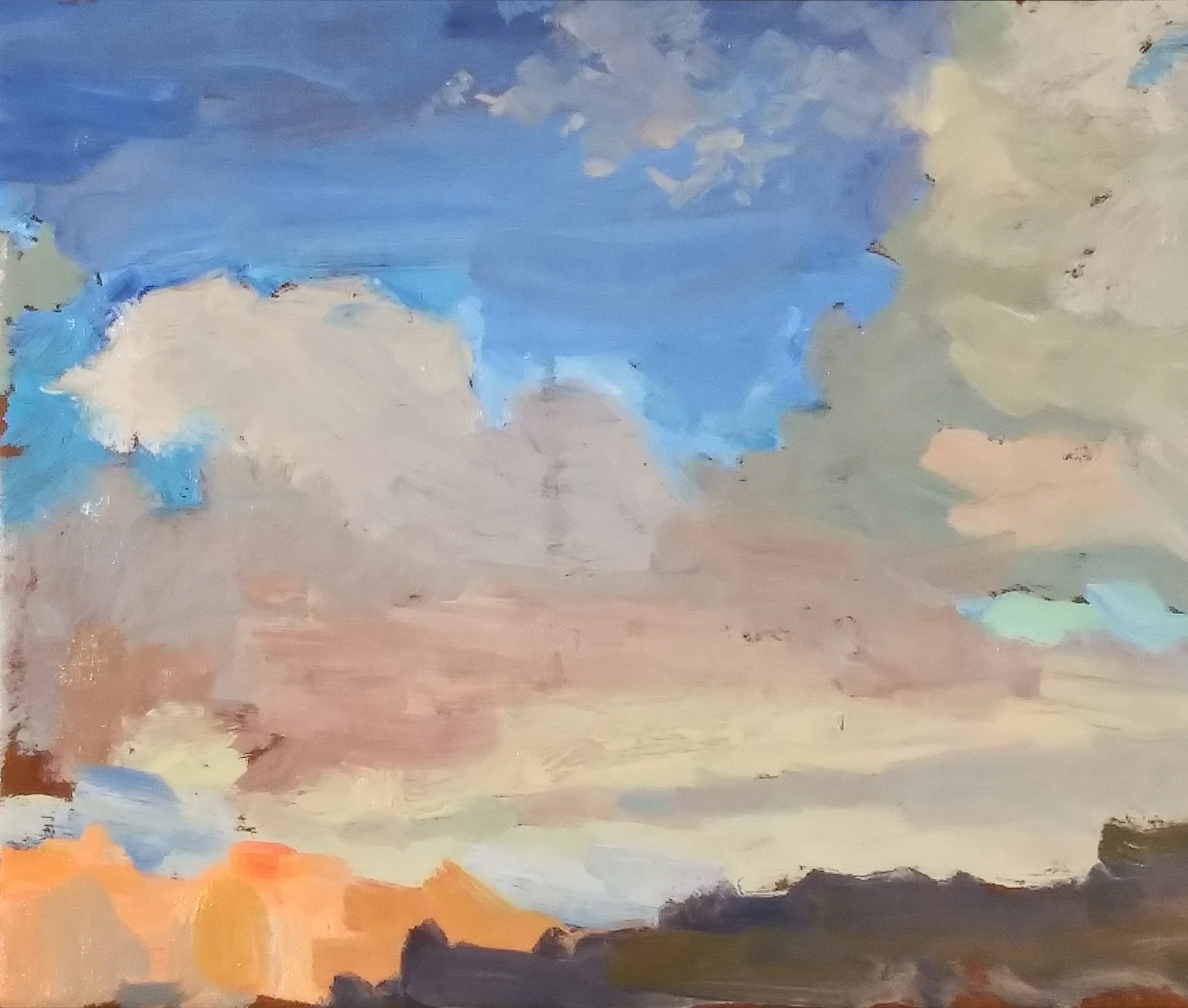
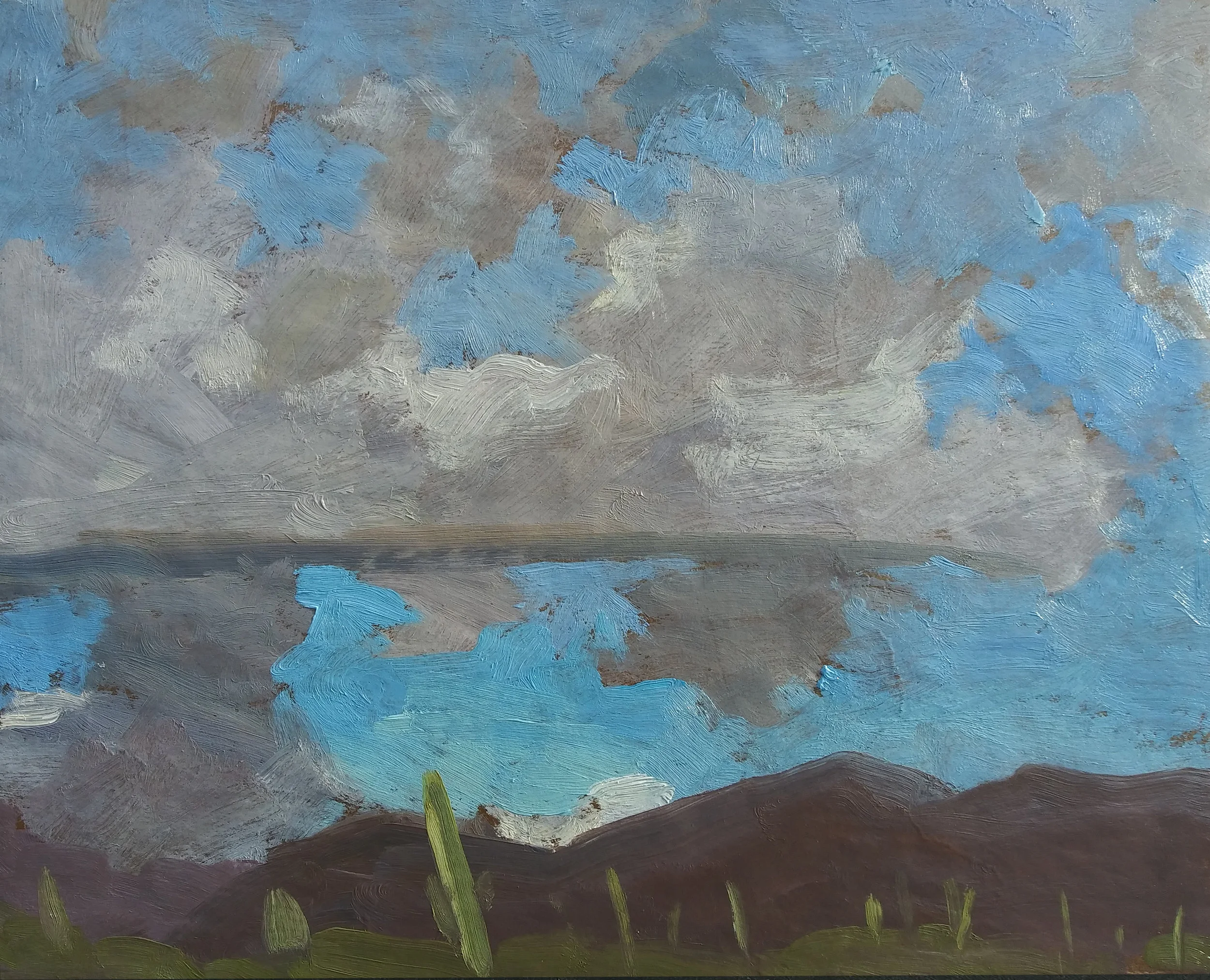
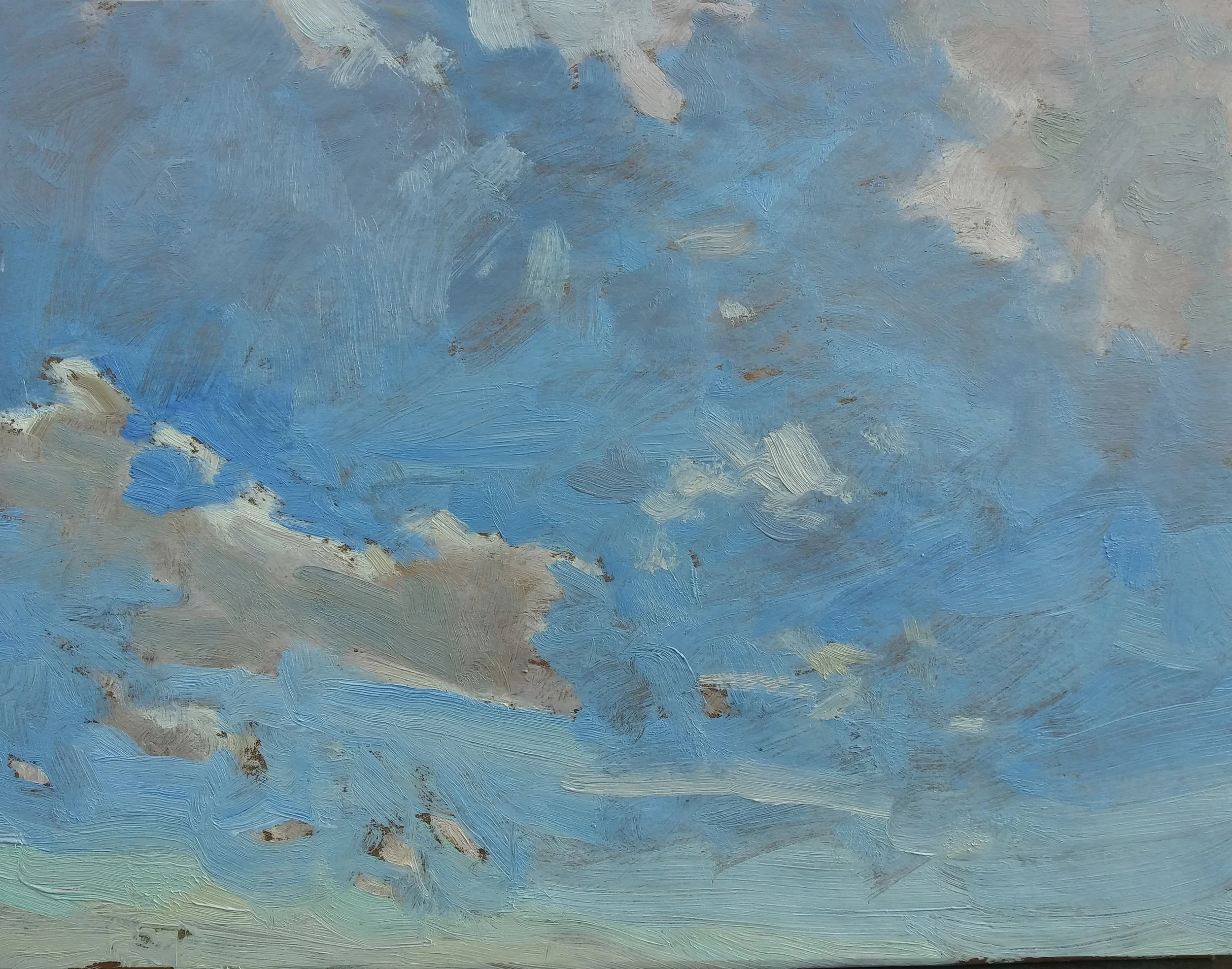
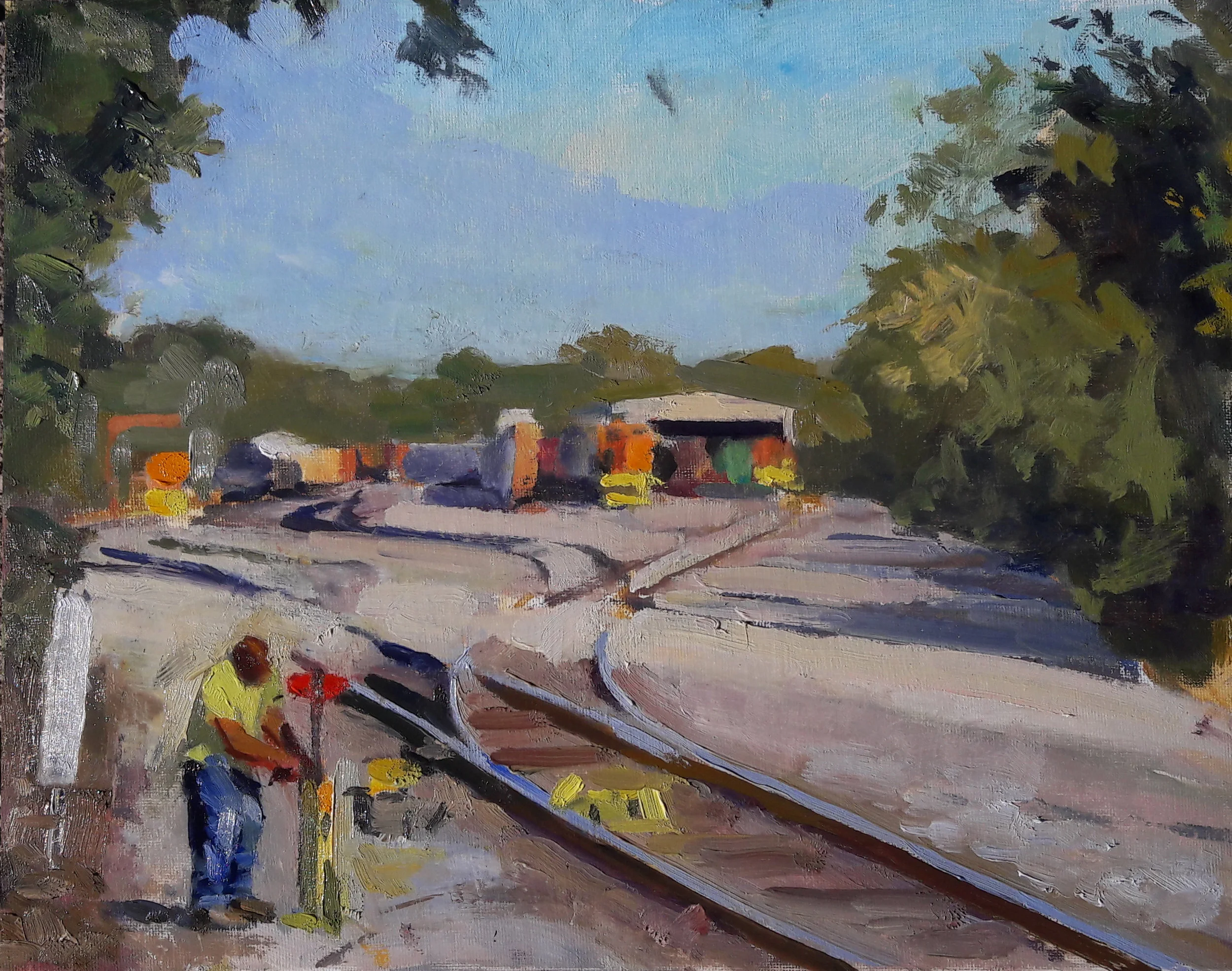
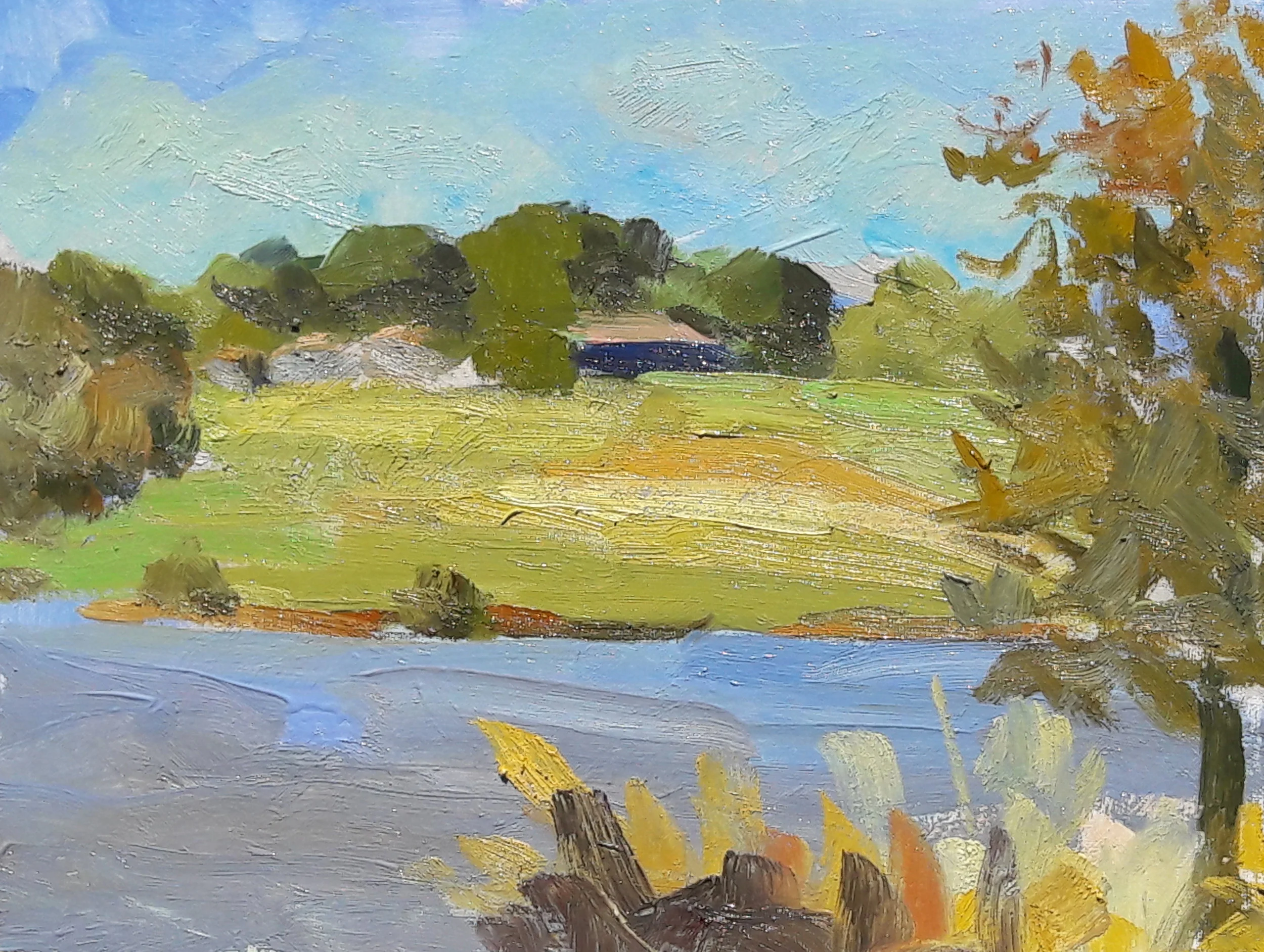
I will not make the claim that a photograph is an accurate record of hue and value, but here’s a snapshot i took after completing the sketch. Its notes are not accurate, but they’re far more accurate than my sketch.
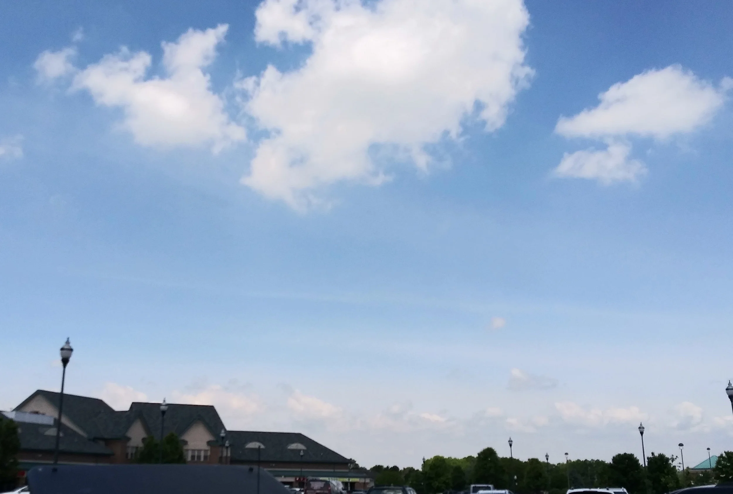
The phthalocyanine pigment in the Sevres blue completely overwhelms the painted sky. What actually attracted me to this motif were the pale violet cloud shadows hovering over the horizon, and the pink lights of those clouds. All of this is lost in the oil sketch, because these delicate little passages have to compete against the explosive phthalocyanine pigments.
Sevres on your palette is like someone doing Primal Scream Therapy in your local encounter group. Maybe it’s a decent way for the screamer to get his head together, but nobody else is going to get much out of the experience.
The rise of Sevres blue corresponds to the fall of Cerulean blue, which is the pigment which Sevres was almost certainly designed to replace. Cerulean has perennially been the go-to color for the lower regions of the sky. The problem is that for some reason, in recent years Cerulean has become garbage. It looks nice when you squeeze it from the tube, but mix a little bit of white in it and the stuff becomes a chalky gray. Rembrandt, which is generally a dependable mid-level manufacturer, sells their 40 ml tube of Cerulean for $47.55. It’s currently on special at Jerry’s Artarama for only $28.53. They couldn’t lower it enough to make it worth using. Maybe it tastes good on a Ritz cracker, but it’s unusable for painting skies, or much of anything else.
For the truly budget-conscious, Jerry’s offers Gamblin’s 37ml tube of Cerulean Blue Hue for $7.95. Rod Serling might have found a way to use the stuff as a Twilight Zone punchline. Remember Burgess Meredith’s bookworm character, the sole survivor of nuclear catastrophe? At last he’s got enough time to read. Then his glasses break. Today Meredith would be a landscape painter, but instead of breaking his glasses, he’s left with only Gamblin’s Cerulean Blue Hue for the sky’s lower region. It’s an unpleasant thought. “Cerulean Blue Hue?”. Word to the wise: the word “hue” in the name of any paint at all is a red flag.
For those who are willing to do what must be done, Cheap Joe’s Art Stuff offers Old Holland Cerulean at $85.50 for a 40ml tube. Jerry’s Artarama and Blick sell the same tube of paint for $56.51. My friends tell me it’s far better than the Rembrandt version. Hell, it better be. Other manufacturers offer Cerulean at prices ranging from $49.21 for Michael Harding to $30.87 for Williamsburg. These are not outrageous prices, if the stuff will do the job, but it’s a crapshoot. I’ve tried the Williamsburg, and am not much impressed. Somebody call Consumer’s Union.
A solution might be to simply reduce the intensity of Sevres before allowing it on one’s palette. I should experiment with this. Maybe mixing it with a bit of Burnt Sienna, more or less Sevres’ complement, could get the job done. If Sevres cannot be excluded, perhaps it can at least be put on a short leash.
John Ruskin, who knew a little something about painting, counseled us, “There is hardly anything in the world that some man cannot make a little worse and sell a little cheaper, and the people who consider price only are this man's lawful prey.” Cheapo materials are undoubtedly as old as art itself; John Carlson’s early 20th century book on landscape painting gets a few laughs at the expense of then-current “academy boards”, sold to students as an inexpensive alternative to canvas. One doesn’t see too many examples of such compromise in the museums; pictures made with third-rate materials don’t last very long to begin with, and those who use such tools are unlikely to produce work that would ever wind up in a museum.
But when it comes to paint Ruskin was, if anything, an optimist. The concept of “student grade” paint in general is worth its own discussion. One might profitably economize on everything in the course of one’s training, and a vast range of price can be paid for different grades of brushes, canvas, mediums, solvents, and paint. In his authoritative handbook on materials and techniques, Ralph Meyer urged that a painter can economize on anything except brushes. But some fine painters have made a career using student grade brushes. Third-rate canvas is going to retard both one’s technique and the permanence of anything you might happen to paint that could be worth saving, or selling. Its sole merit lies in the student’s need to do a huge number of starts, so as to acquire the confidence and judgment to eventually produce good work.
But student grade paint? Its raison d’être eludes me. The stuff’s cheap for a reason, so loaded down with fillers that in the end you’re using much more paint than you’d otherwise have to. And this compounds the problem: twice as much paint means twice as much medium, and a manufacturer willing to compromise the quality of pigment is unlikely to hold out for good quality oils and varnishes. And in general, the less stuff you add to pigment, the better. Student grade paint, piled on thick to compensate for its paucity of pigment, will be loaded with cheap binders. It’ll take longer to dry. And in the end, you have no idea what the results will look like in five years. If all you can afford is student grade paint, maybe you simply can’t afford to paint.
You could make a case for using cheaper kinds of color, such as earths. The old masters had little else, earths plus horrifically expensive Vermillion and Lapis Lazuli, from which ultramarine was extracted at great price. But if impressionism is your game, you’ve got no choice but to load your palette with a series of pigments corresponding to the spectrum, and able to hit whatever note you seek. In the lower sky, that note is a pale, ethereal blue veering toward the green end of the spectrum, a blue which no mixture of ultramarine or cobalt can match. Can Sevres’ nuclear chroma be dampened sufficiently to make it usable? Time will tell. If not, I guess Jerry’s will hear from me, if I can cobble together the $56.51.