More Summer Skies

John Constable may have had a good point about painting as a branch of science — or, in the lingo of his time, “Natural Philosophy” — with each picture thought of as an experiment. What exactly is a scientific experiment but an attempt to study a natural phenomenon by restricting the possible factors which may or may not produce it? Particle physicists buried a vat of water hundreds of feet below the surface of the earth and armed it with neutrino detectors, knowing that only neutrinos could get to such a vat. The solar eclipse of 1918 provided a means of verifying Einstein’s General Theory of Relativity by restricting the various factors which might bend the passage of light. Keppler spent two decades hunched over Tycho Brahe’s precise observations of the positions of the planets, trying to find a pattern. Lois Lane spent even longer, attempting to devise a situation which would require Clark Kent and Superman to appear in the same time and place. And so on. Experiments are scenarios devised to establish or disqualify a hypothesis. If you’ve got a hypothesis, and have a way to test whether it works or doesn’t work, you’re performing an experiment, and in every sense of the term, you’re doing the work of a scientist.

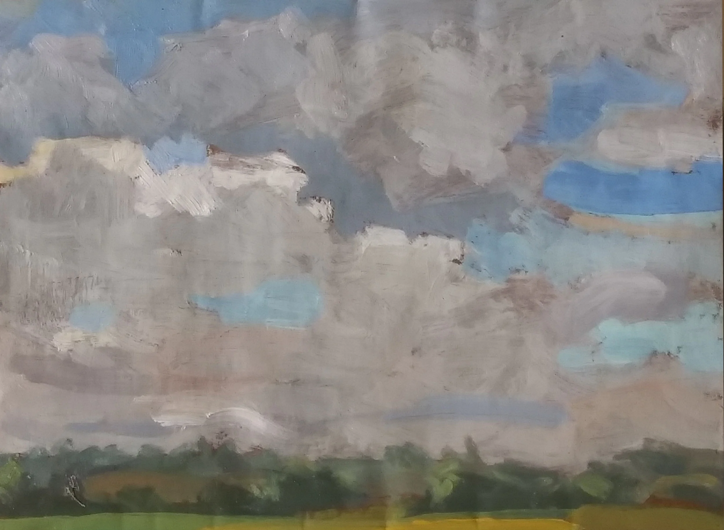
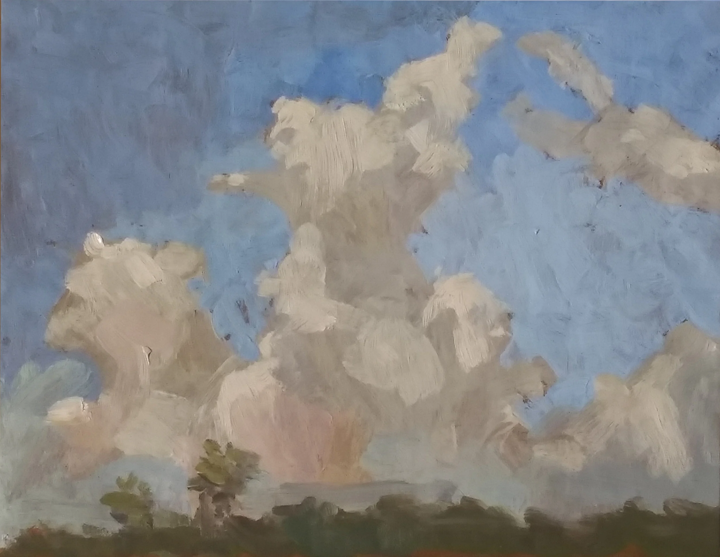
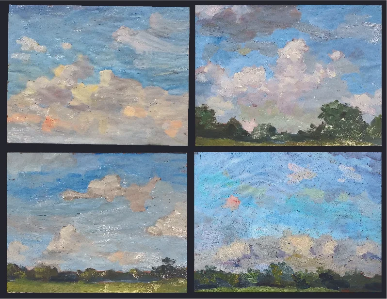
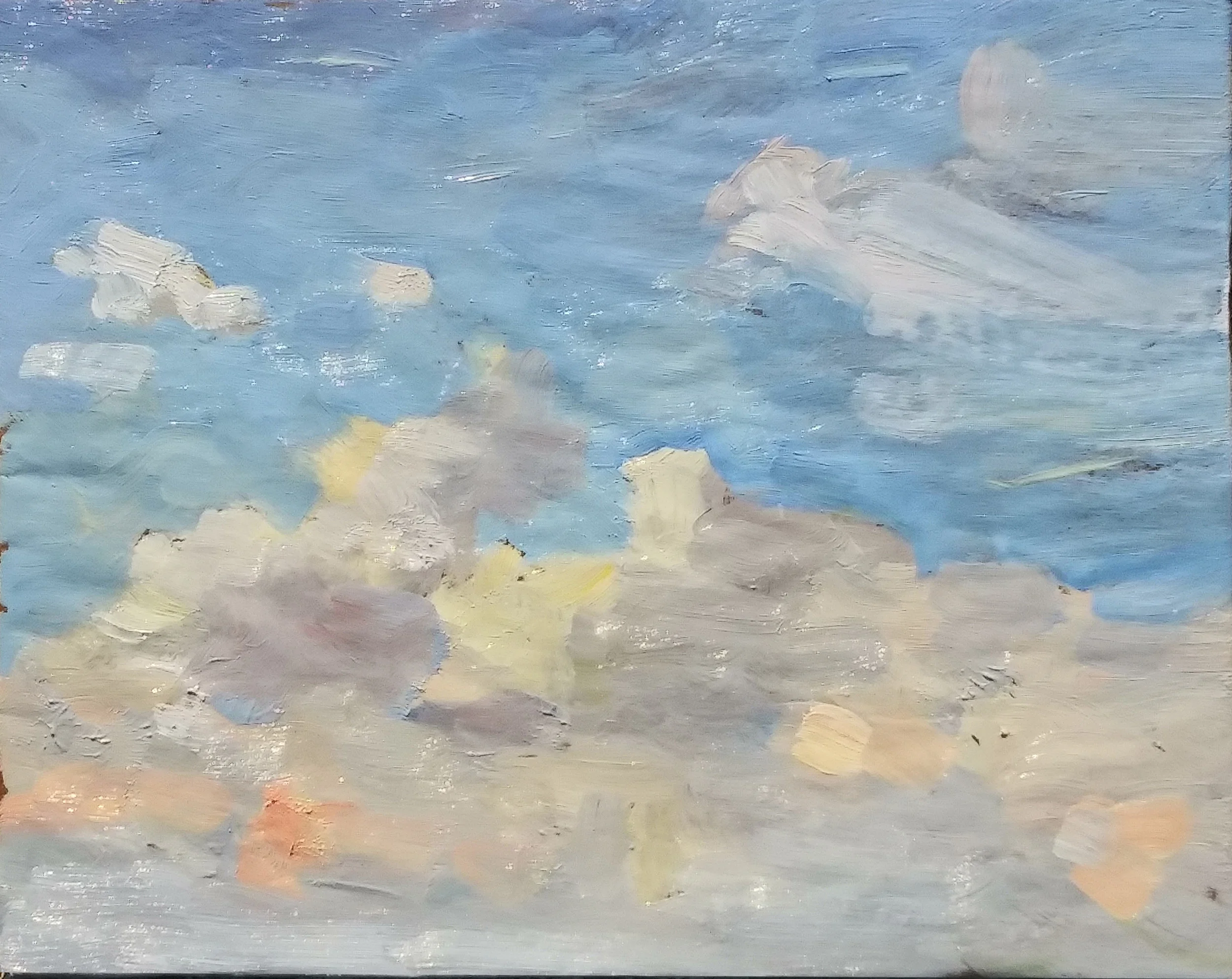
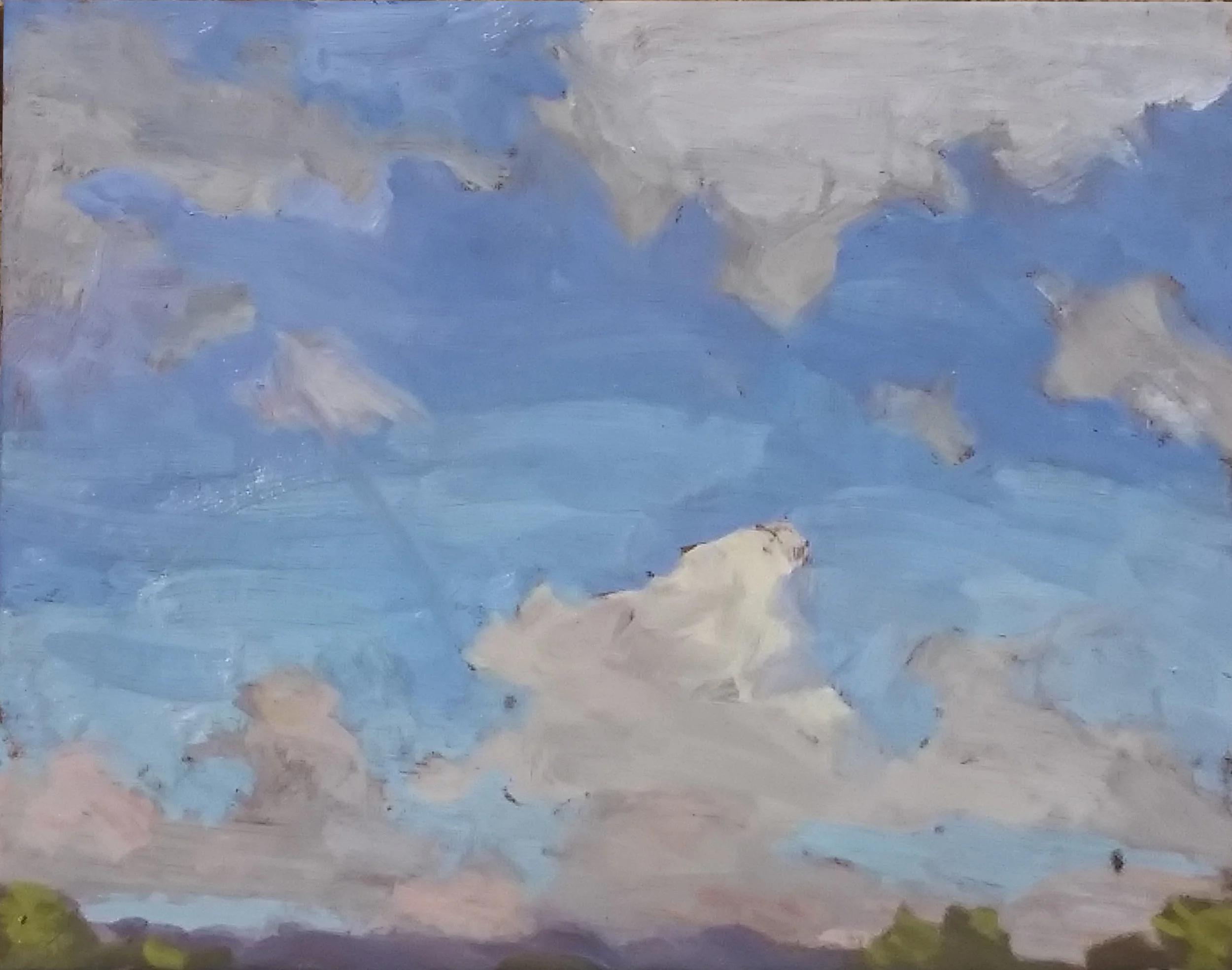
Me, I’ve given a lot of thought to the hue found in the light areas of summer clouds. They can’t be a pure form of white, but what sort of color might they be? The sky sketches posted earlier were an attempt to answer that question. In each, I mixed a color which I thought corresponded to what I saw before me. But looking again at them, their tinted orange hues made no sense, and did not evoke the sensation of summer skies. So I whacked out three more today.

7_9_2019_2_day1.jpg

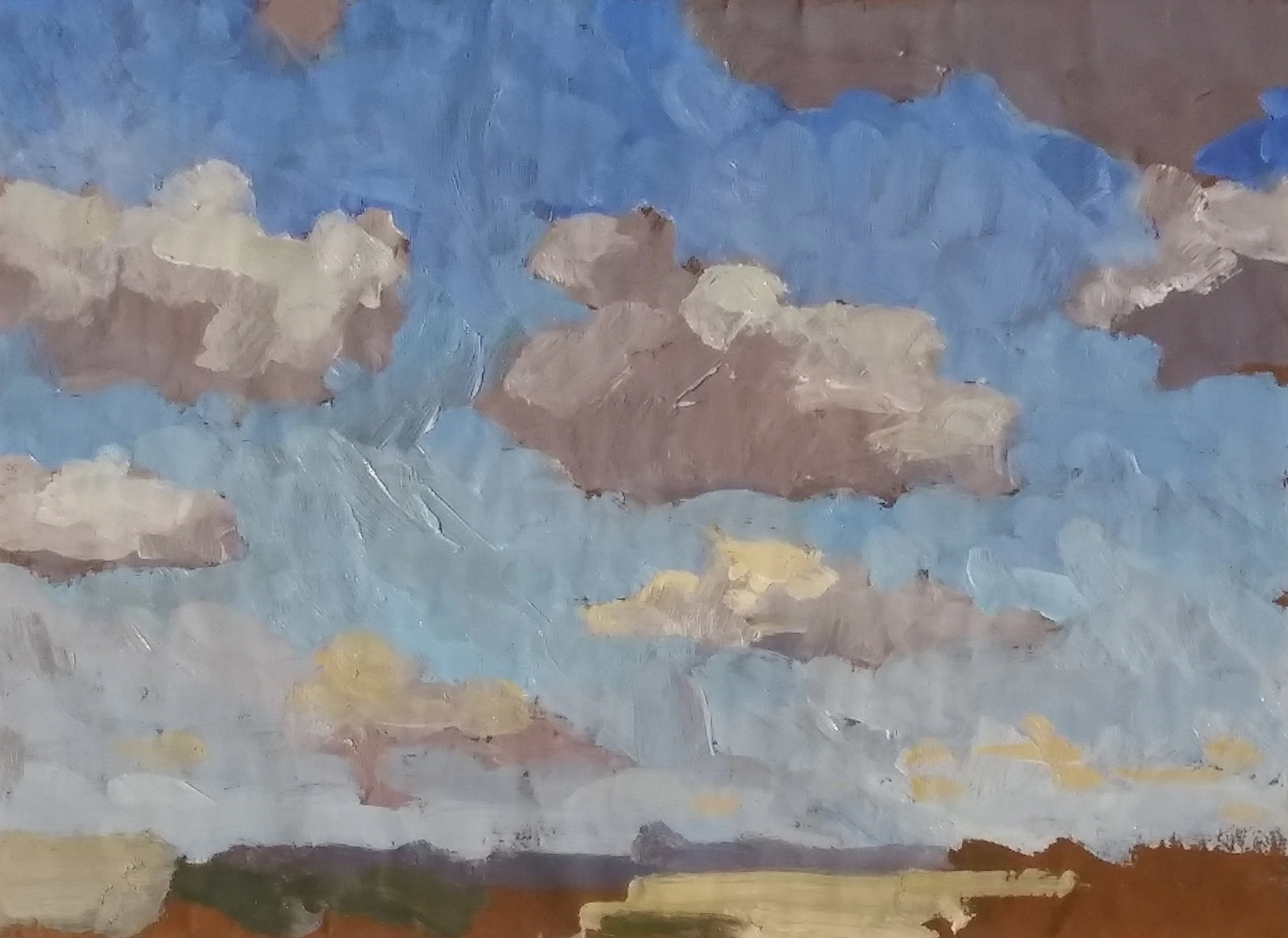
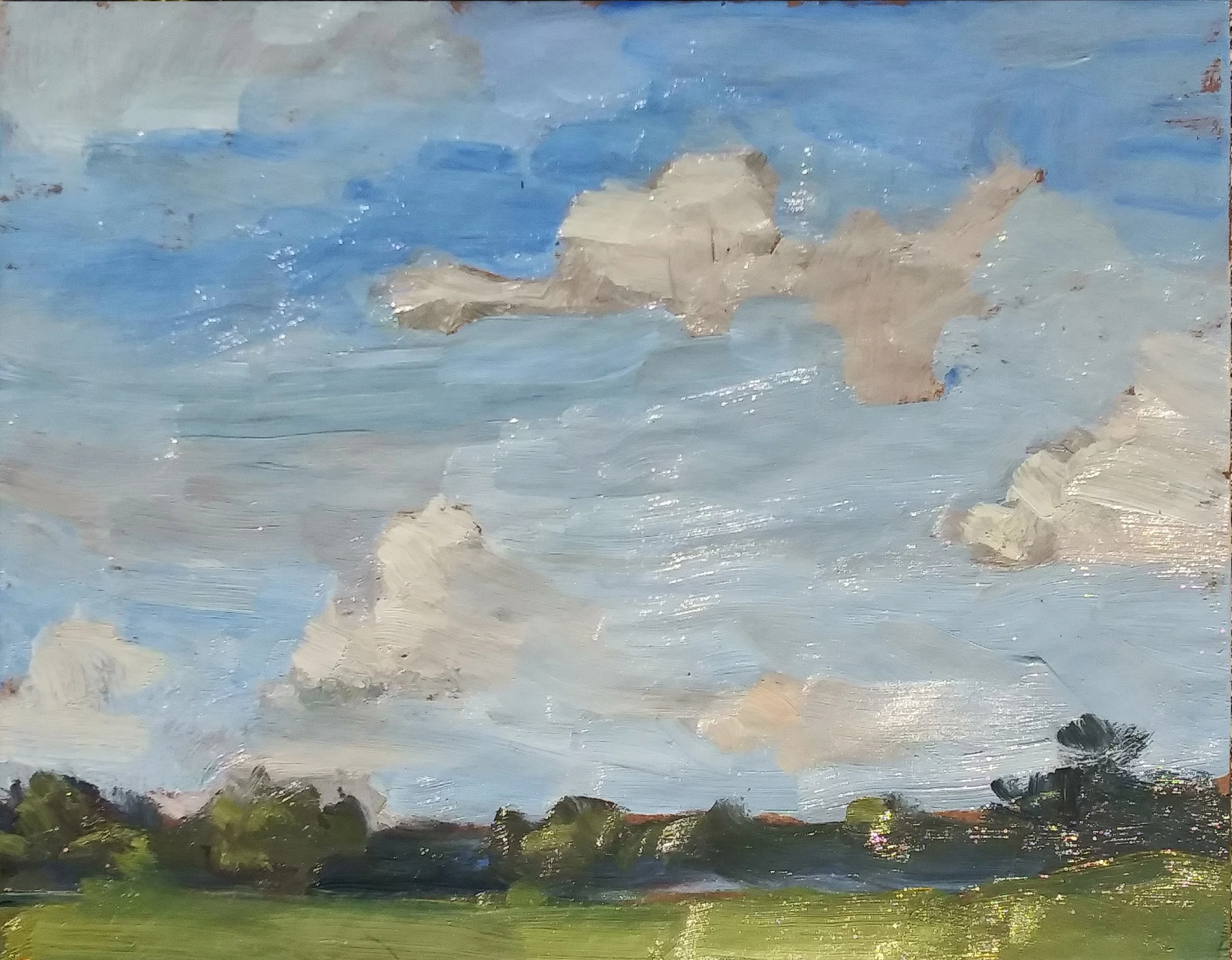
Here was the first. I did mix some Cadmium Yellow Medium with my white, but tried pretty hard to reduce its intensity. You see orange lights in the clouds below, but the chroma is quite subdued as we rise from the horizon toward the zenith. A good painting? I don’t know. But a good experiment. This is closer to the mark than the sketches I posted earlier.

7_9_2019_3_day1.jpg

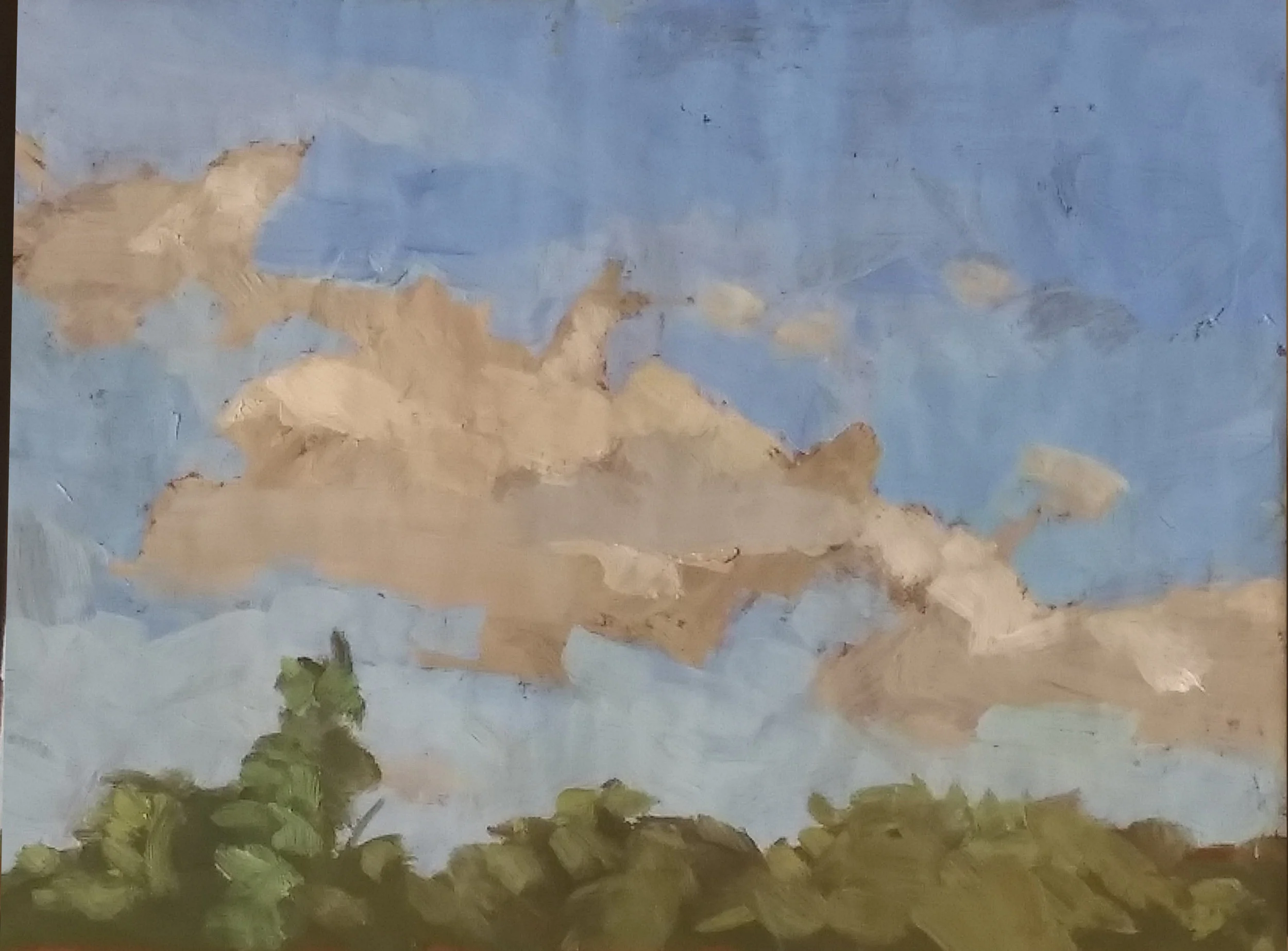
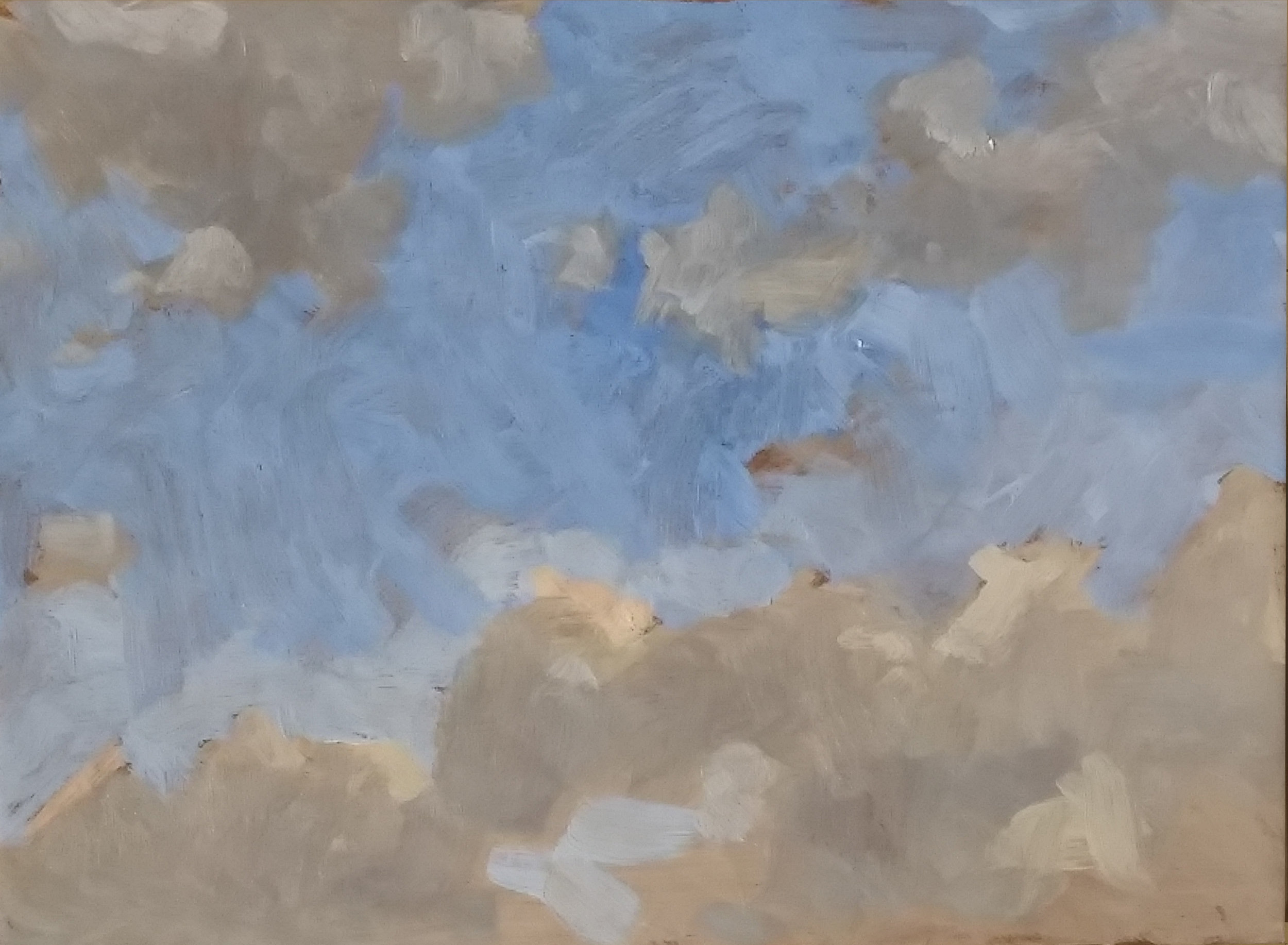
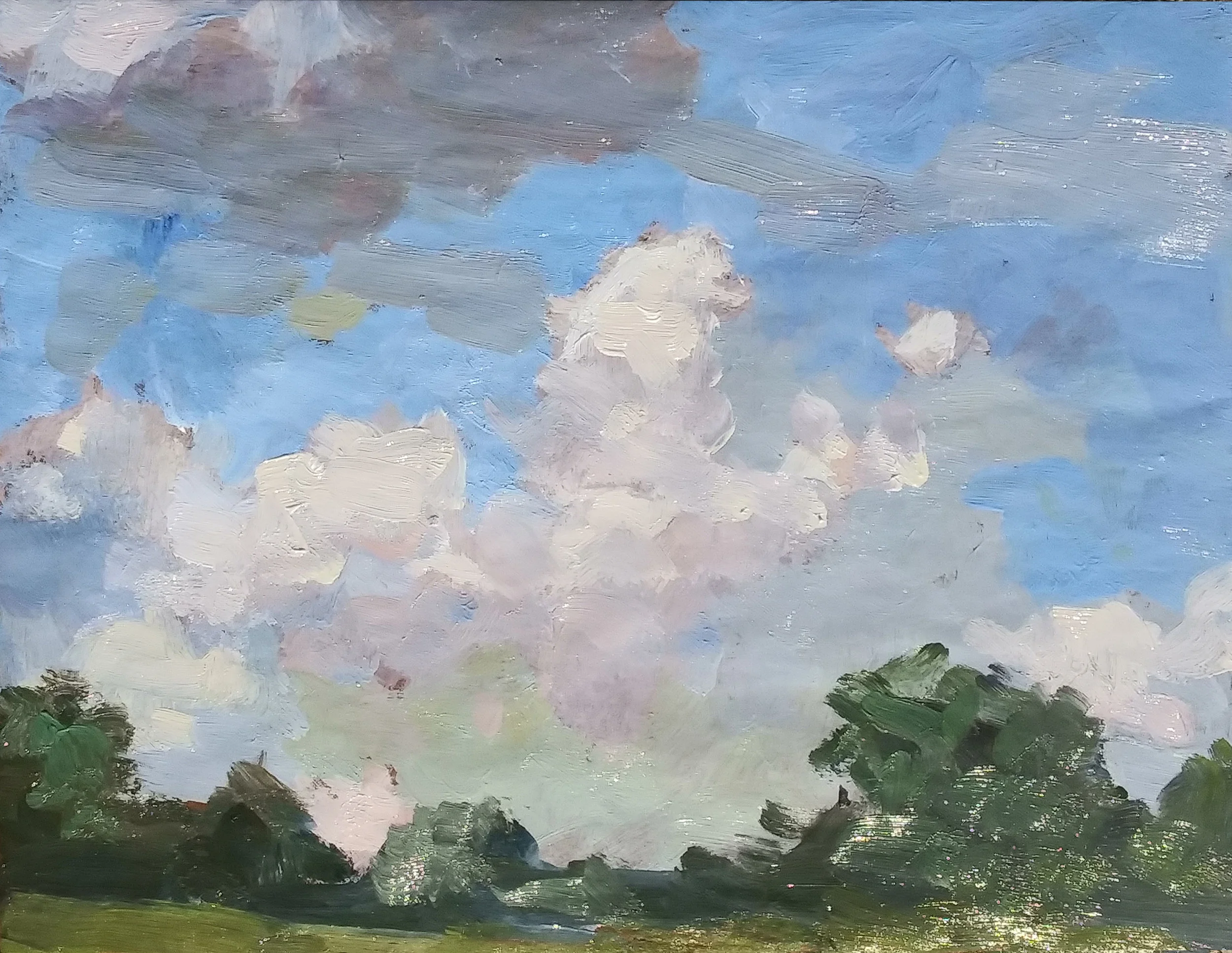
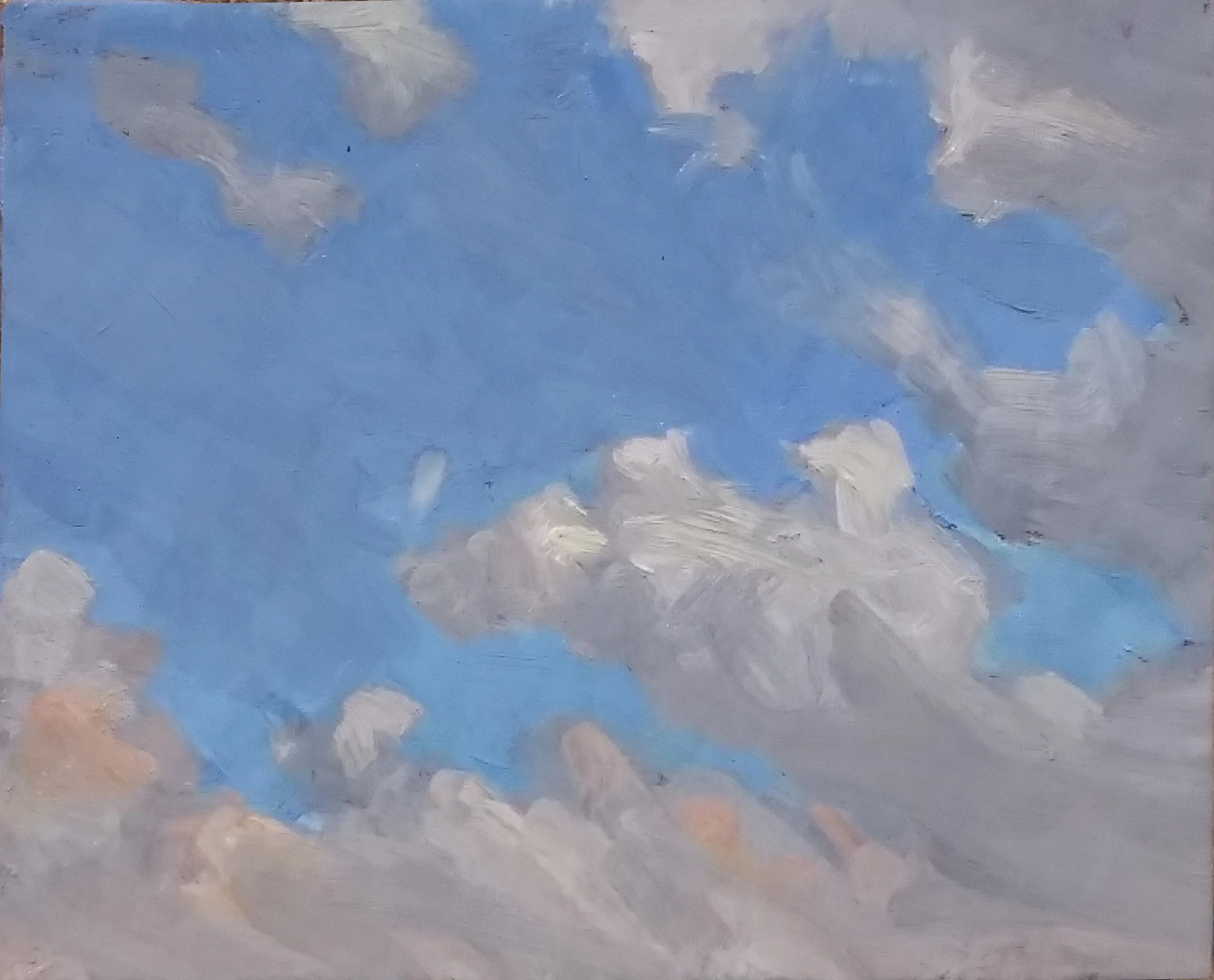
The second sketch also could be termed a good experiment.

7_9_2019_4_day1.jpg

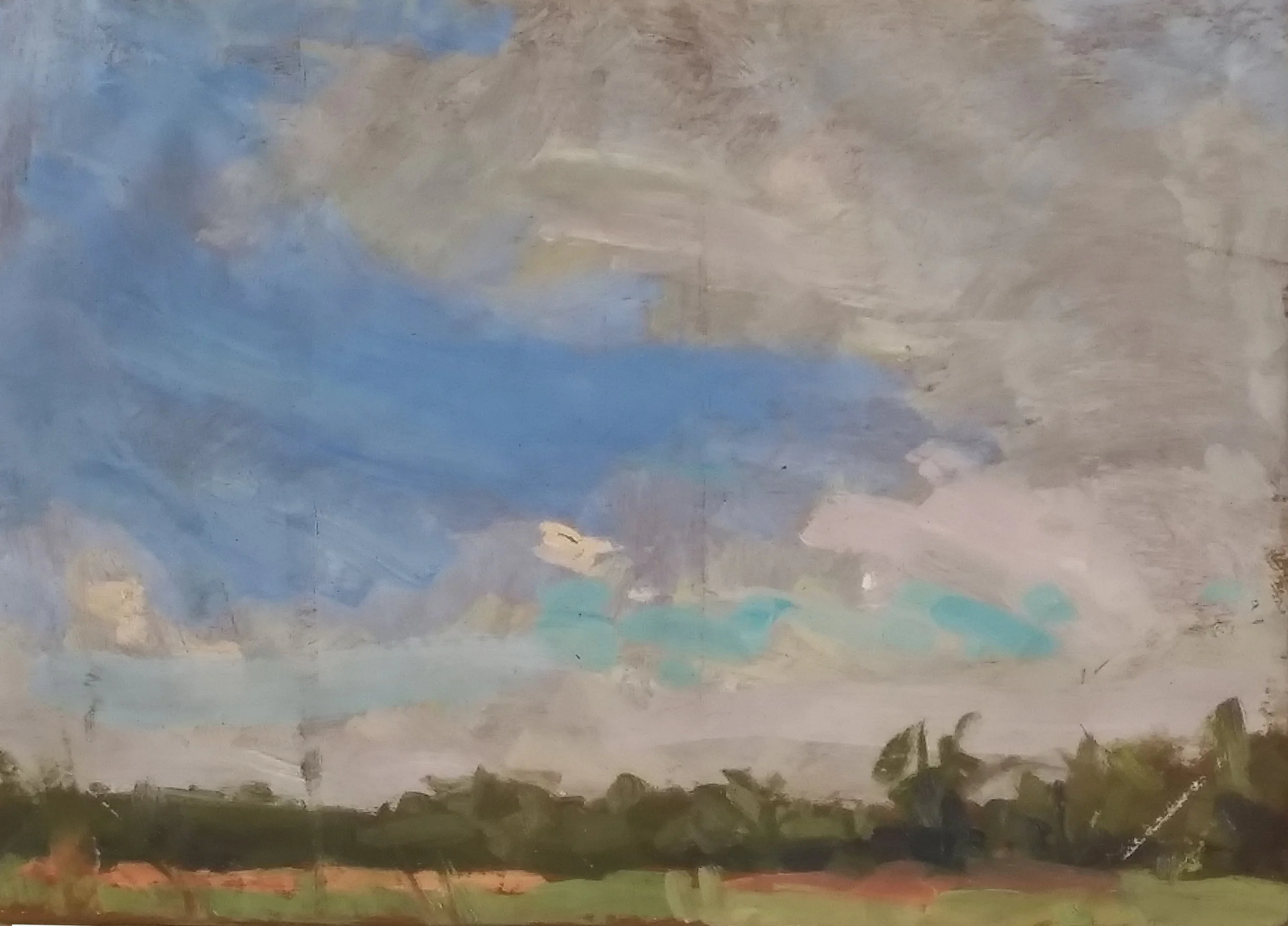
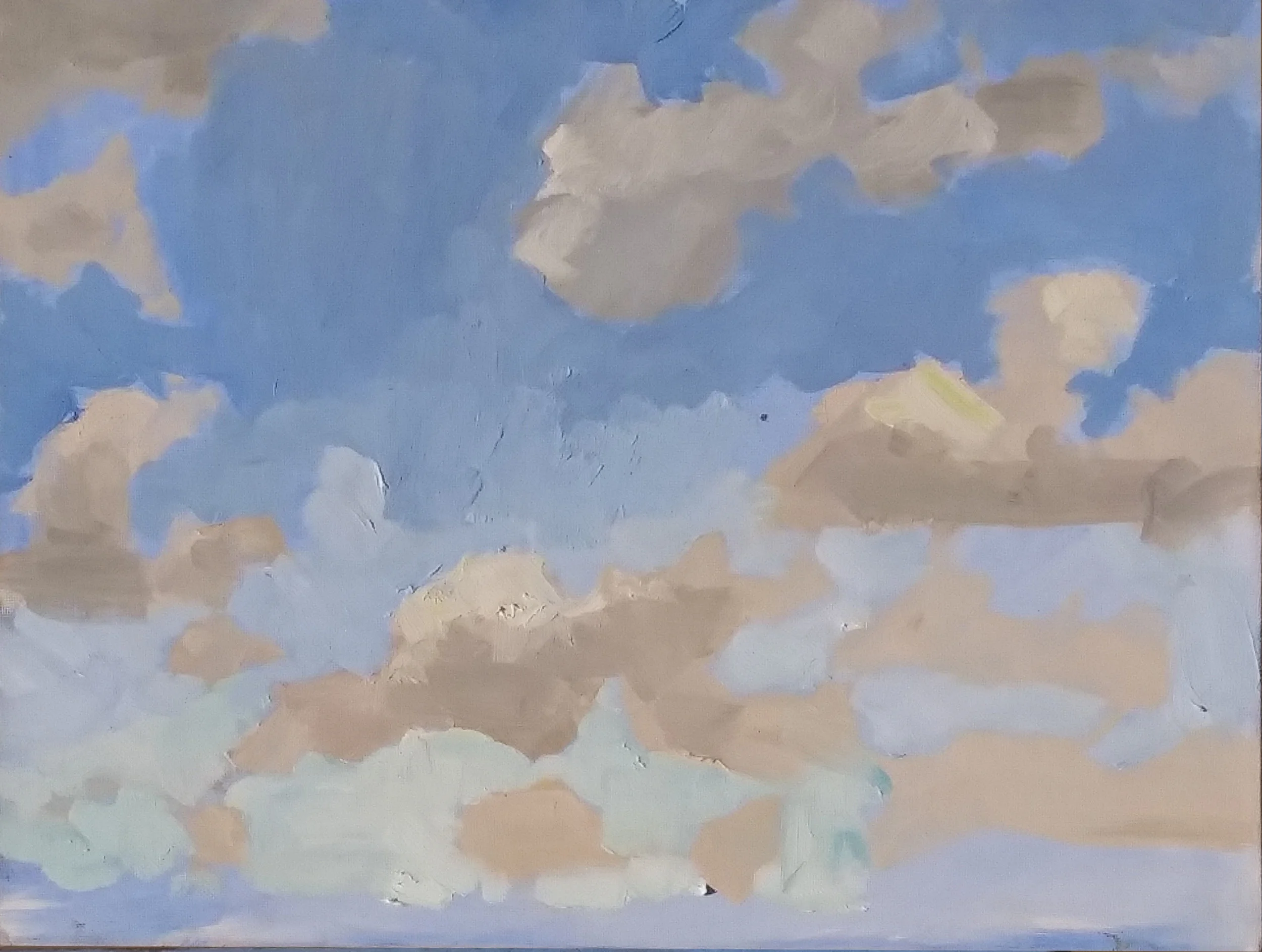
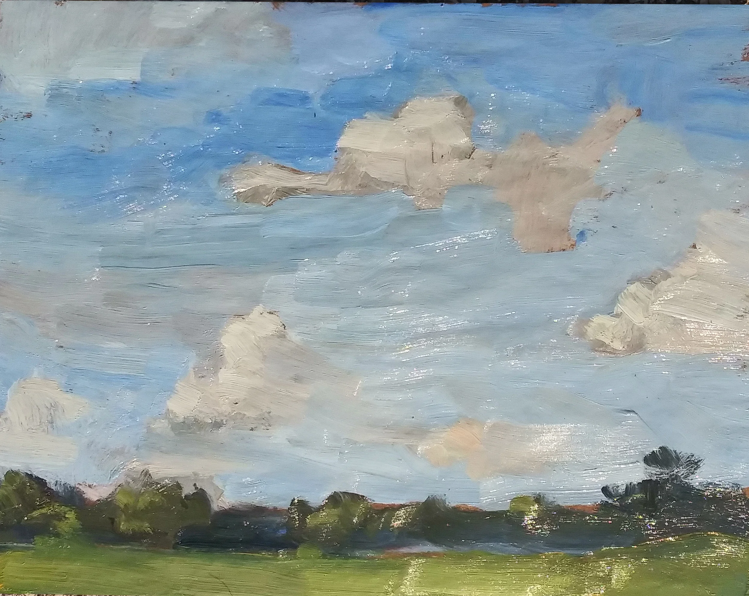
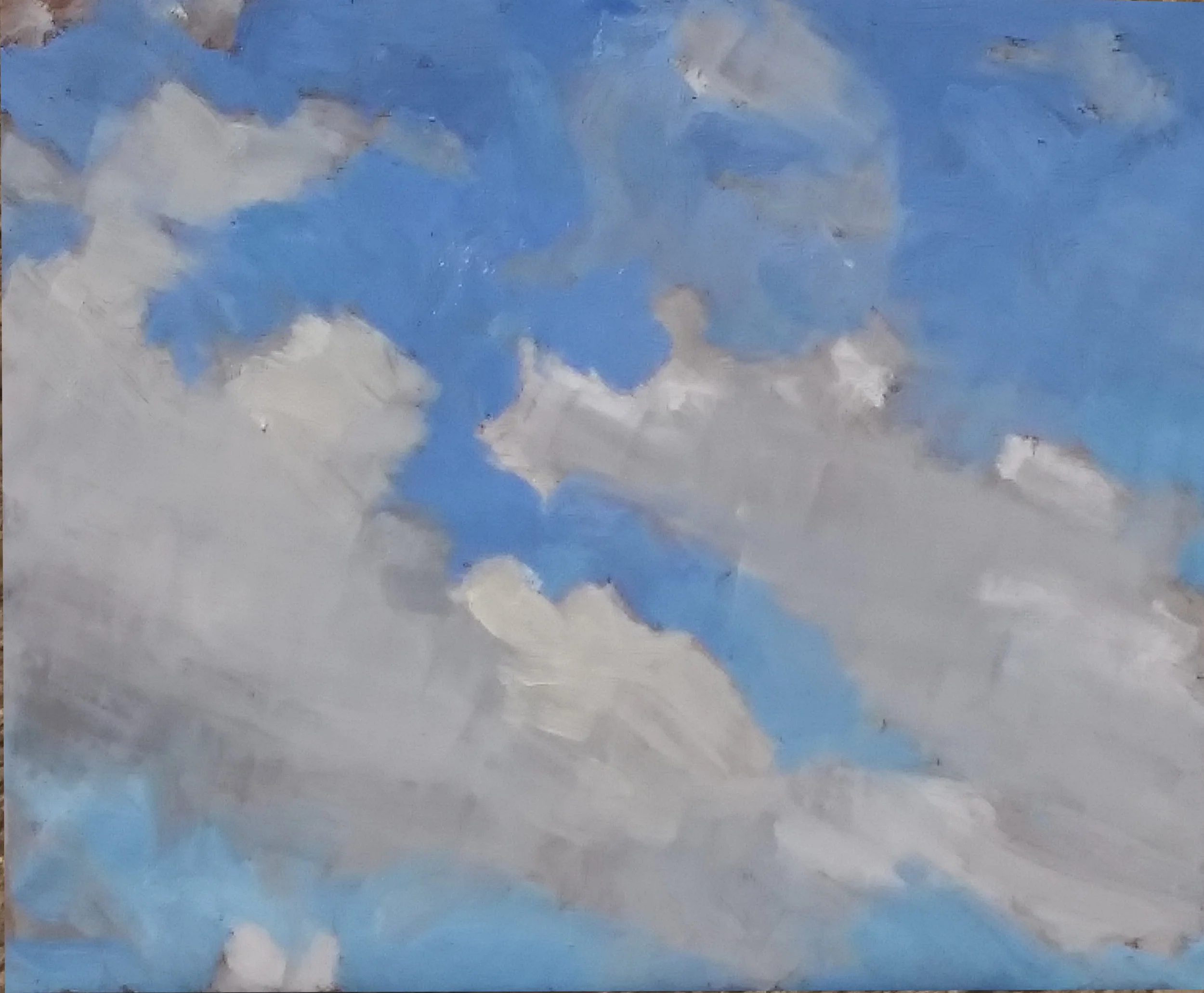
And yet another experiment. All three of these were designed to isolate and prove (or disprove) my motion that my clouds were unbelievable, in large part, because I was painting them with too intense a series of colors. In fact, these three are actually an experiment in the use of Ivory Black, which was used to paint in the darks of the clouds here.

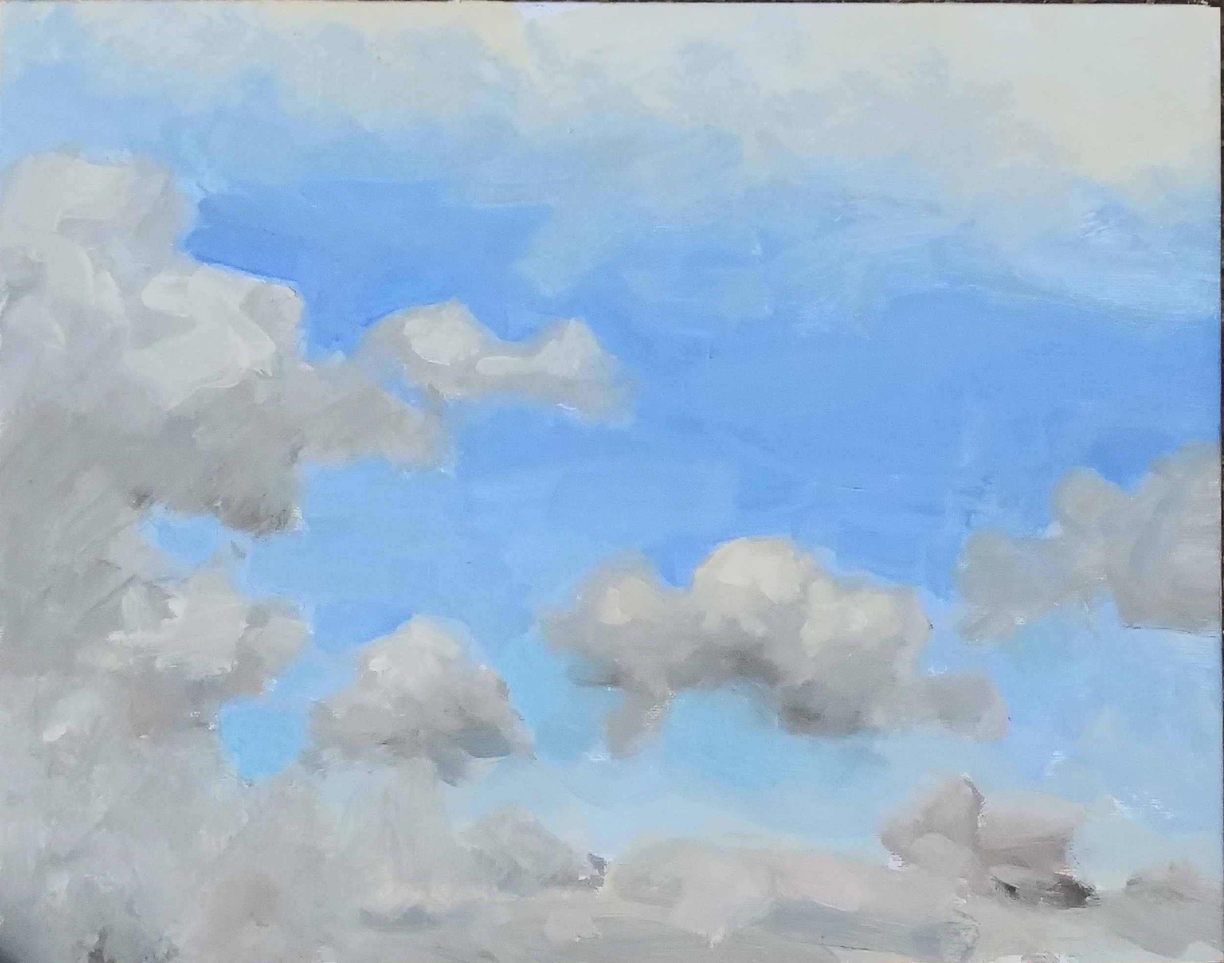
Bad? Good? Neither. Three experiments. I’ll mull over them and see what ought to be adopted from them for the procedure of landscape painting.

Stepping on Phthalocyanine

A couple of posts ago, we discussed the possibility of cutting Sevres Blue with its complement, to tamp down its explosive tendencies. I tried it this afternoon. A marvelous rack of clouds faced me, descending to an area four or five degrees above the horizon in which the massed clouds beyond the resolution of my eyes turned the area into a band of pale violets and roses. I squeezed out my normal palette: Rose Madder, Cadmium Red Light, Cadmium Yellow Medium, Yellow Ochre, Cadmium Lemon, Cobalt Blue and Ultramarine. in between the Cadmium Lemon and the Cobalt Blue i left a few inches. In this area, I squeezed out Permalba White, Flake White and the Forbidden Mystery Ingredient.

That Mystery ingredient was an experiment. I have no Cerulean worth using. I thought I would try the solution I proposed a few days ago, some Sevres Blue — a phthalocyanine color about as subtle as Napalm — mixed with a little Burnt Sienna. Burnt Sienna is an orange of very low intensity. Ideally, a mixture of the two will tamp down the intensity of the Sevres, enabling it to hit the notes found as the sky descends towards the horizon, but without infecting the entire canvas with its explosive power.

Mr. Tom Dunlay counseled me that others had tried the same solution, without success. He said that one ought to bite the bullet and purchase Old Holland’s Cerulean Blue. I don’t lightly ignore his counsel, but I wanted to try and see if I could get what I wanted out of the materials I already own.

After several months of painting exclusively on kraft paper, coated with shellac, i decided on an 11x14” piece of oil primed linen, glued to a panel, and rubbed with burnt sienna and turpentine to cut the brilliance of the white primed linen, and provide a more sympathetic surface into which i could paint.

it was a lovely experience. Before we look at what i did then, let’s look at what i did earlier that day, on a piece of cheap cotton, glued to a cardboard panel and rubbed in with a little ultramarine.

5_27_2019_1_day1.jpg

This was a surface upon which I could draw with a sable brush dipped in a mixture of Ochre and Ultramarine. (The shellacked kraft paper permits no such line drawing; it’s too dark, and too slippery.) the idea was to draw the cloud shapes as clearly and accurately as possible, and then paint into this map-in with a loaded brush. the procedure defeated the problem with shellacked paper, namely its resistance to clear, specific line drawing.

it’s not too bad a sky study. i may bring it out again in a few day, and paint over it the trees, telephone lines, and rooftops which overlapped the cloudscape.

A couple of hours later I headed out again and tried to do homage to a rack of clouds in Newtown, using that 11x14” linen panel.

5_27_2019_2_day1.jpg


The lower half of the sky is the area into which Sevres cut with Burnt Sinna was painted. Sevres no longer dominates the scene. Sometimes the term “stepping on” is used for the practice of reducing the brilliance of a color by adding some of its compliment. You “step on” cadmium red by adding a bit of viridian. Here, the idea was to step on the Sevres by adding the Burnt Sienna.

For some time I’ve admired David Leffell’s stiff life work, particularly how he is able to rough in the background passages of his pictures with brushstrokes which summarize, rather than describe. I tried to do the same thing here with the ground plane and the trees.

Achilles' Horses

We examined the history of phthalocyanine pigments a few days ago, focusing in particular on Sevres Blue, which is basically phthalo blue cut with titanium white. Sevres resembles Cerulean, a blue which is quite useful in replicating the color of the sky as it approaches the horizon and is warmed somewhat. The conclusion was that Sevres, while a very lovely hue, infects everything within reach, causing a whole skyscape to take on its acid color.

Just for laughs, I went out and painted three sky sketches this afternoon, but excluding Sevres from my palette. Here they are, along with the one from a week ago, painted with the same colors, plus Sevres.

Can you spot the sketch which was painted with Sevres blue? Yep, the lower right. Much as I tried to quash Sevres’ explosively chromatic hue, it still commands the whole picture, and makes the coloring of subtler passages, such as the clouds hoverin…

Can you spot the sketch which was painted with Sevres blue? Yep, the lower right. Much as I tried to quash Sevres’ explosively chromatic hue, it still commands the whole picture, and makes the coloring of subtler passages, such as the clouds hovering near the horizon, ridiculously bland. Think of it this way: if you sang at the Open Mic along with Enrico Caruso, the judges probably wouldn’t remember you.

The exclusion of Sevres allows the whole spectrum to play on a more level field. It makes sense.

Today’s first sketch

Today’s first sketch

When some Greek sentries happened upon a Trojan spy sneaking into their camp, they asked him what could possibly have motivated him to embark on such a suicide mission. “They promised me Achilles’ horses,” replied the spy.

His captors thought that was pretty funny. “Achilles can hardly ride those horses, let alone a wuss like you,” they told him.

And then they killed him.

Sevres blue, like Achilles’ horses, is hard to tame.

Another sketch, painted without Sevres. All the pigments are pretty much in the same league.

Another sketch, painted without Sevres. All the pigments are pretty much in the same league.

Yet again, no Sevres.

Yet again, no Sevres.

The real mission here was not so much to banish Sevres, but replace it with Cerulean. But I have no decent Cerulean, and it didn’t seem to make much difference, Ultramarine, along with Crimson Madder, Cadmium Red Light, Cadmium Yellow Medium, Yellow Ochre, Cadmium Lemon, and Ultramarine seemed to get the job done.

But having the whole orchestra play in the same key seems like a better way to go about things, I think.