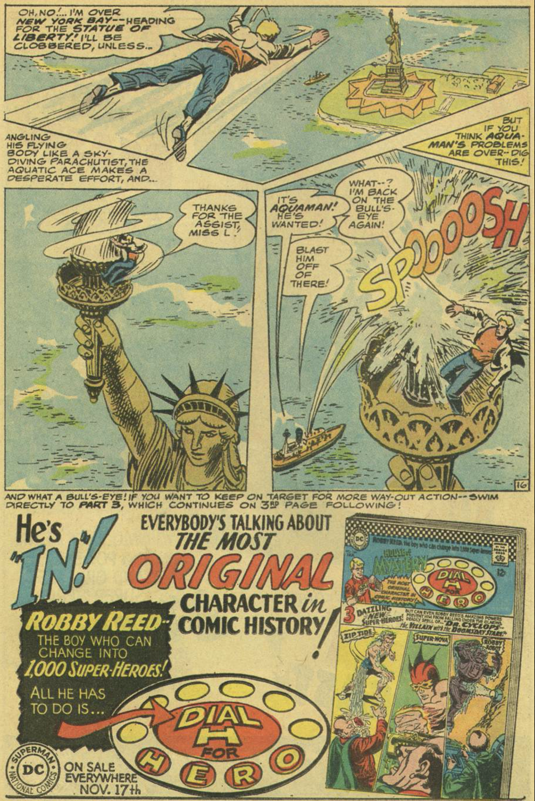
Serendipity

Life, some wit told us, is what happens when you were busy making other plans. Once upon a time in Boise, Idaho, I lost my job and needed to come up with fifty bucks by the end of the day. Fifty bucks was a bigger deal in 1985 than it is these days. I had absolutely no idea where it might come from.

But I remembered an art director who lived in the foothills north of Boise. I’d been shopping my portfolio around town a few months earlier, and the man was nice enough to tell me that I paint like Vermeer. It occurred to me in my time of crisis that the man had a nice rock garden in front of his house.

So I drove up into the hills and knocked on the door. This was more than a little bit awkward.

“Do you remember me? I’m the illustrator who showed you my book. You told me I paint like Vermeer.”

He looked dumfounded. I didn’t know why, so I continued.

“Well, I could use a few bucks and wondered if you’d like me to weed your rock garden.”

He shook his head. “God must really watch over you, son. And over me.” He brought me into his studio, sat me at a drawing board, and showed me a thumbnail for a book cover he’d been hired to design. The final artwork was due the following morning, and whatever other skills he may have possessed, drawing was not one of them. “Can you draw this cover?”

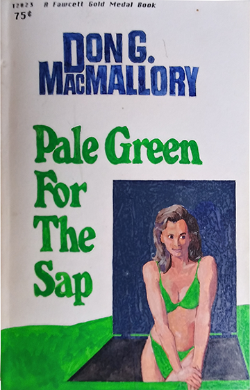
Not quite as well as Vermeer could have, but by the end of the day, I’d drawn this:

NEA book.png

Didn’t win any awards, but he got his cover and I got my fifty bucks, times three. And a pretty good ongoing client. And any time I wanted to piss off a teacher, all I had to do was loan him, or her, this book. Mr. Blumenfeld tore the National Education Association into little pieces.

He also introduced me to his daughter, a very lovely and talented young lady. We were never romantic, but we had some exciting adventures studying the Bible together. Later she introduced me to her best friend, another lovely and talented young lady. We not only investigated Scripture together, but many other areas of life as well.

Thirty years ago, I managed to persuade her to become my wife.

I wish I had a better copy of the book, but I’m glad I’ve got this one. It’s a nice little reminder that the art director in the hills north of Boise was absolutely right: God does watch over me.

Bob Haney and Nick Cardy: Past Masters (Part Two)

As I asserted yesterday, Bob Haney’s stock in trade was action set pieces. He was comics’ answer to Michael Bay. There were much better writers, but I don’t know anyone who could write as visceral a fight sequence as Haney.

Although he wrote his share of Superman stories, his best work involved heroes who were vulnerable, and in particular, vulnerable to gravity. This made him an ideal Batman scripter, and Haney wrote some of the best Bat stories of the late sixties, during his collaboration with Neal Adams on Murray Boltinoff’s teamup book The Brave and the Bold.

But Haney’s best collaborator, when it came to vertiginous action sequences, was the great Nick Cardy.

Granted, these are covers, and may have been conceived independently of Haney, as DC covers tended to be. So let’s look at an action sequence in an early Teen Titans story, beginning with a clever means of capturing our hero, and a heart stopping, if ridiculous, means of dispatching him.

It’s just close enough to being possible to make it genuinely scary.

But the mother of all Haney/Cardy set pieces is found in a 1966 Aquaman story, a spy rip-off called “O.G.R.E. Strikes Back!” For sheer preposterousness, you can’t beat this one. And nothing could be more preposterous than Aquaman’s strange trip over Manhattan Island.

A little explanation might be helpful. O.G.R.E., one of the thousands of abbreviated criminal organizations which threatened world peace in the 1960s, cooks up a plan to hold the United Nations building, and all of the diplomats inside, hostage. The plan involves tricking Aquaman into letting loose a cascade of water under tremendous pressure, forming a wall around the building that nothing can penetrate. After being suckered in, Aquaman finds that both O.G.R.E. and the cops are after him. So he takes refuge behind a pair of sunglasses and hops on a tour boat, wondering what to do next. As it happens, the matter falls out of his hands: a child falls overboard, and our hero has to save him.

That’s all you need to know. What follows is one long action sequence, seven pages worth. I wonder if something like this could ever be convincingly put on film? But that’s one of the nice things about comics: the best writers and illustrators can make almost anything look plausible, even this:

AQ_12.png

Yesterday we looked at Haney’s use of the three-act structure commonly employed in feature films. Here we find another tool of screenwriters, the complication. Aquaman wants only to conceal himself in a crowd long enough to figure out what his next move must be. But the kid falling overboard makes this impossible:

AQ_13.png

If you’re part of a top-secret criminal organization, it’s always helpful to wear T-shirts which advertise it.

We took note yesterday of Cardy’s casting choices. Here we see him casting Slavs as assassins, two guys straight out of another spy story, From Russia With Love. Works fine, as far as I’m concerned. Much more interesting than Aquaman’s Hollywood bone structure.

Good writers keep raising the stakes on you. Earlier our hero had been tricked into doing O.G.R.E.’s bidding, and was being sought by the authorities as a traitor. But now he’s in the crosshairs of both the FBI and O.G.R.E. And his one way out is more dangerous still:

I’m sorry, but this thing is terrific, absolutely terrific. Catapulting over Manhattan. Our hero can’t fly and isn’t invulnerable. He’s just able to breathe underwater, and is quite strong. (And a weensy bit gullible.) Presumably he could hit the water with a nice dive and emerge unscathed. But oops, here’s another complication, some twenty years before Remo Williams used the same landmark for a fight scene.

Pretty good place for a chapter break. Chapter breaks have seldom been used in comics since the 1960s, but they can sure offer the customer a moment to catch his breath before what happens next. I guess the water jetting from the boat is for fire-fighting or something along those lines.

AQ_17.png

Struck by a bullet, another complication.

AQ_18.png

So much for our action sequence, seven pages of steadily ramping up the danger.

Today, by the way, they would never allow the same sfx to indicate Aquaman’s hitting the water, and the sound of the hand grenades. It’s too easy these days to send the page back to the letterer for changes. But in 1966, such changes were done only reluctantly. Then as now, letterers weren’t working in the office. Changing that WHOMP to a BOOM would have been a far more complicated process.

Anyway, that’s the action sequence, one of the best I’ve ever seen. It begins on a boat, then into the harbor, moves to a plume of cascading water, takes us over Manhattan, onto the Statue of Liberty, and then back in the harbor.

This ain’t War and Peace, just seven pages of adrenaline. I can’t think of a better one in my history of reading, and working on, comic books. But I have a hunch that if there is indeed a better sequence, it too probably came from the hands of Bob Haney and Nick Cardy.

Bob Haney and Nick Cardy: Past Masters (Part One)

Anything can be done well. Sometimes things can be done so well that they transcend the most ridiculous of artistic strictures.

A wonderful example is a 56-year old issue of Showcase, DC comics’ “tryout” book, in which new characters were introduced and, if sales were good, eventually given their own comics. Here, the characters were the Teen Titans — Robin, Kid Flash, Aqualad and Wonder Girl. It only took two Showcase tryouts for the team to get their own book. It sold like hotcakes.

The writer was Bob Haney, the artist Nick Cardy. We’ll poke through the second tryout story. In its own way, “Return of the Teen Titans” was one of the most perfectly written and drawn comics of the 1960s.

I mentioned ridiculous artistic strictures. In this case, the artistic stricture was Haney himself. DC was getting clobbered by its archival Marvel, and the suits at DC thought perhaps the reason was that DC’s characters didn’t speak in a sufficiently “hip” fashion. So in writing this book about teenage superheroes, Haney was ordered to make them talk like beatniks.

Haney’s strong suit was never dialogue to begin with, and this was too much. His attempt at jive-talking renders the story unreadable.

Unreadable? No problem. This story doesn’t have to be read. It communicates on a far deeper level than that. Let’s take a peek.

up the wall.png

The story, if you can call it a story, is about three teen rock sensations who call themselves The Flips: a motorcyclist, a surfer and a baton twirler. They’re the hottest music act in the country. And suddenly, they appear to be turning to crime as well.

No, just let’s not think about it, okay? Plenty of comics made sense, but not this one, so don’t let it bother you. Instead, just look at how Haney and Cardy stage this action sequence. Haney was a master of setpieces like this, as the action goes from horizontal to vertical to diagonal. And Nick Cardy drew the living bejeebers out of it.

mayor turner.png

Unlike most writers of the period, Haney wrote this story using the three-act structure beloved of screenwriting professors. This panel would be the close of Act One. The kids at Clarkston won’t get to see their heroes The Flips if something miraculous doesn’t happen.

generic hero heads.png

In this case, our miracle workers are the Teen Titans, somehow convinced that The Flips are being railroaded.

Interesting that in these Comics Code Authority days, Wonder Girl sees fit to use the name of a famed lesbian poet as an expletive. I think Wonder Woman did the same thing.

More interesting still are the faces Cardy gives our four heroes. Or make that uninteresting. Cardy’s hero characters were generic, mannikins. A gorgeous girl, three stalwart boys, and the four are totally unbelievable. Superhero faces have always been idealized and formulaic, so it wouldn’t be so noticeable except for one thing:

mayor turner.png

The bit-players in a Cardy book were always much more interesting than the heroes, which is why those heroes looked like they were made of wax. Conversely, Mayor Turner and his coterie of middle aged townspeople are flesh and blood, and they’re fun. Comic book artists talk about “acting,” using expressions and body language on characters to help tell the story. Less commonly spoken of is “casting,” selecting physical types to play these parts. While Cardy’s hero casting is bland, the supporting players are damn near perfect.

And as for acting, the mayor was not only perfectly cast, but perfectly directed. A total square, whacking the teenager’s copy of the newspaper with his umbrella? Who’da thought of something like that? I wonder if the gesture was in Haney’s script? I would imagine not. The longer and more productively a writer and artist collaborate, the less the artist needs to be told what to do. (I lettered 100 Bullets, and by the time a couple of dozen issues had been done, Brian Azzarello’s art direction was minimal, sometimes nonexistent. And quite often, artist Eduardo Risso simply ignored it. He was as conversant with the story as Azzarello was, and he knew how he wanted to tell it. Similarly, after a few issues Brian gave me no direction about which words to make bold; he assumed I knew what I was doing, and left such choices to me. If there’s anything really terrific about working in comics, it’s in the relationships you forge with your collaborators. It’s always fun, but sometimes it’s magical.)

dumb cop.png

One trope of the fifties and sixties was that cops were dumb, as opposed to today’s myth that they’re evil. Here’s the local police chief, grooving on The Flips. I don’t know if police chiefs are elected or appointed in Clarkston, but if I had the opportunity, I’d vote for this guy in a heartbeat.

KidFlash.png

Comics featuring superhero teams are notoriously difficult to write. There were just four Titans, but this still was a bitch. How do you divide up action so each Titan has a chance to do his thing, or hers? Haney made it look easy, as The Flips appear to really be criminals, and our heroes have to chase after them. That motorcycle was a marvelous bit of visual business: yet again, the action goes abruptly from horizontal to vertical.

jill vs wondergirl.png

What the hey!! Jill — replete with her Elton John sunspecks — throwing her baton while doing a handstand, inches from the edge of a rooftop? Gravity, and vertigo, have always been a mainstay of comics. Long before a scene like the one above could be put on film, writers and artists like Haney and Cardy provided visual thrills like this.

When Delacroix saw a performance of Hamlet, he was so thrilled that he did a series of drawings and paintings depicting the play. He couldn’t understand a word of it, but the ideas in the play mesmerized him.

So it is here. Not that there are profound ideas or anything. There’s really nothing at all: no believable characters, no credible plot, and dialogue geared to wind up on the floor of a bird cage. But who cares if Haney couldn’t make characters even appear to talk like human beings? In the little universe Haney and Cardy concocted for these characters, words were superfluous. Ideas were superfluous. Plot was superfluous. We only wanted one thing for our twelve cents: adrenaline. And Haney and Cardy delivered it by the carload.

The writer and artist paced this thing like an express train, although they did provide us with a moment to catch our breath in the fourth panel. Look at the mayor and police chief approaching the crime scene, the chief on his tippy toes. Can’t you just hear Elmer Fudd? “We must be vewwy, vewwy quiet!”

Editor George Kashdan wasn’t high on the food chain at DC, and one result of this was the support personnel he didn’t get for his books. To the point, he never got DC’s superstar letterer Gaspar Saladino, who was the property of more assertive editors, Julie Schwartz and Bob Kanigher. He didn’t even get the second-tier guys, Milt Snappin or Ben Oda. He had to make do with Stan Quill. Quill’s work is crude. Yet it somehow works nicely here. It reinforces the message that Haney and Cardy hammered home, and that John Lennon would soon after enshrine in song: “Turn off your mind, relax, and float downstream.”

That baton gimmick worked nicely on Wonder Girl, so it’s a sure bet that it’ll take care of John Law here.

aqualad.png

Does any of this make sense? Of course not. But it’s sure a fun ride, as we fast approach the end of Act Two, in which all appears to be lost. The teenagers of Clarkston aren’t going to get to see The Flips perform, because the grownups think they’re crooks. Never mind that if they could dream up special effects like this, or were really rock superstars, there’d be little need for them to rob banks. Don’t think about it, it’d just spoil the fun. Just turn the page for the big resolution:

foiled again.png

Fast forward to the climax of Act Three, as our evil rock and roll trio are ready to make out with their booty. Suddenly the Flips are vanquished — by another set of Flips.

faces of evil.png

Did I mention how wonderfully Cardy cast the supporting players? Here’s another example, the faces he chose for his fake Flips. And look at the contrast between these three venal people and our three wholesome superheroes. After 56 years, I still have a crush on Wonder Girl.

Notice a little compositional trick Cardy uses. Obviously the two panels are reflections of each other. But somehow in between the two images, Aqualad and Kid Flash have changed places. The reason is simple enough: had Kid Flash stayed in the middle, the two figures in dark leather jackets — the fake Jack and Aqualad — would have formed a solid blob of black in the center of the first panel, making it tough to read.

Nobody could kick you through a story like Haney and Cardy. It’s like a lot of the lyrics in the songs Phil Spector produced; it didn’t have to make sense if you’d just move it fast enough.

Tomorrow I plan to post another set of pages from this artist-writer team. It’s one of the most visceral, and most beautifully paced, action sequences I’ve ever seen in a comic book. If it doesn’t hammer home the point, that these were two extremely talented people, then nothing will.

Bob Haney was a pro’s pro, who unfortunately never attended to the deficiencies of his work. No writer should be this bad at writing dialogue. But he was selling a gazillion comics, and helped make Irwin Donenfeld rich. There is a sad story, of when Haney met the twentysomething writer who was being eased into the choice assignments, which Haney was losing. “They tell me you’re a very good writer,” Haney told him. “They once told me I was a good writer, too.”

As for Cardy, he never fell out of fashion. He was just too damn good. At this point in his career he was pencilling and inking two regular books, plus their covers, plus whatever else came along. That translates into, at minimum, pencilling and inking 25 pages a month. You had to be incredibly fast to make a living in comics back then. Cardy just happened to also be incredibly good.

Pale Green for the Sap

I was the exception in a family of readers. My mom, pop and sister were voracious readers. I was a lazy one and, compared to them, probably still am. My pop was flabbergasted when he gave me a collection of Jack London stories for my eleventh birthday, and found me uninterested in them. Had he had such a book when he was eleven, he said, he would have devoured it. Clearly, comic books were already sapping my intellectual resources.

It wasn’t until my late teens that I got bit by the bug and began reading, a lot; and it wasn’t till my mid-twenties I began to read some of the stuff my parents had gorged themselves on. I was living in Idaho, and a friend offered me a “John D”. I recognized it as one of a series of crime thrillers that had been mainstays in our home.

JohnD.png

The author was John D. MacDonald. He’d written hundreds of short stories for the pulp magazines, and a few dozen paperback originals. In 1964, in the wake of James Bond’s huge success on the silver screen, MacDonald was persuaded by his agent and his publishers to try his hand at a series character. He came up with a setting, a hero, and a concept. All of the books would have a color in the title: The Deep Blue Goodbye, Nightmare in Pink, Dress Her in Indigo, The Scarlet Ruse, etc., etc. MacDonald figured that the color gimmick would make them stand out on the spinner rack, particularly in airport bookstores. Traveling businessmen would spot the books and buy them as in-flight entertainment. It seemed to work.

There were 21 novels in the series. Two or three are duds, but the others took entertainment to cosmic levels. The protagonist was a boat bum, living on a house boat moored at Bahia Mar in Ft. Lauderdale. His name was Travis McGee. If you’re a Boomer, chances are your parents read these books. They sold by the gazillions. McGee’s schtick was that people take their retirement when they’re too old to enjoy it. He took his in installments. He’d lay around doing nothing except boffing young maidens in gargantuan quantities until the cash reserves ran low. Then he’d hunt for work. He called himself a “salvage consultant,” meaning that if something had been stolen from you in such a way that the law was powerless to intervene, he would try to salvage your loss. Whatever he could get back for you, he’d keep half its value. The notion was that half was a lot better than nothing. And in the course of each book, McGee/MacDonald took the time to pontificate about a myriad of subjects: the vagaries of county government, the rape of Florida’s environment, the catastrophe of the modern educational system and, especially, about sex. McGee’s privy member was therapy for wounded women in nearly every book. I’m hardly a crusader for woman’s lib, but even I find the casual sexism in these books a little much. But in the context of the world MacDonald designed for his hero it made a kind of sense.

Travis McGee was fun on steroids. And it was an experience I was able to share with my father. (My mom was considerably more jaded toward MacDonald, and told me pointedly that Ross MacDonald was a far better writer. I laughed at the notion, although I’m grateful that just before her passing, I’d seen the light, and admitted to her that Ross, and especially in his later books, was a far more substantial artist than John D. “So who listens to mothers?” she shrugged.)

Anyway, yeah, it was an experience I got to share with my father. He loved McGee and I loved McGee. And as his eightieth birthday loomed on the horizon, I had an idea of what might be an appropriate gift for him.

It took a couple of years. I came up with parody versions of MacDonald’s characters, and his setting. I stole phraseology and, occasionally, whole paragraphs from his books. Boat bum Travis McGee became trailer park resident Dimples McCann. (My sister, who is actually a real writer, suggested the name.) McGee’s sidekick Meyer became Hoover. McCann’s girl friend, whom he kept chained in a pit next to his trailer, was inspired by my soon-to-be wife Lisa. Her maiden name Boswell became Boz. She manages to escape from the pit by almost strangling McCann with the chains that had bound her.

MacDonald had an unmistakable style, which was easy to parody. I managed to seize on every proclivity to which he was prone, and build 117 pages of text using them at every turn: the alliterations, the anadiploses, the antanaclases that MacDonald might use two or three times in a book were stacked like cordwood in almost every sentence. I’m not a good writer, but I know how to take cheap shots at good writers.

I presented Pale Green for the Sap to my Pop on his eightieth birthday.

DonG.png

Although the book was given to my father in June of 1993, it had been typeset, bound and illustrated two years earlier. The cover was painted in gouache, as was its lettering. The technology existed then to paint the cover, scan it, and place it in an Illustrator document. But I didn’t have a very powerful computer and had never used Illustrator, so the cover is a good example of the technology of the early 1990s marshaled against problems which a trained seal and a license for Photoshop and Illustrator could do far better today.

The clunky painting, done using a Victoria’s Secret catalogue as a reference, would have looked terrific had I painted it twice up. But unwilling to shell out a few dozen bucks for scans, layout, professional typesetting and printing, I did it the hard way. Which probably made it far more endearing to my father.

When he died, we took the book back. I ran across it yesterday and read it. It was kinda funny here and there, especially turning John D’s explorations of various social and governmental phenomena into conspiracy theories of the lowest order.

When I was a kid, my sister and I made comic books together, and gave them to Pop. Although he detested comic books, he loved us, and he delighted to read them with us. Fast forward a few decades. He was delighted to read my silly and inconsequential parody of one of the great series characters of the twentieth century.