The Best Batman Sequence of All Time

Having read hundreds of Batman stories, and having lettered a few dozen of them, I’d like to spotlight what I believe is the single greatest sequence in the character’s history. The whole 13-page story, from Batman #47, cover dated April 1948, is good all the way through, an excellent example of economy in storytelling, plot structure, and illustrations that work perfectly, despite their crudeness and, in some areas, their ineptitude.

But we’ll just look at the story’s four-page climax. Stories are built of sequences, and I have never seen a better sequence than this one in any Bat story.

Let’s start by placing that sequence in its context. We’re reminded that the child Bruce Wayne swore to fight crime after seeing his parents murdered by a mugger. Some twenty years later, after reinventing himself as Batman, he stumbles upon the man who killed his parents. He identifies him as Joe Chill, who’s running a trucking company, and using it to transport wanted criminals out of harm’s way for big money.

The story, written by later Superman editor Mort Weisinger, uses a three-act structure quite deftly. The first act introduces Chill, tells the story of his murdering Thomas and Martha Wayne, and ends with Batman requesting of Commissioner Gordon that he be permitted to take over the case, and making one more request, this one of his teenage sidekick:

I didn’t understand why when I was a kid, but Weisinger was a good enough writer to challenge the audience just a bit.

In Act Two, Batman makes two unsuccessful attempts to nail Chill on his criminal activities. First, he adopts a disguise and attempts to infiltrate Chill’s mob:

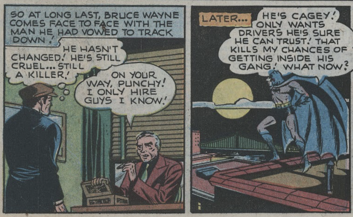
The dialogue is as crude as the drawings, by legendary penciller Jerry Robinson. It veers into the land of cliché to call this noir, but if this ain’t noir, I’d like to know what is.

(That line about Chill only hiring people he can trust is a nifty little piece of irony, as the story is going to end with those trusted henchmen murdering him.)

I won’t show the second attempt, although it’s well worth reading. You can find this story online and see for yourself:
https://viewcomics.me/batman-1940/issue-47/full

Weisinger understood that in the second act, you up the ante, over and over, until the stakes become unbearable. Chill sees through Batman’s attempt to expose his activities, and commits a brazen act of murder, in such a way that he can’t be prosecuted. Which brings us to the end of Act Two. Batman’s best attempts are futile against this feral little man. He must try something considerably more desperate.

Act Three begins with Batman determining that there is only one way to get his enemy: to stake absolutely everything on one single turn of the wheel. This single page, for all of its crudeness, is comic storytelling at its absolute best.

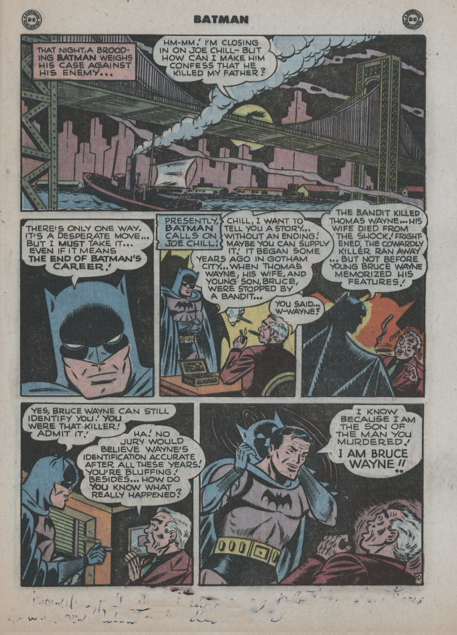
Dick Sprang, a far better illustrator, was working in comics at the time. One wonders how he might have handled the page. Unlike Robinson, Sprang totally understood one-, two- and three-point perspective, and loved Gothic architecture. He certainly could have handled the first panel far more monumentally, particularly had he been paired, as he often was, with Charles Paris as his inker. But I wonder if it would have been an improvement. What Robinson lacked in finesse, he made up for in his ability to depict raw emotion. Batman addresses his enemy, arms folded, in panel 3. He’s in control of himself, but clearly, something big is about to happen. He towers over the terrified Chill in panel 4. And when he yanks off his cowl in panel 6, it is genuinely shocking. Sometimes crudeness can work in a story’s favor.

Good writing is characterized by surprise. Maybe you’re more sophisticated than I was at eleven, when I first saw this thing in reprint form. But it surprised the living hell out of me: our hero revealing his most jealously guarded secret to his most hated enemy.

It gets better. Take a look:

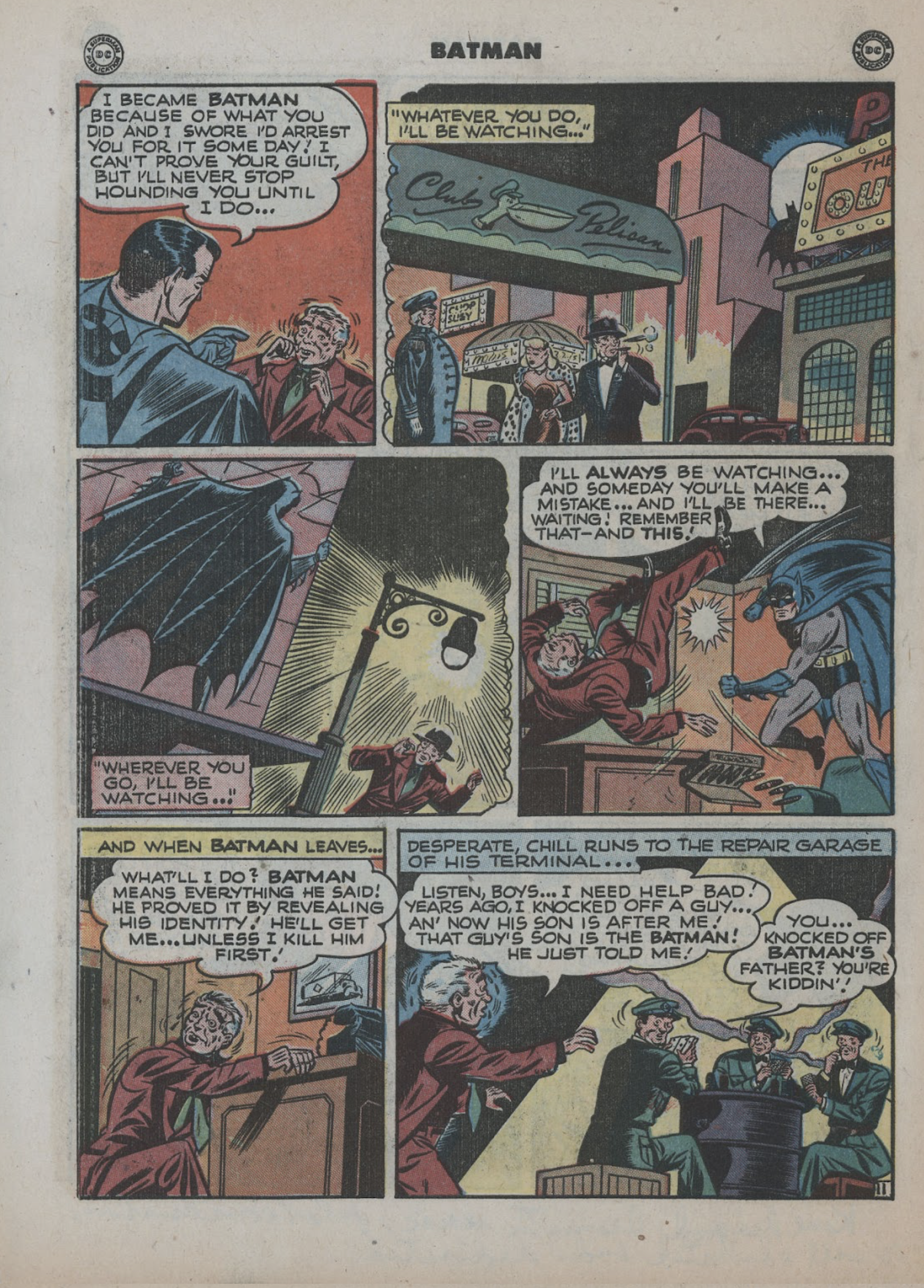
You don’t need much more than this, although you’re going to get a whole lot more. Chill stripped to the bone, terrified. The Club Pelican in panel 2 is (obviously) there as reference to the Stork Club, the most celebrated night club in Manhattan. Poor Chill, with his cigar and his blonde. It’s all come to nothing. He’s a ruined man. There’s no way out for him. Weisinger manages to make him a figure of pity, and it adds that much more to the pathos of the final scene.

Batman’s solution worked brilliantly, except for one thing: he failed to anticipate Chill’s desperate solution to the dilemma, seen in panels 5 and 6. Yet here again we get that element of surprise, and delicious irony:

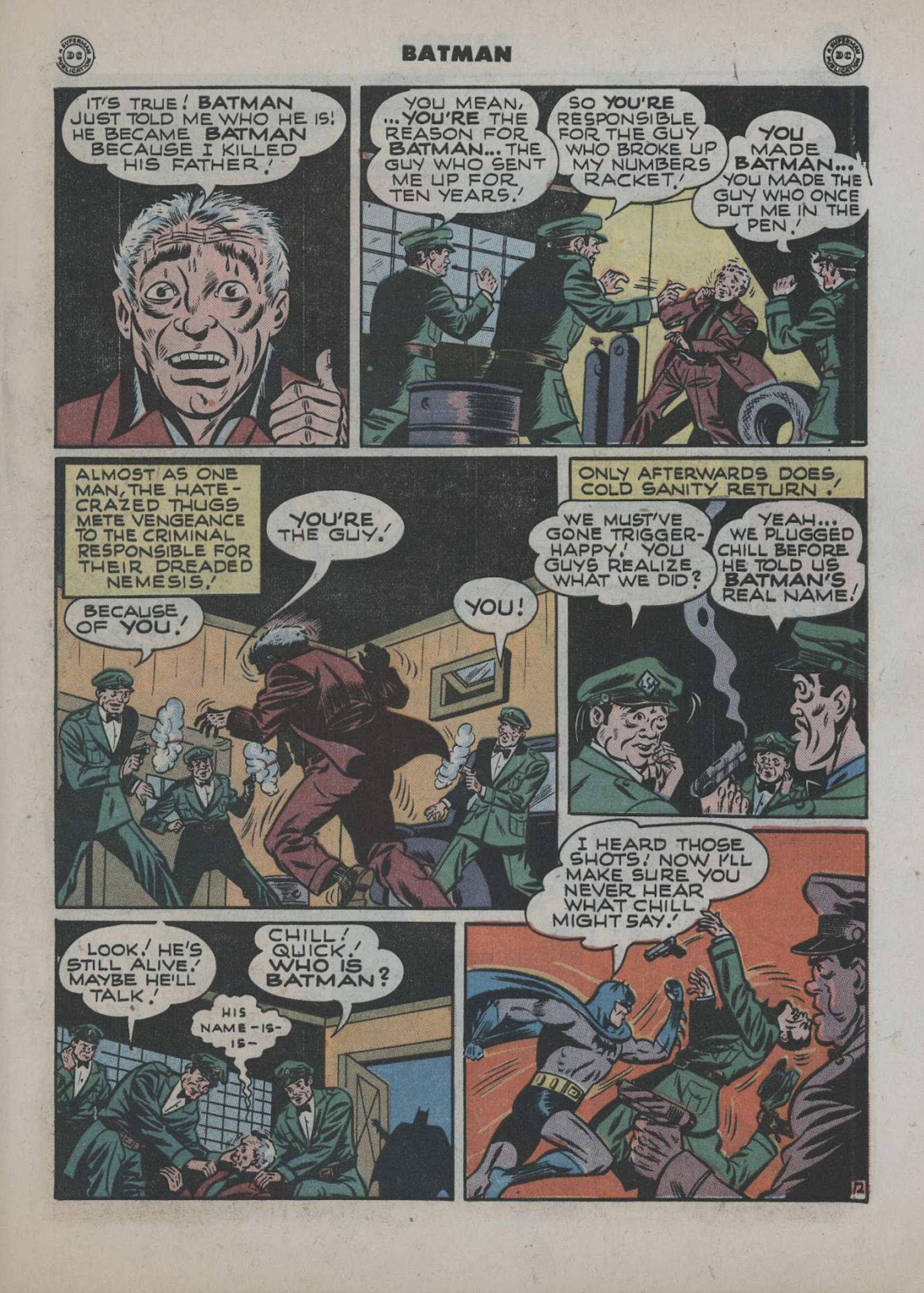
I love it. The terrified, white haired thug. The kill crazy mob. I even like the incompetently drawn hands. And, of course, the last-minute realization that they’ve just killed their golden goose. And a nifty little action sequence:

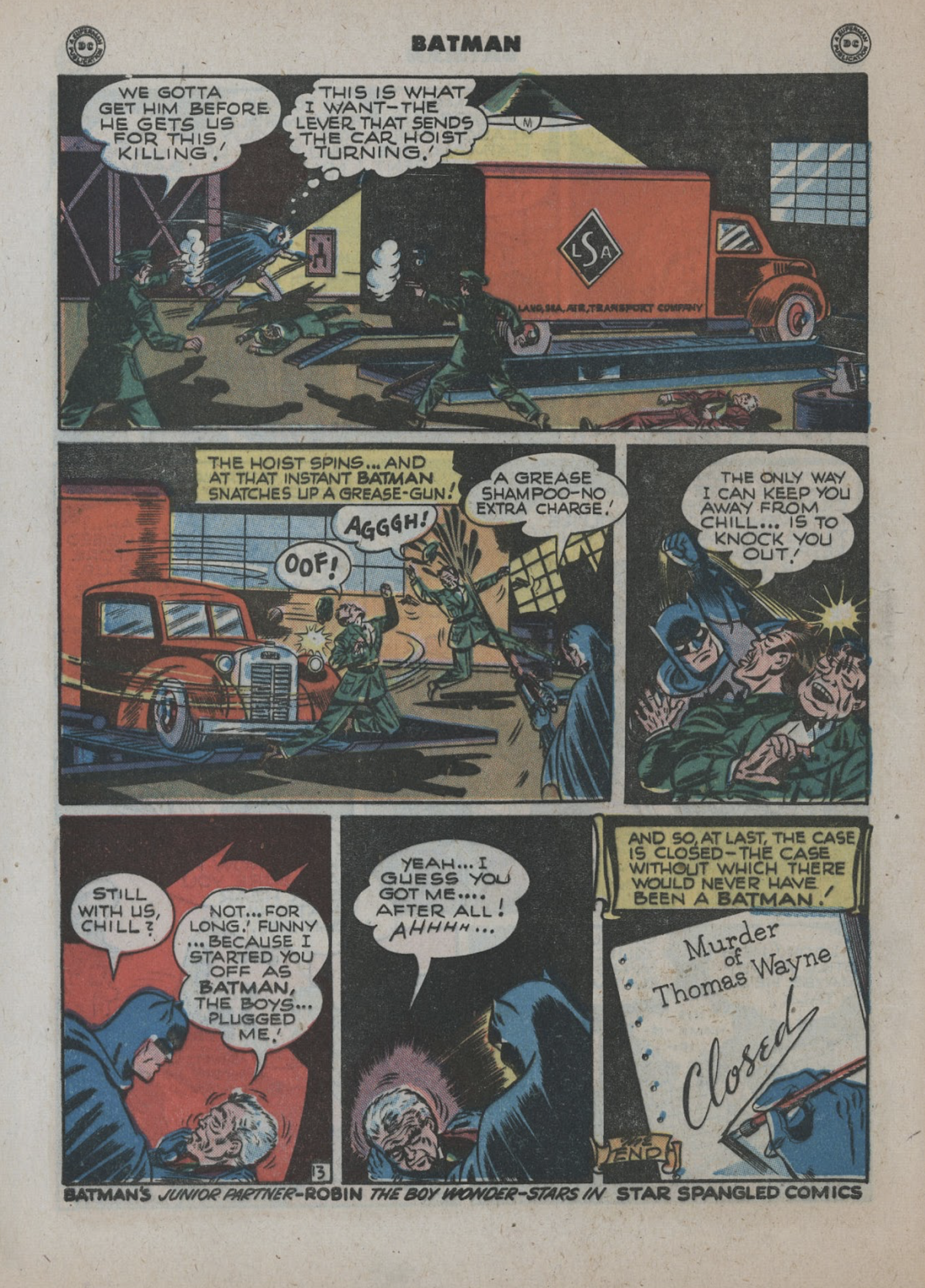
I said the script was by Mort Weisinger, but that spinning truck-hoist screams Bill Finger. I dunno. If you do, please let me know.

There’s something sweet about Bats’ question in panel 4: there’s no more vindictiveness, he’s got his revenge. Chill’s ruined, and on his way across the Styx. And that “Case Closed” final panel. It really doesn’t get much better than this.

Comics were 52 pages long at this point, and “The Origin of The Bat Man” was one of three stories. Pretty inauspicious. And this is a character whose origin has been told, retold, and revamped many times since. I had a hand in one such revamping, the 2003 Brian Azzarello-Eduardo Risso-Trish Mulvihill miniseries “Broken City,” a story as touching as this one is crude. And Alan Moore’s “The Killing Joke,” while not a retelling of the Bat’s origin, is still about as penetrating a look into his heart as anyone’s ever managed to come up with.

But Batman #47’s “The Origin of The Bat Man” has its own mystique: in spite of its crude drawings, cruder inking, dialogue straight out of the pulps, bad coloring, and bad printing on bad paper, it somehow all clicks. In this one man’s opinion, these four pages are the single greatest sequence in the history of the single greatest character in the history of comics.

My Funnybook Sound Effects Type Library

When the comic book industry transitioned into an all-digital environment, I was given a chance to adjust my lettering work into the new way of working. It was none too soon: I began working digitally in 2002, and by the middle of 2003, practically no one was still buying hand lettering.

It took me quite a while to learn to make the new technology work for me. In 2009 I cooked up a means of automatically introducing alternate versions of each letter of the alphabet to my body copy. The font I use for dialogue and captions contains almost 4,000 glyphs, as compared to the standard 256. I’ve adjusted and refined it in the 13 years since. One of these years I’ll have to rebuild it from the ground up; typography has changed enormously, and my type definitely needs to be retooled.

Sound effects are basically a zipped up version of one’s handwriting. I resolved early on that I wouldn’t use anyone else’s sfx type, so as to preserve the familial resemblance of every element of lettering.

Over the past twenty years I’ve probably designed seventy sound effects fonts. Most of them have fallen by the wayside. Here’re the ones that I use on a regular basis:

In the world of legitimate typography it takes months or years to design a new font family, but comics are a little less demanding, especially since all of these have been designed for my own use. A basic alphabet might take two days to draw. Spacing and kerning add a day or two to the process. Were I making these for other people’s use, they’d need to be more refined. But all of these are just an attempt to bring about a digital equivalent of the sort of characters I once drew with a pen or brush, to describe the sound of a gunshot, a fist against a jaw, a revving motor, or whatever else.

Some of these get a lot of use, others are seldom needed. It depends on the sort of drawings I’m lettering on. For the past two days I’ve lettered a book drawn by Gabriel Hernández Walta. I’d never heard of him before, but his understanding of the language of drawing, and his very poetic ink line are stunning. They demanded I drag out fonts that I hardly ever use: Pieface, Pinkeye, Arghh. There’s no logic to this except visual logic: you use what will best harmonize with the drawings.

I think it was in 2013 I hit on a means of defeating the sterile, mechanically perfect outlines that computer typography offers. A human being with a pen will constantly vary his line weights. If the line weights in sound effects are not similarly varied, it’s odd looking. I don’t think one reader in 100 notices what’s going on, but I fancy that subconsciously, everybody sees the difference. Here’s a closeup to show you want I mean:

This sound effects type family is named Parkhurst, after the famous 19th century academic painter Daniel Burleigh Parkhurst. As you can see, the outlines are constantly varying, like the pen or brush line of the artist upon whose work these letters will be found.

Parkhurst is also noteworthy in that its letterforms, in slightly varied forms, enable it to describe the same sound effect 24 different ways without any manual adjustment, as you can see here:

All of these are typeset, without having to resort to altering their forms. With a little chicanery, 576 different versions of the same sound effect could be produced. To date, Parkhurst represents the most successful attempt on my part to disguise the fact that comic books are lettered on a computer.

To which, I imagine, the obvious response would be, “Get a life.”

Hegel Meets the Magi

When I was a teenager, I got to watch a very good painter in action. He was close friends with Harvey Dinnerstein, and was in some ways a better painter. His name was Stanley Phillips. He drew beautifully, and had a staggering command of oil paint. He hosted a figure drawing group at his studio, which I and my father attended. One pose for two hours. Stan had evolved a technique that enabled him to do a finished oil study in that period of time. I wish I’d spent less time trying to draw the model and more time watching Stan. But I saw a few things.

He would rub a thin, opaque layer of dark paint onto his canvas, and begin by knocking out the lights with a rag, and then painting into the wet surface with dark paint, usually burnt umber, and a fast drying underpainting white. He understood the proclivities of these materials so well that he never seemed to have to mix paint; the right amount of white would be darkened just the right amount by the dark paint underneath. It was like a magic act. If Bob Ross never held much charm for me, maybe it’s because I came of age watching Stan.

His full-blown compositions were not quite as exciting to me; as with John Constable, Phillips’ rapid oil sketches had an excitement that wasn’t as evident when he had numerous sessions with which to work.

His method for long-form pictures was to paint directly, and then once the session was dry, glazing or scumbling over it, or in his words, “Bring it together.” He would then paint into the wet glaze, restating his darks and lights.

Stan had been a follower of Karl Marx when he was younger, and his method reminds me of Hegel’s theory of the dialectic: Two steps forward, one step back. Paint boldly, temper it with a glaze, and then try again.

At the time, I was in the process of discovering and emulating the Post Impressionists, and this whole “bring it together” thing made no sense to me. It makes considerably more sense to me today, but I’ve got reservations as to the technique Stan used to harmonize his color.

There can be some problems with successive layers of paint when there’s medium mixed between each coat, particularly a medium containing varnish; a lot of people say that this can play havoc with permanence. “Fat over lean” is an axiom that’s guided the construction of oil paintings for centuries. One teacher, who’s helped me a lot over the past ten years, is extraordinarily cautious about such things. Paint directly. If it ain’t right, paint it again. At one of his workshops, he saw me about to apply a scumble to a picture in progress, and when he stopped me, it was with the urgency one employs when little kids want to play in traffic.

I’ve tried to follow his advice, and seldom cut my paint with anything but really good turpentine. But as this small picture nears completion, I’ll probably find myself glazing, scumbling, and overpainting.

I began this thing in Phoenix, three years ago. I’ve worked from a few sketches of a marvelous rack of winter clouds and a scraggly hillside, pockmarked with snow. The scene is the Magi approaching Jerusalem.

Snow isn’t often seen in Biblical subjects, but this particular event took place in December, and the Bible does mention snow 25 times, so I think I’m safe enough including it. (It also figures in another composition I’ve wrestled with for quite some time, of Jesus in the wilderness after his baptism. The warmth of Palestine’s climate doesn’t tell the whole story. Jesus’ ministry had to place him up against everything that makes life difficult, so why not show him coping with snow? Modern scholarship tells us that Jesus’ forty-day temptation took place in the central highlands of Judea during the months of February and March. Snow was a sure bet. And even if Jesus somehow never literally encountered it, he definitely had to deal with a thousand other things that make life in a world dominated by God’s archenemy a challenge. So why not suggest it with snow?)

The Magi were Persian astronomers, and followers of the prophet Zoroaster, whose teachings very closely paralleled those of the Old Testament regarding the coming Messiah. They came bearing three gifts, gold, frankincense and myrrh, but nowhere does the record in Matthew say that there were only three Magi. Considering that they were heading a delegation from one nation to another, the notion of only three Magi borders on the ridiculous, especially considering that they were paying homage not to an ordinary king, but to the King of Kings.

Anyway, three guys traveling hundred of miles carrying hugely expensive treasure would be on a suicide mission. The route connecting Persia with Jerusalem was rife with highwaymen. The Magi, however many there were, would have been accompanied by guides, assistants, and a formidable security detail.

I want very much to finish this thing in the next few weeks. This may well involve the dangerous glazes and scumbles. So be it. Hegel meets the Magi.

Amethyst World

My painter friends and I used to do an open air figure session every year. I wish it could go all summer, giving us a chance to do some serious outdoor nudes. There are few motifs that can compare with it.

This pose is from 2012. I’ve noodled with it here and there in the years since.

The model noticed that I’d underpainted the picture using violet. You can see traces of this here and there, most noticeably in the upper left corner. She called the picture Amethyst World. Sounds good to me.