My Funnybook Sound Effects Type Library
When the comic book industry transitioned into an all-digital environment, I was given a chance to adjust my lettering work into the new way of working. It was none too soon: I began working digitally in 2002, and by the middle of 2003, practically no one was still buying hand lettering.
It took me quite a while to learn to make the new technology work for me. In 2009 I cooked up a means of automatically introducing alternate versions of each letter of the alphabet to my body copy. The font I use for dialogue and captions contains almost 4,000 glyphs, as compared to the standard 256. I’ve adjusted and refined it in the 13 years since. One of these years I’ll have to rebuild it from the ground up; typography has changed enormously, and my type definitely needs to be retooled.
Sound effects are basically a zipped up version of one’s handwriting. I resolved early on that I wouldn’t use anyone else’s sfx type, so as to preserve the familial resemblance of every element of lettering.
Over the past twenty years I’ve probably designed seventy sound effects fonts. Most of them have fallen by the wayside. Here’re the ones that I use on a regular basis:
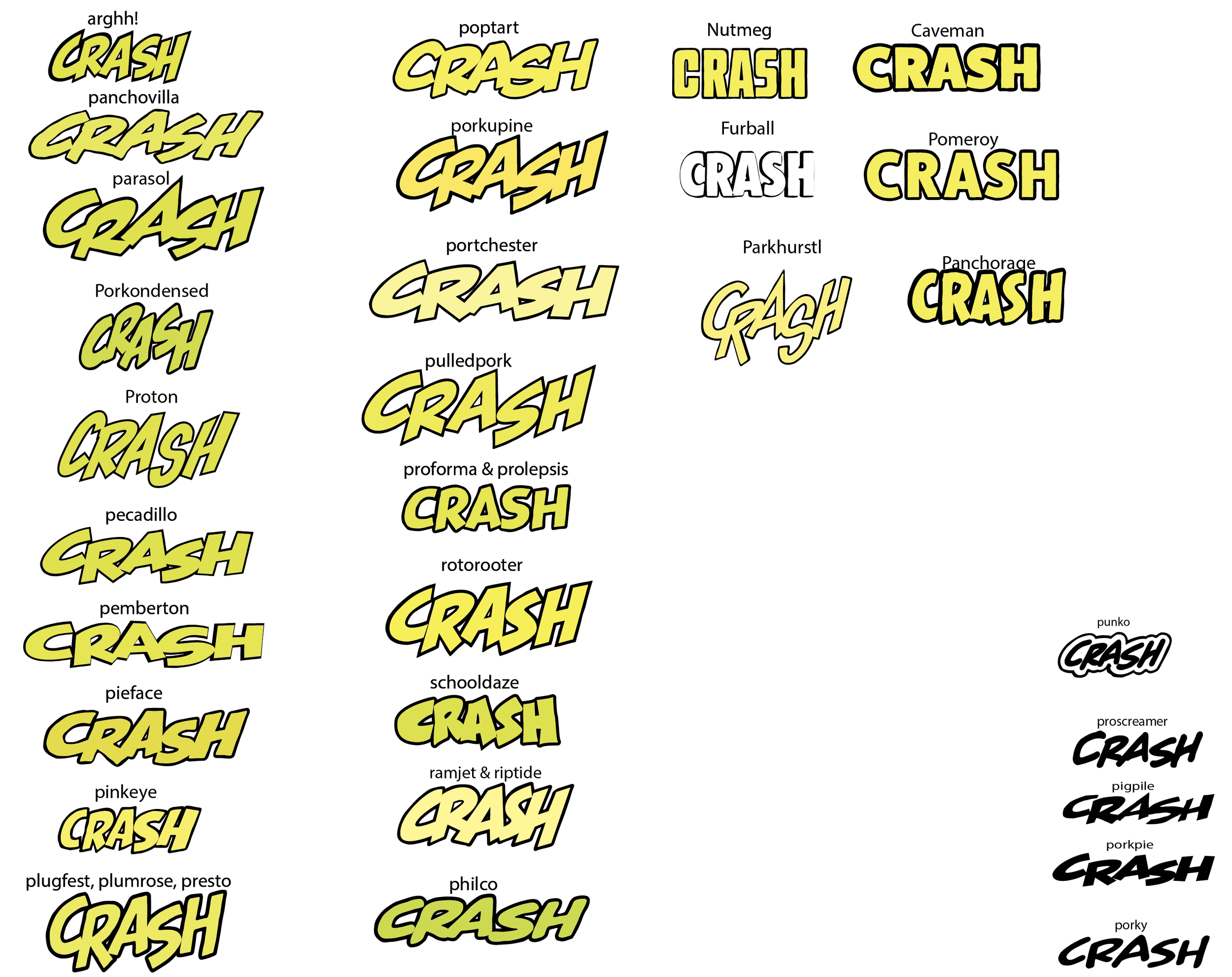
In the world of legitimate typography it takes months or years to design a new font family, but comics are a little less demanding, especially since all of these have been designed for my own use. A basic alphabet might take two days to draw. Spacing and kerning add a day or two to the process. Were I making these for other people’s use, they’d need to be more refined. But all of these are just an attempt to bring about a digital equivalent of the sort of characters I once drew with a pen or brush, to describe the sound of a gunshot, a fist against a jaw, a revving motor, or whatever else.
Some of these get a lot of use, others are seldom needed. It depends on the sort of drawings I’m lettering on. For the past two days I’ve lettered a book drawn by Gabriel Hernández Walta. I’d never heard of him before, but his understanding of the language of drawing, and his very poetic ink line are stunning. They demanded I drag out fonts that I hardly ever use: Pieface, Pinkeye, Arghh. There’s no logic to this except visual logic: you use what will best harmonize with the drawings.
I think it was in 2013 I hit on a means of defeating the sterile, mechanically perfect outlines that computer typography offers. A human being with a pen will constantly vary his line weights. If the line weights in sound effects are not similarly varied, it’s odd looking. I don’t think one reader in 100 notices what’s going on, but I fancy that subconsciously, everybody sees the difference. Here’s a closeup to show you want I mean:
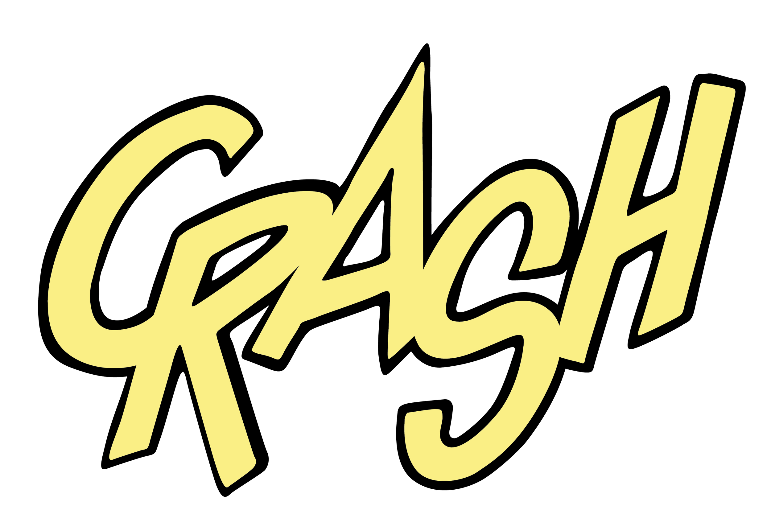
This sound effects type family is named Parkhurst, after the famous 19th century academic painter Daniel Burleigh Parkhurst. As you can see, the outlines are constantly varying, like the pen or brush line of the artist upon whose work these letters will be found.
Parkhurst is also noteworthy in that its letterforms, in slightly varied forms, enable it to describe the same sound effect 24 different ways without any manual adjustment, as you can see here:
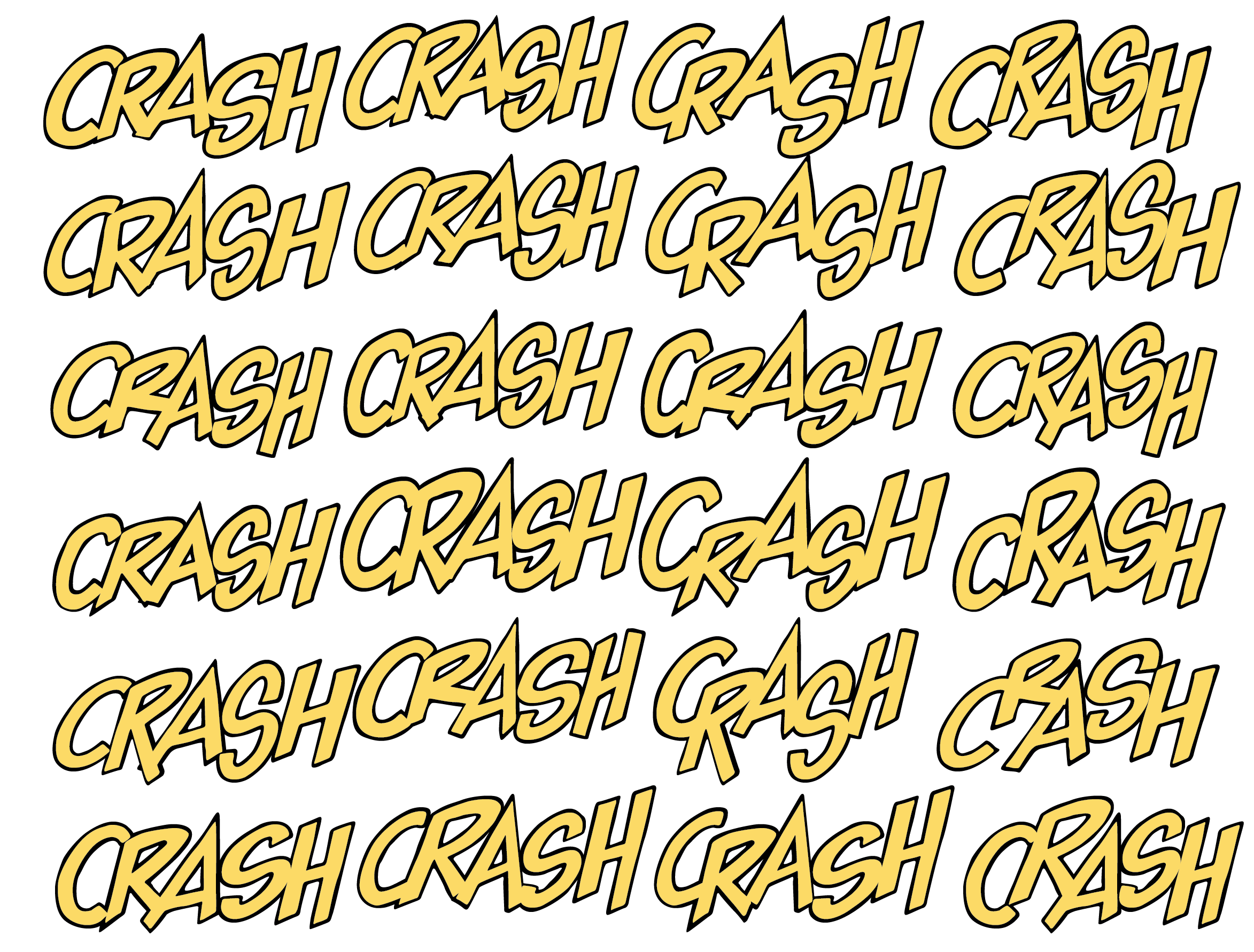
All of these are typeset, without having to resort to altering their forms. With a little chicanery, 576 different versions of the same sound effect could be produced. To date, Parkhurst represents the most successful attempt on my part to disguise the fact that comic books are lettered on a computer.
To which, I imagine, the obvious response would be, “Get a life.”