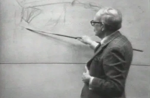
ASYSTOLE, or the Art of Designing Type for Comic Books, Part 4

To understand how a myriad of alternate versions of each letter of the alphabet can look beautiful next to each other, we must consider how a human being might choose to alter the shape of letters as he draws them. This is mostly done to eliminate a lot of excess white space. Here's an example. our test word ASYSTOLE, typeset using the multi-character type family which I eventually developed:

asystole.jpg

This is not the same as type simply kerned, i.e. with characters brought closer to each other or farther apart, based on the amount of excess white space of its neighboring character. Here, the letter S is actually reshaped so as to absorb some of the white space on both sides of the letter Y.

This mimics the work of a human being. Look back at our Gaspar Saladino sample once more:

Gaspar1.jpg

A lot of the paired characters here have no particular rhyme or reason for their altered shapes; Gaspar was clearly enjoying himself, and not thinking too much. however, a few pairs seem here involve the reshaping of characters to fit the proclivities of their neighbor. Here are a few:

gaspar pairs.jpg

In each of the five pairs seen here, one of the characters alters its shape to accommodate the shape of its neighbor. The diagonal bar of the R plunges forward, to fill some of the space below the curve of the C. The S's forward curve is extended to fill some of the W's white space. The R's diagonal bar again is extended into the white space of the Y. The lower curve of the C is held back, allowing the A to fill the space. And the center slat of the E is trimmed a bit, to make room for the backward curve of the S.

In the all-upper case environment used for comic books, we can divide every letter of the alphabet into one or more of three categories: inert, catalytic and passive. And in these three categories lies the means by which digital type can be made to appear handmade.

An inert character is one which is not affected by the shape of its neighbors, and which exerts no influence upon its neighbors. Like the inert gases on the periodic chart, these simply do not react with others. The inert characters are H, I, N and U. What all of them have in common is a simple vertical border on each side. There is nothing to cause a neighboring character to alter its shape, not does such a character have any reason to alter its own shape.

The catalytic letters are those which exert an influence on the characters next to them. Such characters are A, D, F, J, L, M, P, T, V, W and Y.

And the passive characters are those most prone to being affected by their neighbors. These are B, C, E, G, K, O, Q, R, S, and Z.

The reason our sample word ASYSTOLE illustrates this point so well is the presence of the strongly catalytic Y surrounded on both sides by the  extremely passive S. Like a sycophant, the S changes its behavior under the influence of the domineering Y.

Other words which illustrate this are EVERY, REMEMBER, and ACT. In these, a passive letter is bullied by its catalytic neighbor:

13_every.jpg

Note particularly how the first E in EVERY takes on some of the shape of the V which follows it. The two EMs in REMEMBER are affected in the opposite fashion by their neighboring Ms. Similarly, the bottom curve of the C tucks under the white space of the T. C is far and away the most passive character in the alphabet. Any other letter can push it around. A C can even be reshaped by a neighboring apostrophe or comma.

Here lay the answer to my dilemma of the thousands of variant characters not looking right next to each other: develop character pairs (or triplets, quintuplets, or whatever), taking care to have the letters involved behave in the above fashion.

Variety could also be introduced, by providing multiple versions not only of the letters of the alphabet, but of some of their more common groupings. For example, the triplet THE is very common in English, so why limit oneself to just one THE when you can have nine of 'em?:

14_the.jpg

And if you're lettering the same character every month, why not see to it that his name will never appear the same way twice?

batman.jpg

Around the time our previous President was inaugurated, I was laid up for a week after hernia surgery. It was a pretty serendipitous time: I used it to concoct every character pair I could think of. In the years following, the font was constantly under revision: whenever i ran across a situation which seemed to call for a new ligature, I'd stop and design one.

Nine years and more than 3,000 ligatures later, the font family is still under construction, and still getting very heavy use.

Probably not smart to spill my secrets like this, but I'm hoping nobody reading this is dumb enough to follow in my footsteps. It's a pretty heavy price to pay, just for the privilege of faking out people into thinking it's all still handmade.

I also managed to cook up a means of making balloons and sound effects look handmade. Maybe we can talk about it sometime.

ASYSTOLE, or the Art of Designing Type for Comic Books, Part 3

I spoke cryptically about the Holy Grail of digital type for comic book lettering. It's simple enough, at least from my own point of view: make the stuff look handmade! This is not entirely a matter of caprice, or of the stubborn prejudices of a guy who did handmade comic book lettering for a quarter of a century. Rather it's a matter of unobtrusiveness, of doing everything possible to help tell the story. Comics are drawn by human beings, with pens and brushes which produce lines of varying weight. Lay mechanically perfect letters on top of that and the effect is jarring or funny, but not harmonious. When Al Feldstein took over Mad Magazine from Harvey Kurtzmann, one of his editorial decisions was to replace hand lettering in the magazine's movie and TV parodies with typeset copy in oblong balloons. It was a good move: it was intrinsically funny, because of the dichotomy between the dynamic pen line of Mort Drucker or Al Jaffee or Jack Davis, and the mechanically perfect type and balloons. It calls attention to itself. It screams, "I'm kidding, I'M KIDDING!!"

But me, when I make comics, I'm not kidding. I want to help tell a story. I want the artist and writer to look as good as possible, because the better they look, the better the storytelling experience for the reader. And the last thing I want is Mad Magazine. I want handmade, and if I can no longer sell handmade lettering in today's digital environment, I damn well want the stuff to look handmade.

So let's take a peek at real handmade, and notice a few very charming qualities about it, which helped to tell some of the best stories comic books have ever had to tell.

Gaspar1.jpg

Here is a bitchin' sample of hand-made comic book lettering, from what I consider to be one of the most perfectly lettered comics ever published. It is from Plastic Man #1, cover dated November-December 1966, lettered by the great Gaspar Saladino. It was a very funny story, written by the eternally goofy Arnold Drake and drawn by Eli Katz, whose nom de plume for comics was Gil Kane.

The story's funny, and so's the lettering. Even the balloon shapes were funny, as I'm sure you'd agree if I'd shown them. Gaspar was lettering more than a dozen comics every month at this point in his life, and most of them were quite serious — as were his letterforms. But here he fell into the zany mood of the story, and you can feel it at a glance.

That's charming characteristic #1 of handmade lettering: its letterforms reflect the mood of the story.

This falling in with the mood is tough in digital work, and I've made little attempt to chase after it in type design. Crafting a usable font family takes months, and it's really not practical, given the other production values I insist on in designing type, to have "funny" families and "serious" families. I've tended to let the story and art provide that sort of atmosphere, and hoped that my letterforms reflected that mood, even though they're precisely the same for funny stories and serious stories. I do have a few goofy type families, and I occasionally use them, but for the most part, one family is used for everything.

A closeup sample of the most ubitiquous character in the English language, the letter E, will spotlight another characteristic of hand lettering:

E's.jpg

In English, the letter E appears, on average, about every seventh letter. In other words, 14% of all letters in the English language are E. The block of copy shown earlier has 111 characters, of which 15 are the letter E, which more or less conforms to the rule. Other characters appear often, but they run a distant second, third, fourth and fifth to E.

These fifteen Es all carry a familial resemblance, particularly in the line weight of Gaspar's beloved FB6 pen point. But they're all clearly different one from another, and this is charming characteristic #2 of handmade lettering: the 26 letters of the alphabet, no matter how often each appears in a block of copy, never precisely repeat themselves.

In my quest to replicate the look of hand lettering, one experiment I tried was a body copy type face with dozens of variant versions of each letter of the alphabet, plus a proprietary word processing program which would randomly substitute one sample for another. The program, designed by a friend of mine in return for a steak dinner, was quite something to watch in action. I'd take a comic book script, open it up in the program, and wait ten or fifteen minutes. The program literally chose, at random, one of dozens of versions of each letter of the alphabet and each piece of punctuation, for each appearance of each letter or punctuation mark.

The font family I used was based on a series of thousands of samples of each letter of the alphabet and each piece of punctuation. I lettered Buffy the Vampire Slayer for Darkhorse comics for many years, and one day the company sent back hundreds of pages of overlay lettering I'd done for the strip. I almost threw it all away before realizing that it could help me out in designing type. I went through the vellum lettering, selecting dozens of versions of each letter. These samples were cleaned up and made into a type face which the random-substitution utility could work with. Presto. If a block of copy had 36 E's, 15 R's, 18 S's, and so on, the font and the substitution program ensured that nothing ever repeated.

It all worked visibly, on the screen. The ten or fifteen minutes it took were very entertaining to watch, particularly if you had a drink in your hands. It worked. It looked handmade. My quest was over. My life was complete. Characters never repeated. There was only one problem:

It looked awful.

Before I realized this, I introduced the new technology to my various clients with great fanfare. No one said much about it, until I used it for a wonderful Vertigo miniseries, and afterward heard from the editor, who was perplexed. She wanted to know why my lettering looked so amateurish all of a sudden.

At first I was pissed off. Who was she to complain? For the first time in four years, the company was getting lettering that looked handmade. But then I looked at the books I'd used the technology on, and had to admit that handmade wasn't everything.

I apologized profusely, and relettered the books that'd been published conventionally, in time for the trade paperbacks. The editor is still a friend, although I can't understand why.

But I had learned a painful lesson about charming characteristic #3 of handmade lettering: the 26 letters of the alphabet, even though they never precisely repeat themselves, must always look beautiful next to each other.

But exactly how do they look beautiful, in a way that my random sampled characters never could? The answer to that is going to have to wait a bit. In the meantime, take comfort that the problem got solved, even though it took my hernia surgery to help bring this to pass.
 

ASYSTOLE, or the Art of Designing Type for Comic Books, Part 2

Now that we've hopefully cleared up my misunderstanding of Richard Starkings, John Roshell, and Comicraft regarding their philosophy of type design for comics, I'd like to go into the things which I felt needed to be addressed when I got around to following in their footsteps, turning my own hand lettering style into type which could be used in the all-digital environment in which comics are made these days.

Let's look at the problem using as a case in point a technical term used by doctors and those who examine EKG charts. It's a lovely word for a difficult problem, when there is no detectable heartbeat. As problematic as that situation is, the word itself brings to light some problems for those of us who wish to design type which suggests the way a craftsman with a pen shapes letters. But before we get around to the craftsman with the pen, let's look at the word as seen through the medium of the long-forgotten manual typewriter.

1_mono spacing.jpg

The typewriter, due to the technical limitations of its early design, could not allow the various letters of the alphabet to occupy different amounts of horizontal space. Upper case, lower case, I or W or even a period, all of these were assigned exactly the same amount of horizontal space. This is referred to as Mono Spacing. Mono Spacing is at its least offensive in an all upper-case environment, such as is seen here. There are two S's, both identical.

Both the sameness of spacing and the sameness of identical characters were problems which I, and everyone else who wished to design type for comics, wanted to overcome, as these do not resemble the work of a human being holding a pen. Such a person can never shape the same letter exactly the same way twice, even if he wants to. And he certainly does not assign all glyphs the same amount of horizontal space.

2_unit spacing_baskerville.jpg

This brings us to the next step forward, although it predated the typewriter by 400 years. This is Baskerville, one of the great classic type faces of the Western world. In the era of moveable type, each character of the alphabet was a separate piece of metal, and could occupy as much or as little horizontal space as was needed. There was no situation where every character was the same width.

But because these pieces of type occupied a given width, characters couldn't be brought closer together, even if the eye felt that such a compression was necessary. For example, the pairs AS, TO and LE look fine. But SY, YS, ST and OL all feel, at least at this magnification, like there is an undue amount of white space between characters.

It is a testimony to the brilliance of the early type designers that this problem is almost undetectable in a printed block of text, although italic alphabets can seem wrong to the eye. The reason for this is obvious: slant a character and you're adding white space, if there is no way to subtract from the distance between that character and its neighbor.

The two Roman I's can sit a comfortable distance from each other, but if we slant them, they must be further from each other.

The two Roman I's can sit a comfortable distance from each other, but if we slant them, they must be further from each other.

It is, in fact, a testimony to the genius of the great type designers that italic alphabets were not only made and used, but that the presence of extra white space, rather than looking clunky, actually had a look of great elegance. In the opinion of many, myself included, the single most beautiful font ever designed in our alphabet is Caslon Italic. Even today, with all of our technology, it's never been equalled.

Still, having an inviolable quantity of white space on either side of each character of the alphabet remains a problem to the eye. When the so-called "hot type" machines appeared in the second half of the 19th century, their advent brought no solution to that problem. Each hot type character still had its own width. Nothing could bring two characters closer together except for proofs, a razor blade and rubber cement. I was a teenager before a practical solution to this problem came to be, namely photo lettering. The technology of the late 1960s enabled characters to be optically moved close together or far apart. Page through a magazine or book cover from the 1970s to the mid 1980s and you're bound to run into examples of this technology.

But in the meantime, if you wanted to do a decent looking comic book, you had to hire a human being. Fortunately so, for me and a few others, who were able to make a tidy living with Speedball pen points, rapidographs, and india ink.

3_unit spacing_mongo.jpg

This is the second type face I ever designed, based on my own hand lettering. It has many of the same problems as the Baskerville example above. Each character has its own horizontal quantity of space, but to the eye it looks wrong. Here the culprits are SY, YS, ST, and TO. No human being with a pen would have made these errors, but in the early days of optical type, they posed a formidable problem.

4_kerned_mongo.jpg

Here is a solution, known as "kerning". While "spacing" applies to the amount of horizontal space assigned to each character, "kerning" applies to pairs of characters. Kerning is a series of exceptions. The designer, in effect, says, "The width of the upper case S is so many units except when the next character is a Y" or "The width of the upper case S is so many units except when it follows a Y", and so on. Kerning enables characters to be spaced farther apart or, more often, brought closer together with certain other characters. Above is the same word, typed in the same font, but with kerning enabled. It's not perfect, but it's easier on the eye.

My father came of age in the era of hot type, and never entirely accepted the rather sterile look of photo typesetting. Even into the late 1980s there were hot type machines in operation, and Pop often hired them to obtain effects not possible in the photo lettering of the time. He was certainly aware of kerning, and had done more than his share of such work with a razor blade and rubber cement. But an extended list of kerning pairs added to the computer memory requirements of a type face. When I began designing type, Pop and I discussed the problems inherent in the task of kerning. His advice was to identify maybe 100 pairs, take care of them, and let the others attend to themselves.

By this time, Pop had lost his vision to macular degeneration. I couldn't show him the problems of only 100 kerning pairs. It's like eating one salted peanut. The need just snowballs.

Modern computers can handle a gazillion kerning pairs, assuming the designer has the patience to identify them. But there are also lot of other cool things that modern computers can do, which brings us to the Holy Grail of comic book type design. But I guess that'll have to wait for Part Three.