Stepping on Phthalocyanine

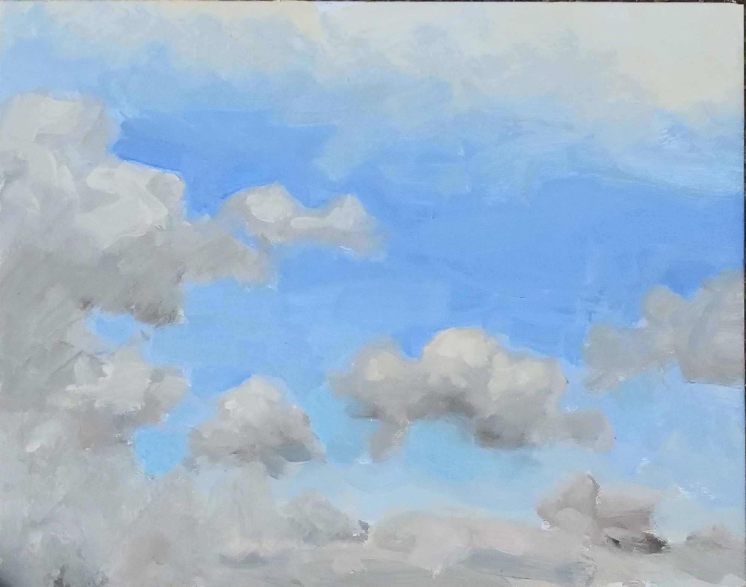
A couple of posts ago, we discussed the possibility of cutting Sevres Blue with its complement, to tamp down its explosive tendencies. I tried it this afternoon. A marvelous rack of clouds faced me, descending to an area four or five degrees above the horizon in which the massed clouds beyond the resolution of my eyes turned the area into a band of pale violets and roses. I squeezed out my normal palette: Rose Madder, Cadmium Red Light, Cadmium Yellow Medium, Yellow Ochre, Cadmium Lemon, Cobalt Blue and Ultramarine. in between the Cadmium Lemon and the Cobalt Blue i left a few inches. In this area, I squeezed out Permalba White, Flake White and the Forbidden Mystery Ingredient.

That Mystery ingredient was an experiment. I have no Cerulean worth using. I thought I would try the solution I proposed a few days ago, some Sevres Blue — a phthalocyanine color about as subtle as Napalm — mixed with a little Burnt Sienna. Burnt Sienna is an orange of very low intensity. Ideally, a mixture of the two will tamp down the intensity of the Sevres, enabling it to hit the notes found as the sky descends towards the horizon, but without infecting the entire canvas with its explosive power.

Mr. Tom Dunlay counseled me that others had tried the same solution, without success. He said that one ought to bite the bullet and purchase Old Holland’s Cerulean Blue. I don’t lightly ignore his counsel, but I wanted to try and see if I could get what I wanted out of the materials I already own.

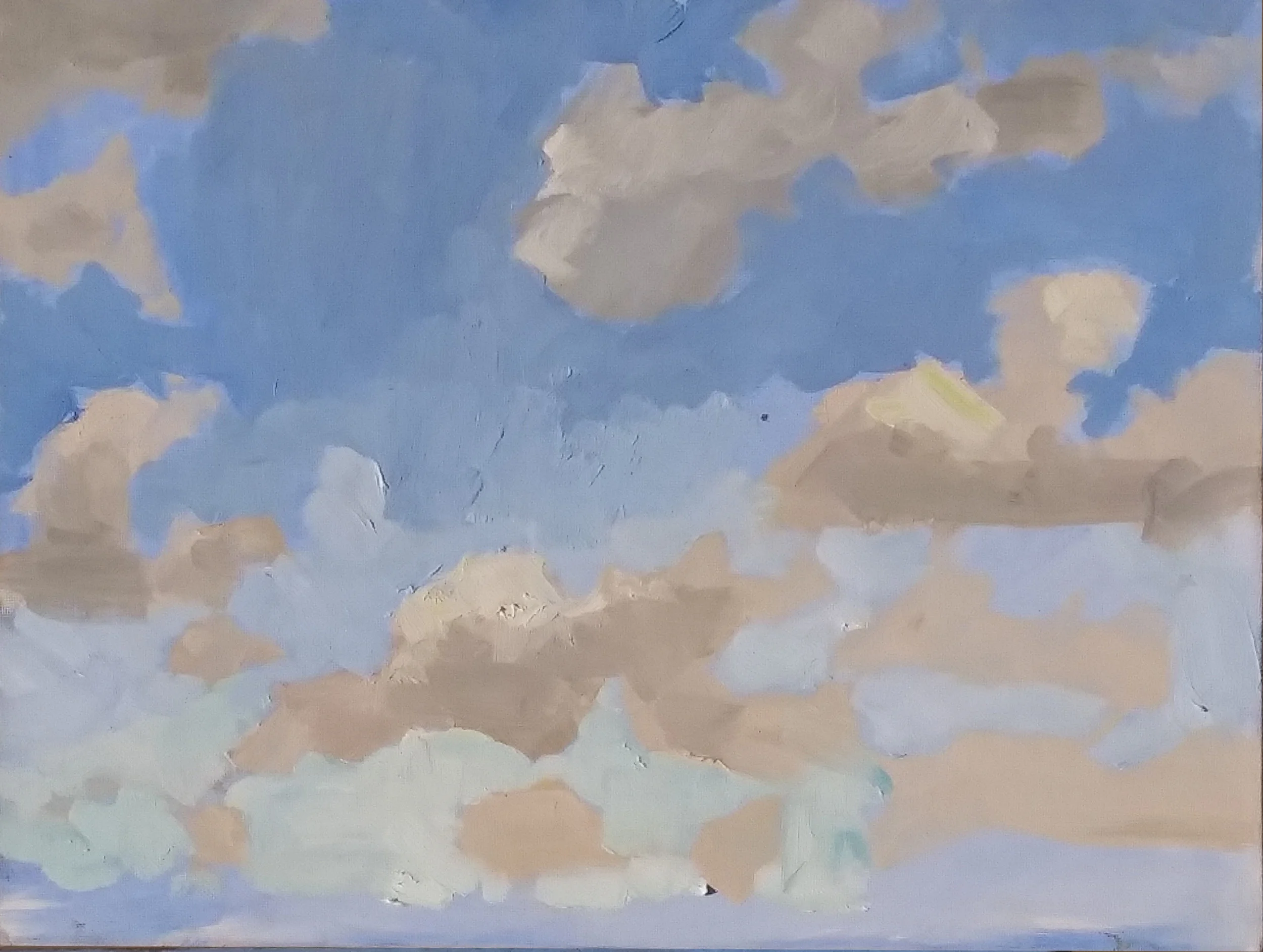
After several months of painting exclusively on kraft paper, coated with shellac, i decided on an 11x14” piece of oil primed linen, glued to a panel, and rubbed with burnt sienna and turpentine to cut the brilliance of the white primed linen, and provide a more sympathetic surface into which i could paint.

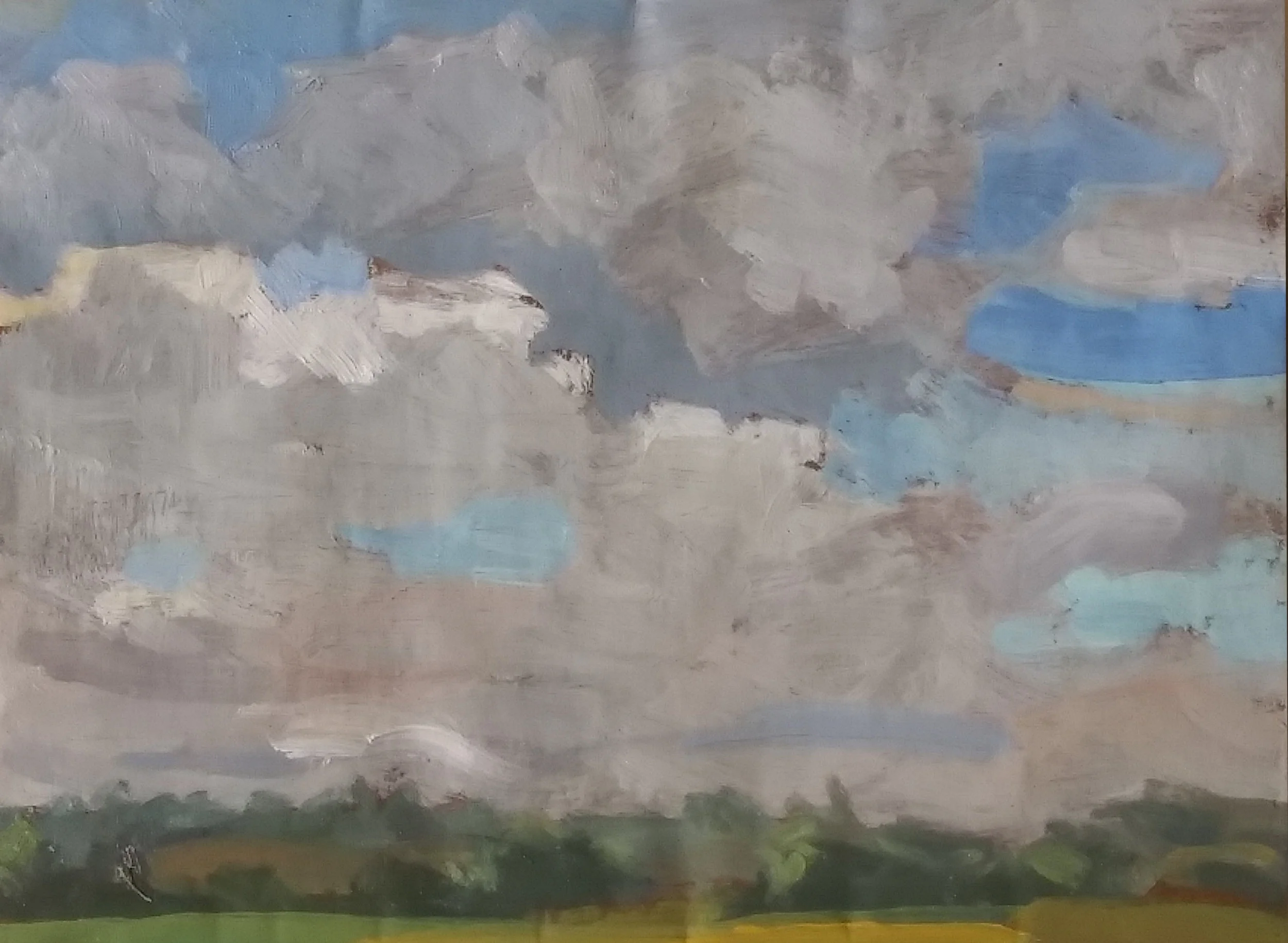
it was a lovely experience. Before we look at what i did then, let’s look at what i did earlier that day, on a piece of cheap cotton, glued to a cardboard panel and rubbed in with a little ultramarine.
5_27_2019_1_day1.jpg

This was a surface upon which I could draw with a sable brush dipped in a mixture of Ochre and Ultramarine. (The shellacked kraft paper permits no such line drawing; it’s too dark, and too slippery.) the idea was to draw the cloud shapes as clearly and accurately as possible, and then paint into this map-in with a loaded brush. the procedure defeated the problem with shellacked paper, namely its resistance to clear, specific line drawing.

it’s not too bad a sky study. i may bring it out again in a few day, and paint over it the trees, telephone lines, and rooftops which overlapped the cloudscape.

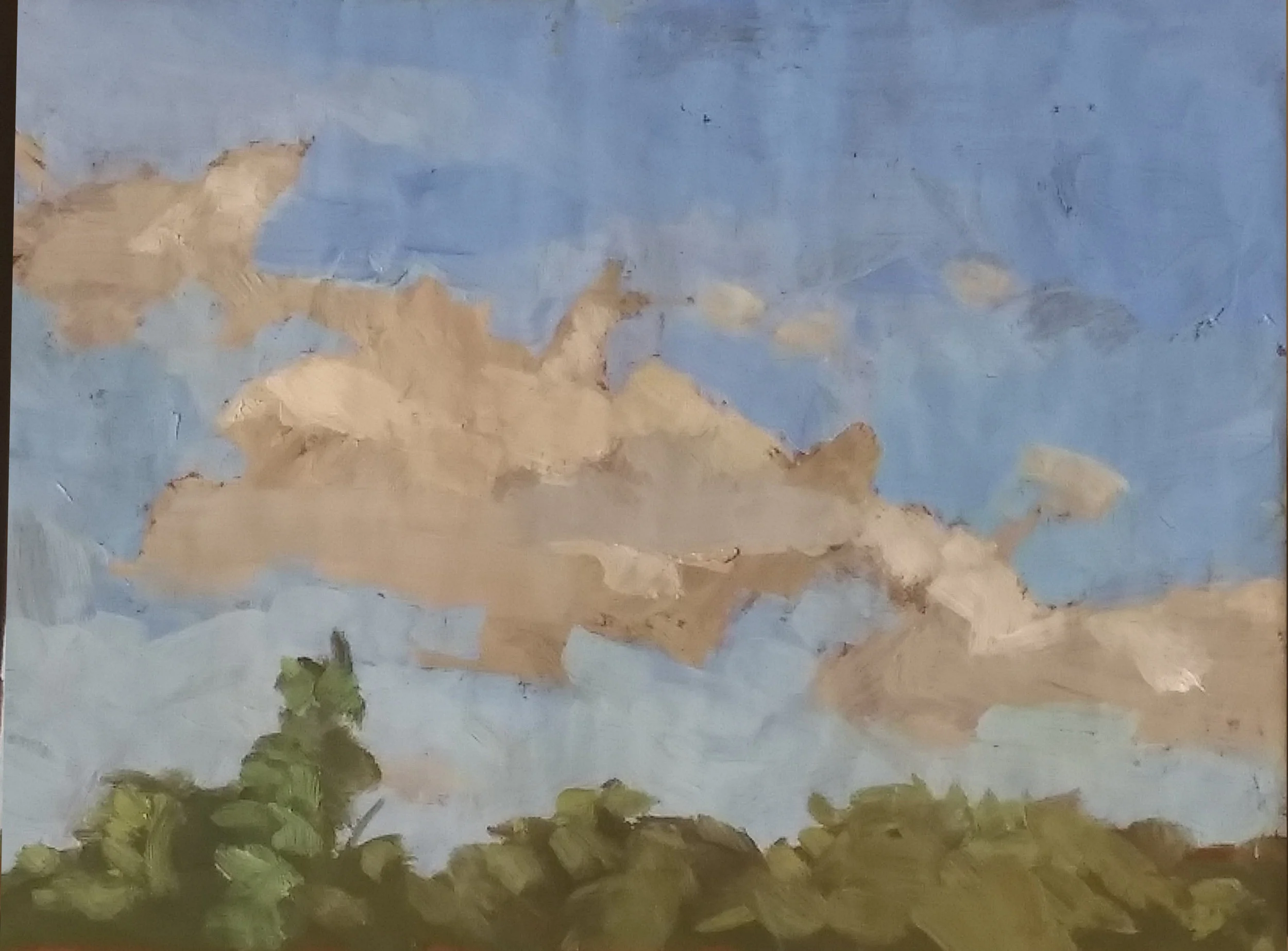
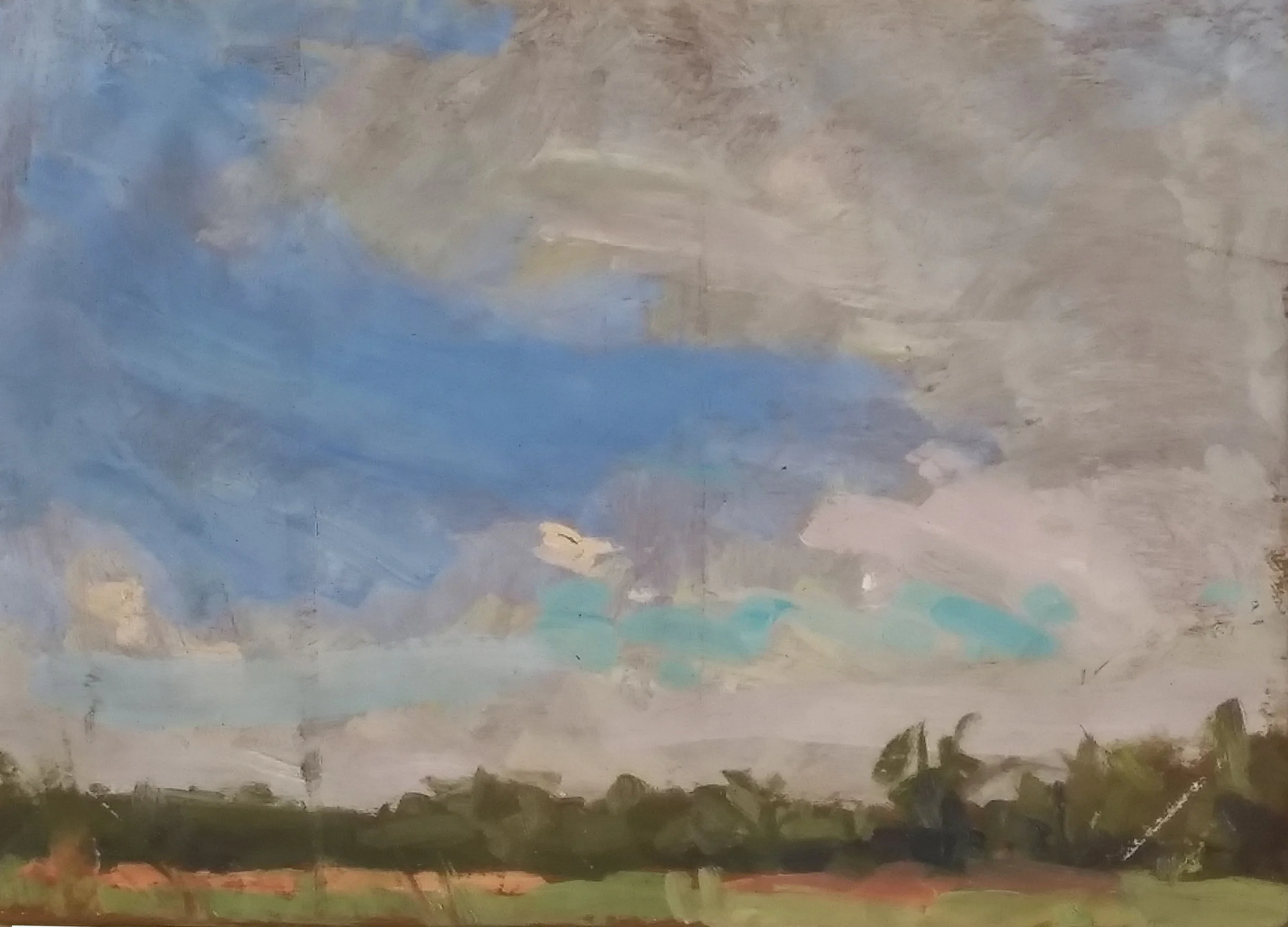
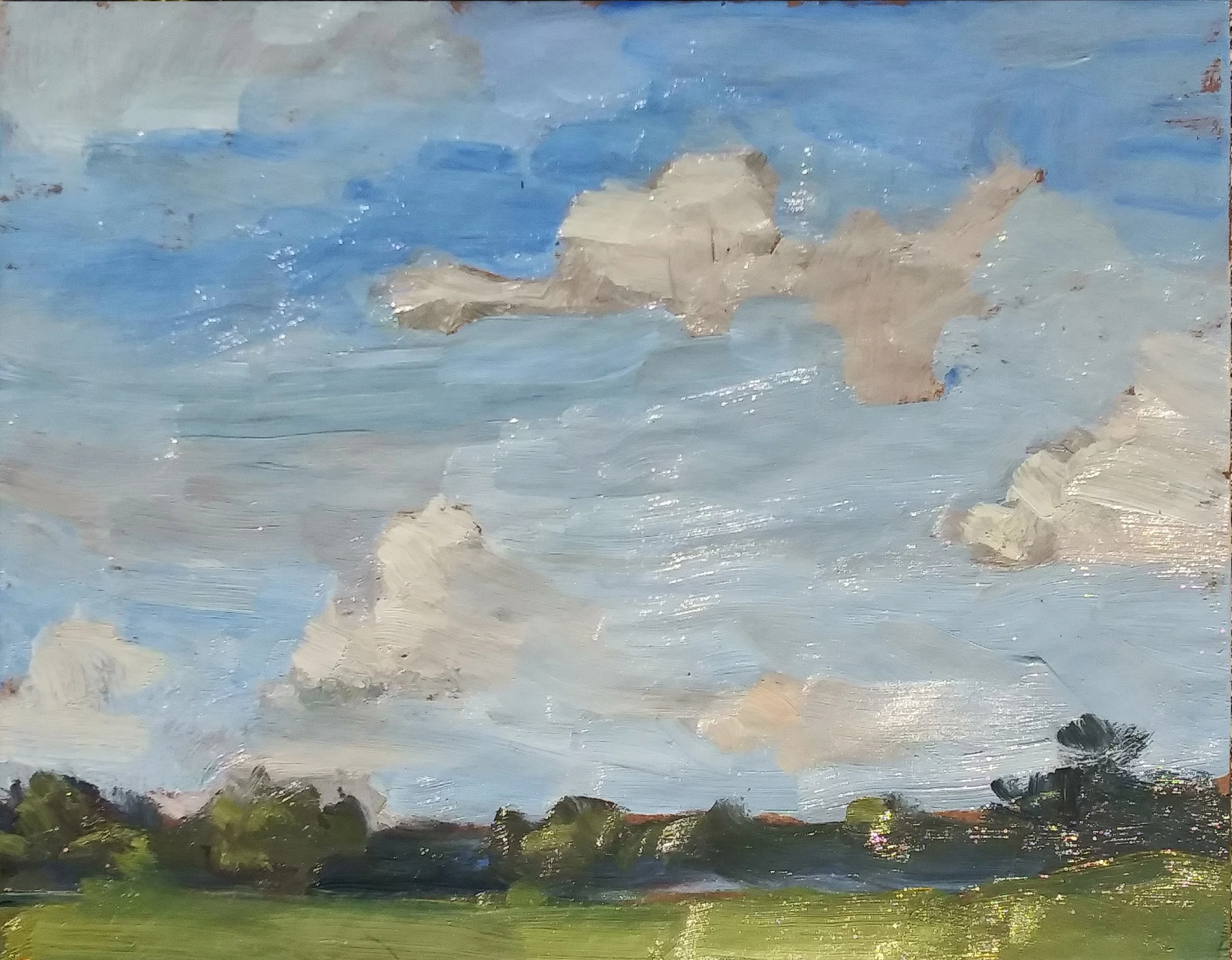
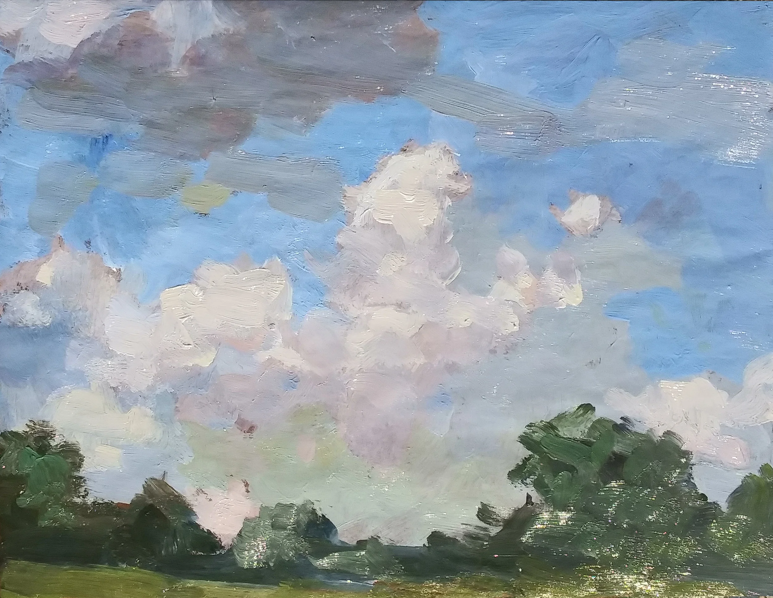
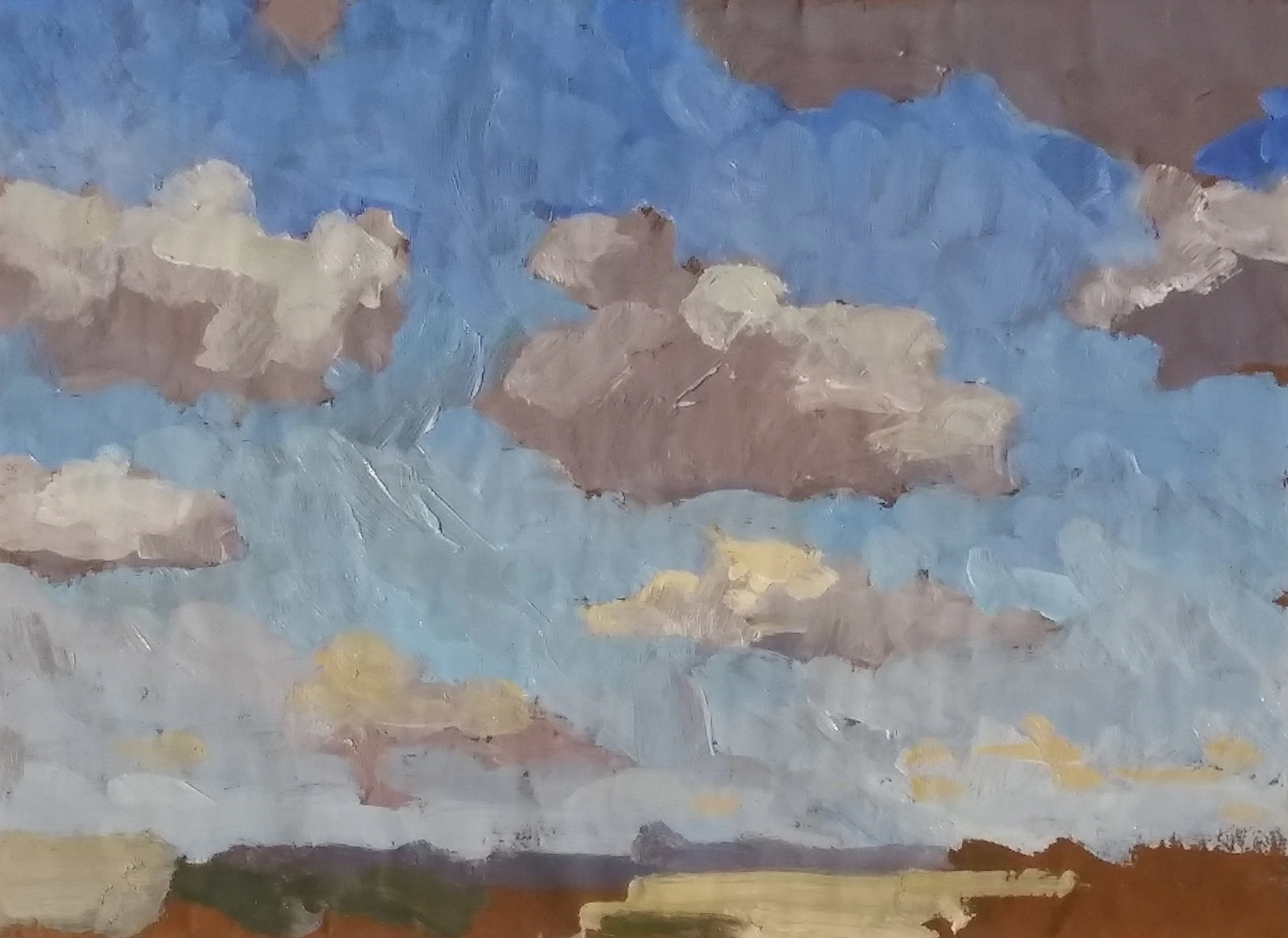
A couple of hours later I headed out again and tried to do homage to a rack of clouds in Newtown, using that 11x14” linen panel.

5_27_2019_2_day1.jpg


The lower half of the sky is the area into which Sevres cut with Burnt Sinna was painted. Sevres no longer dominates the scene. Sometimes the term “stepping on” is used for the practice of reducing the brilliance of a color by adding some of its compliment. You “step on” cadmium red by adding a bit of viridian. Here, the idea was to step on the Sevres by adding the Burnt Sienna.

For some time I’ve admired David Leffell’s stiff life work, particularly how he is able to rough in the background passages of his pictures with brushstrokes which summarize, rather than describe. I tried to do the same thing here with the ground plane and the trees.

Achilles' Horses

We examined the history of phthalocyanine pigments a few days ago, focusing in particular on Sevres Blue, which is basically phthalo blue cut with titanium white. Sevres resembles Cerulean, a blue which is quite useful in replicating the color of the sky as it approaches the horizon and is warmed somewhat. The conclusion was that Sevres, while a very lovely hue, infects everything within reach, causing a whole skyscape to take on its acid color.

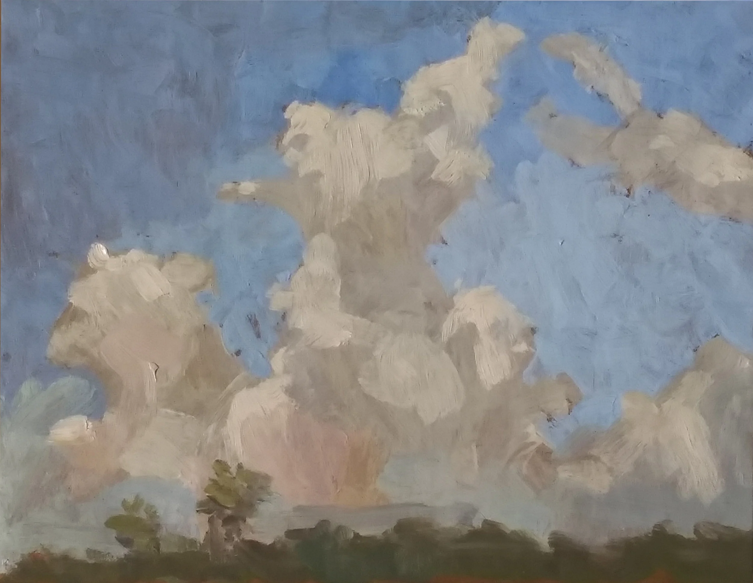
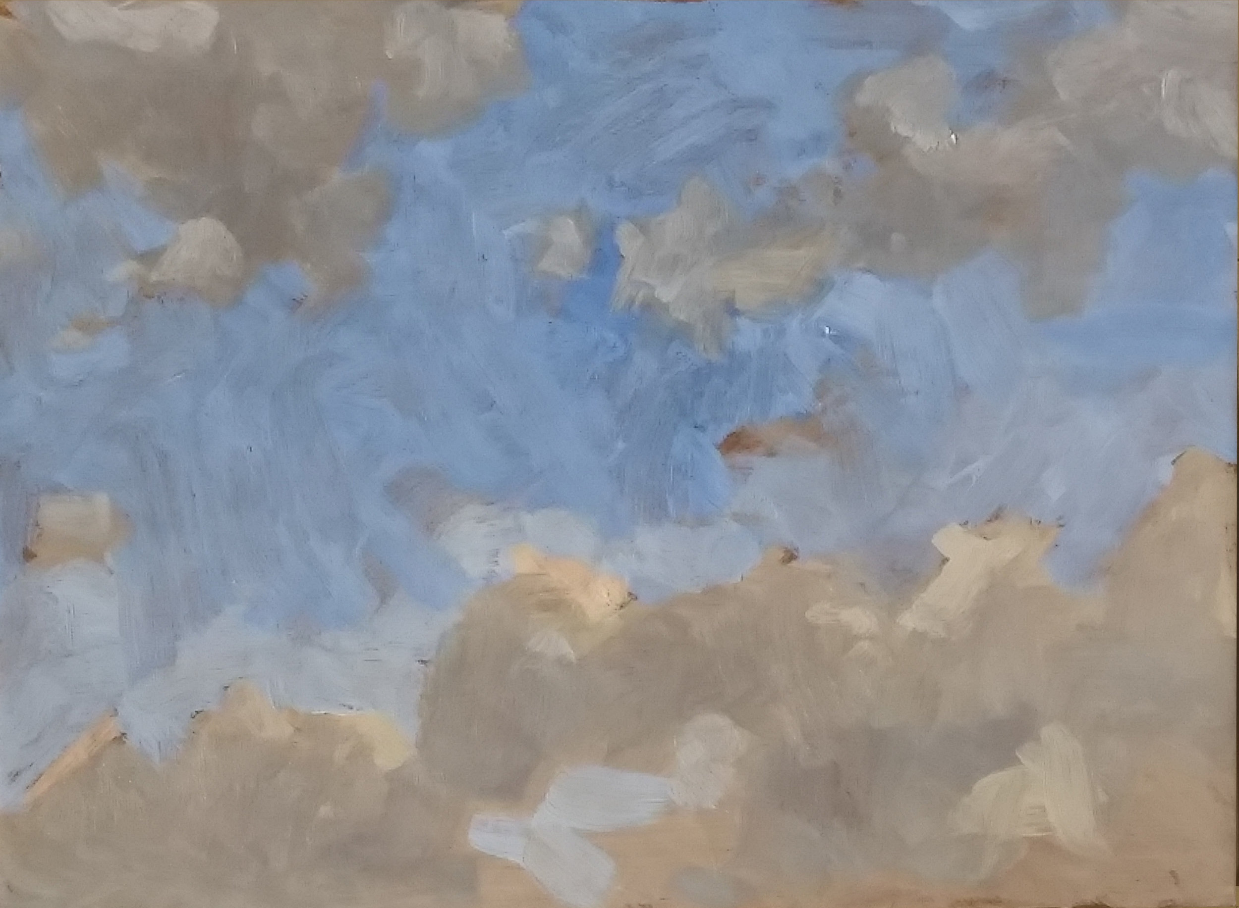
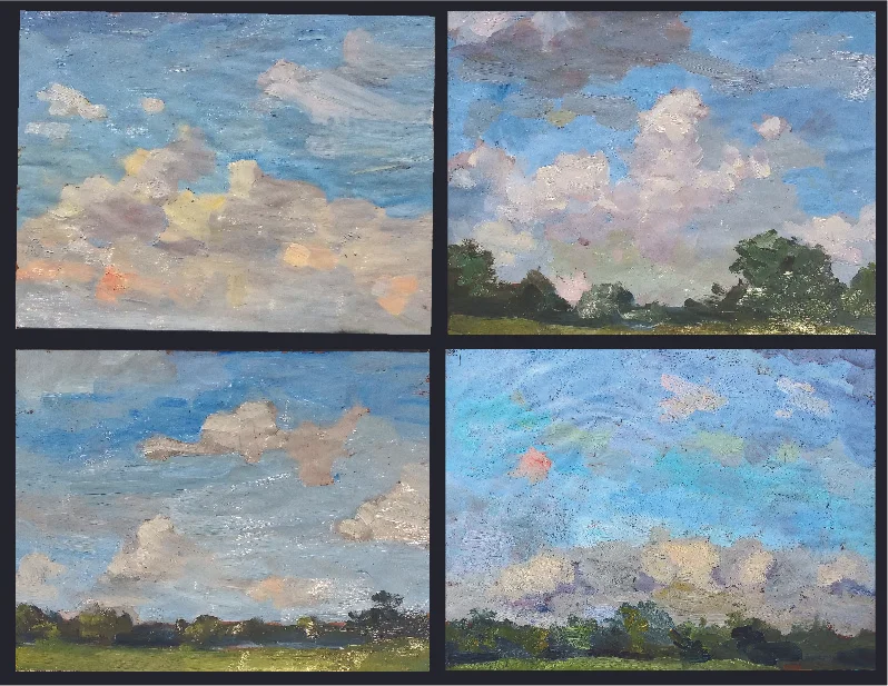
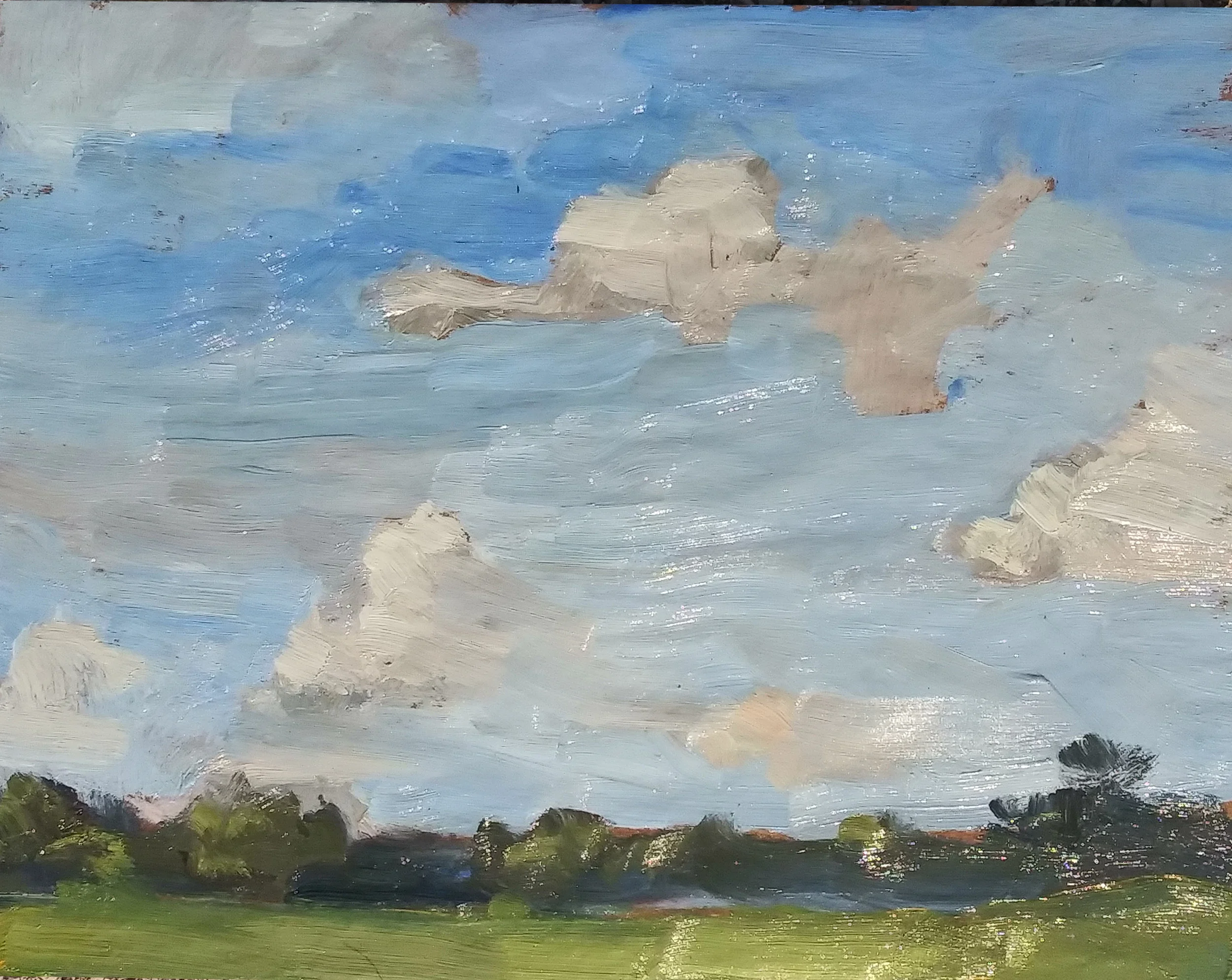
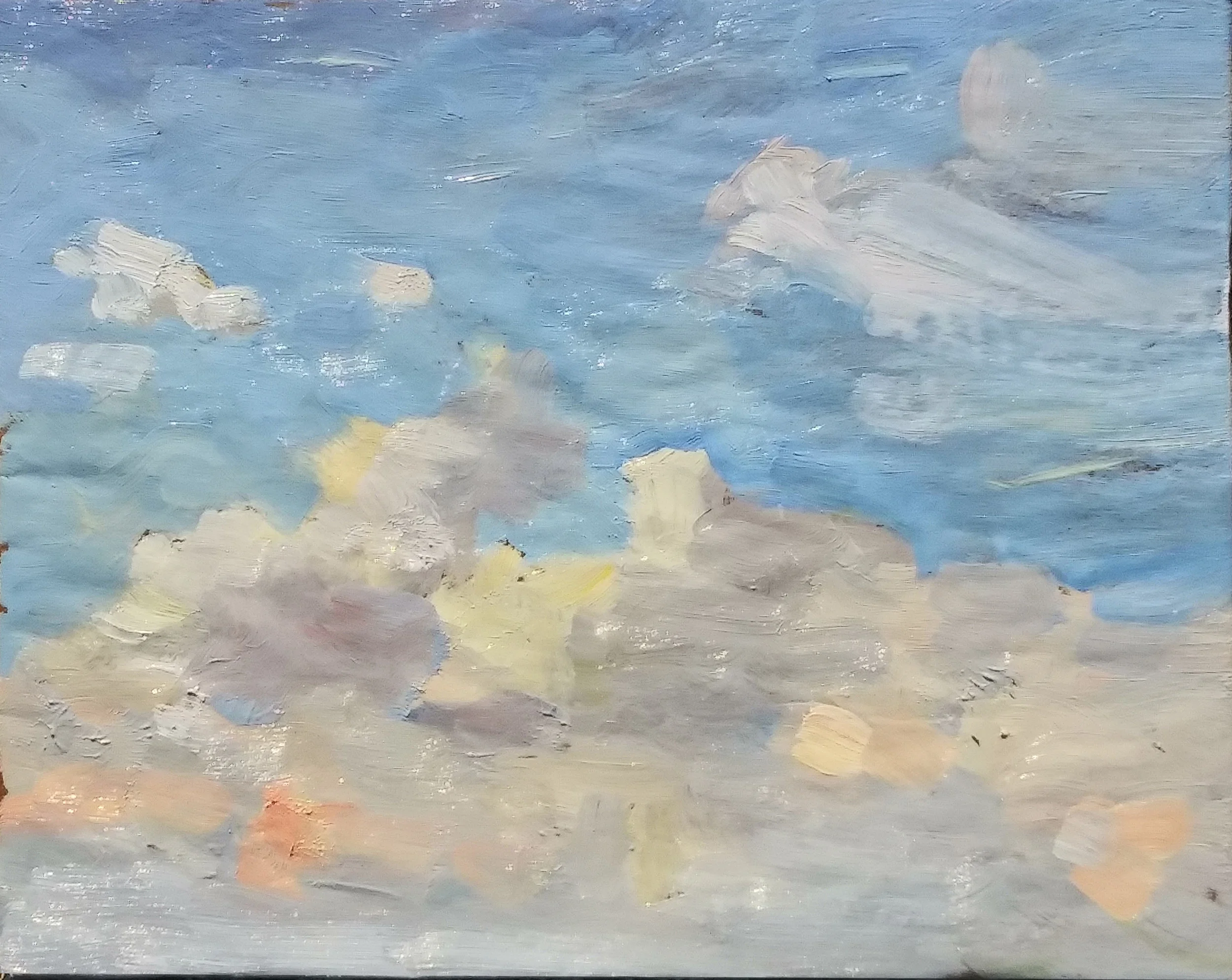
Just for laughs, I went out and painted three sky sketches this afternoon, but excluding Sevres from my palette. Here they are, along with the one from a week ago, painted with the same colors, plus Sevres.

Can you spot the sketch which was painted with Sevres blue? Yep, the lower right. Much as I tried to quash Sevres’ explosively chromatic hue, it still commands the whole picture, and makes the coloring of subtler passages, such as the clouds hoverin…

Can you spot the sketch which was painted with Sevres blue? Yep, the lower right. Much as I tried to quash Sevres’ explosively chromatic hue, it still commands the whole picture, and makes the coloring of subtler passages, such as the clouds hovering near the horizon, ridiculously bland. Think of it this way: if you sang at the Open Mic along with Enrico Caruso, the judges probably wouldn’t remember you.

The exclusion of Sevres allows the whole spectrum to play on a more level field. It makes sense.

Today’s first sketch

Today’s first sketch

When some Greek sentries happened upon a Trojan spy sneaking into their camp, they asked him what could possibly have motivated him to embark on such a suicide mission. “They promised me Achilles’ horses,” replied the spy.

His captors thought that was pretty funny. “Achilles can hardly ride those horses, let alone a wuss like you,” they told him.

And then they killed him.

Sevres blue, like Achilles’ horses, is hard to tame.

Another sketch, painted without Sevres. All the pigments are pretty much in the same league.

Another sketch, painted without Sevres. All the pigments are pretty much in the same league.

Yet again, no Sevres.

Yet again, no Sevres.

The real mission here was not so much to banish Sevres, but replace it with Cerulean. But I have no decent Cerulean, and it didn’t seem to make much difference, Ultramarine, along with Crimson Madder, Cadmium Red Light, Cadmium Yellow Medium, Yellow Ochre, Cadmium Lemon, and Ultramarine seemed to get the job done.

But having the whole orchestra play in the same key seems like a better way to go about things, I think.

A Once in a Lifetime Opportunity

Serendipity rears its head in some awfully strange places. If you provide lettering for comic books, you get used to a lot of funky situations which call for sound effects. Planes crash. Jaws get broken. A man was hung at the end of a graphic novel and the writer, much against my own inclinations, insisted that i provide the sound of the condemned man’s bowels and bladder evacuating. You get used to it all.

But I’ll never forget lettering a strip some 16 years ago called “Adventures in the Rifle Brigade”. I think writer Garth Ennis got a little tired of the renewed appreciation for The Greatest Generation which came around the turn of the new millennium, celebrated by Tom Brokaw’s book, and of course Spielburg’s Saving Private Ryan. The Rifle Brigade was Ennis’ antidote to the Baby Boomer Generation’s recognition that our parents pretty much saved mankind. Nothing was sacred to Garth. The Rifle Brigade was a top secret team of commandos, reserved for only the most dangerous missions, invariably behind enemy lines. There was Hank the Yank, a taciturn American. There was Milk, a commando who managed to make it into the Brigade despite his penchant for the love that dare not say its name. There was the brigade leader, a stalwart super soldier with a stiff upper lip, but endearingly blind to the fact that Milk wanted to take their relationship to the next level. And there was the brigade’s secret weapon: The Piper, a surly Scotsman armed only with a set of bagpipes. I guess Garth didn’t like bagpipes. When the chips are down, The Piper is called into action. He need only play his bagpipes and the enemy goes into brain hemorrhage.

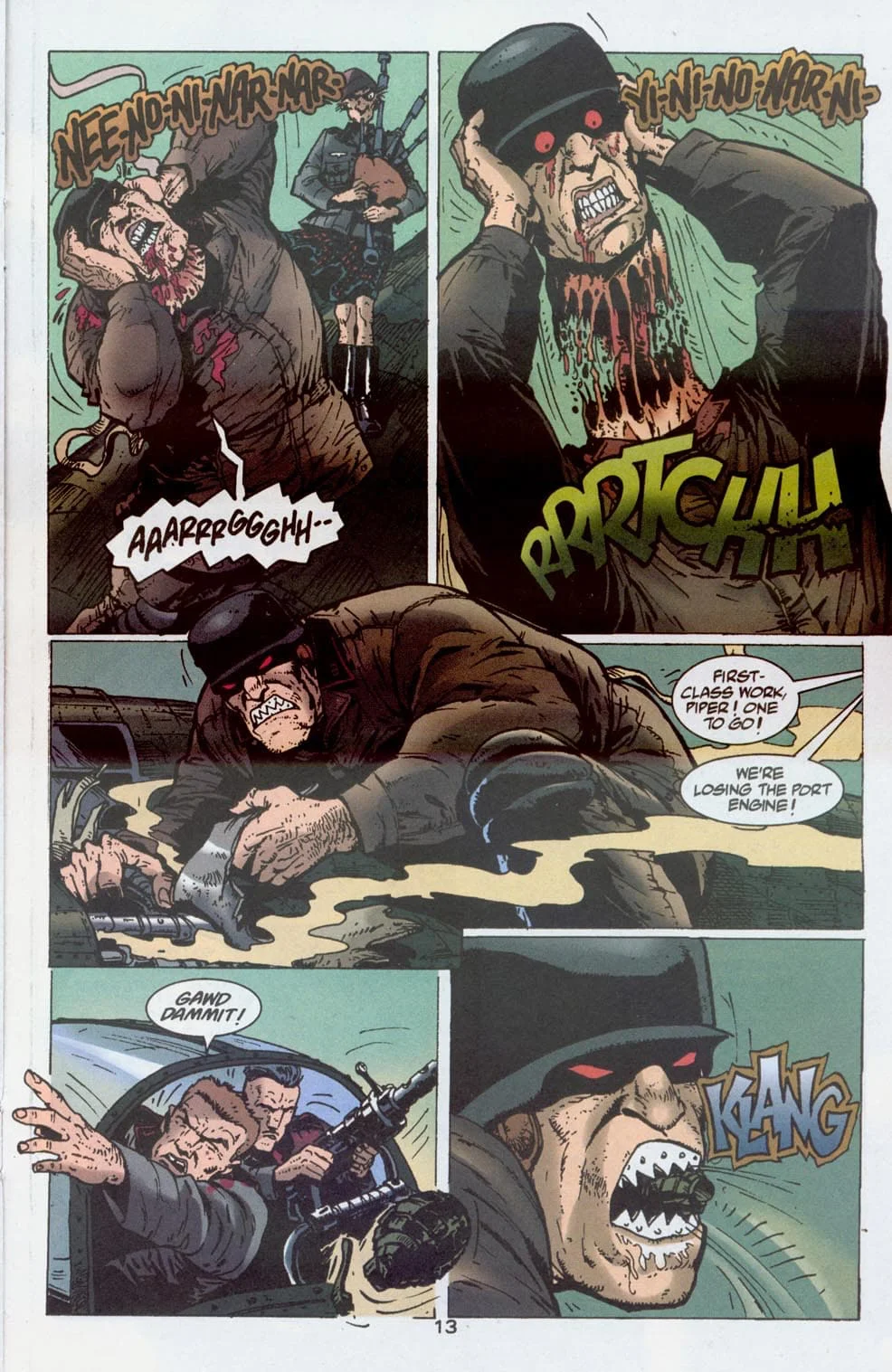
When this happened at the climax of the final issue and one of the Gestapo men surrounding our heroes yanked off his own head, I knew that it was unlikely that i’d ever again have an opportunity like this:

aaa_pull off your head.jpg

Looking back, I could do without the rather uninspired KLANG on the final panel. but that RRRTCHH was very important to me. I played with several ways of doing it, and finally settled on the old cliche of the sound effect itself getting ripped in half. i’ll try that one maybe once every five years. When it all went digital, I designed a sound effects font that would make the trick easy. But what you see here was all hand lettered.

I didn’t know until this morning that we’d lost artist Carlos Ezquerra a few months back. In addition to Rifle Brigade, I’d lettered various other projects illustrated by Carlos, most notably a Preacher graphic novel called “The Good Old Boys”, also written by Garth Ennis. I never got to meet Carlos, but he was a consummate pro, and it was always a privilege to get to work on his artwork. I think all of the projects, including Rifle Brigade, were done for DC’s horror imprint Vertigo. This was the Golden Age of Vertigo. It was all terrifically written stuff, if occasionally unnecessarily vulgar. It was always fun.

But it was this yank-off-your-head fight sequence that pretty defined the high point of the experience. My only regret here is that i wish the colorist had allowed the RRRTCHH to pop a little more clearly.

A lot of people have spent a lot of years lettering a lot of sound effects for a lot of comic books. But I may be the only one whose shoulders were touched for this particular motif. The moral of the story is watch out for opportunities when they knock. And if you know what’s good for you, stay the hell away from bagpipes.