The Green Shed, Part One
My friend Craig Gilkeson allows me free access to his property in Batavia. Two years ago I was wandering around there in search of a motif and blundered across a green shed that I found interesting.
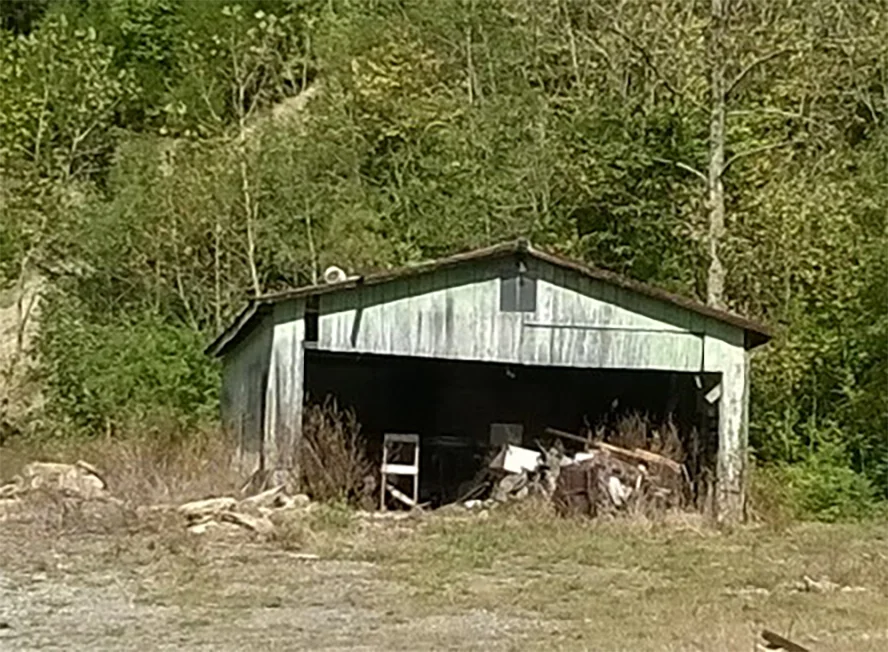
The green isn't all that clear in this photograph. It's a coat of paint from probably fifteen years ago, nicely weathered. I thought a picture could be built around the shed.
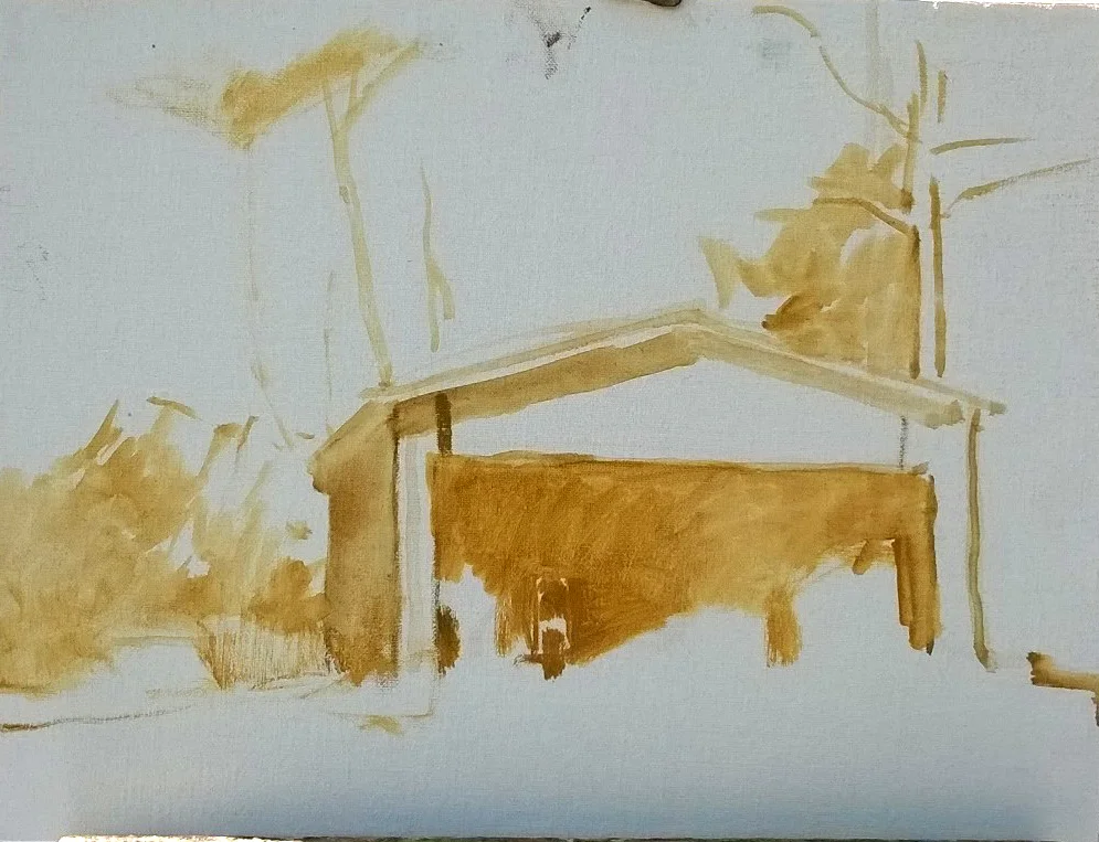
In the least common denominator, a painted image is simply a pattern of lights and darks. So it can be a good procedure to begin by indicating what's dark and what isn't, using a paint color that's muted enough that it won't have too strong an effect on what is to be painted over it. This is yellow ochre, cut with a little bit of ultramarine. Ochre is very cooperative, unlike some other pigments which instantly stain the canvas. You can remove ochre fairly easily with turpentine and a rag.
There would prove to be problems with this composition, problems that I would not notice for a year after finishing this little picture, although looking at the initial work above, the biggest problem is immediately apparent: two tree trunks which appear to grow out of the two sides of the shed, like the antennae on a set of rabbit ears. But this particular problem was not apparent to me at the time.
So here I was at the end of Day One, which happened to be October 4, 2015. Those two antennae are even more apparent now, although i still didn't notice the problem. Worth recalling is that nature's patterns tend to be better than anything you or I could dream up, so I tend not to be suspicious of what I see. But those two tree antennae where exactly where i placed them. Here was clearly a case in which nature needed a little bit of nudging.
But this was a pretty good first day. The canvas, which happened to be an 11x14", is covered, the values are correct, as are the colors, for the most part.
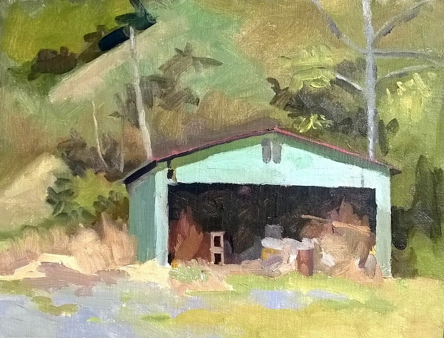
I put in four sessions on the shed. Here's what I came up with. I liked it but didn't love it. Certainly I didn't love it as much as I loved that shed with the muted, fading green paint. I stuck it on a shelf and forgot about it, except that whenever i glanced at it, those antennae bothered me more and more.
There were other things that bugged me. The shed is almost perpendicular to one's line of sight, which is rather dull to my eye. The vertical brushstrokes describing the ground plane defeat their own purpose; you can, and should, use the direction of your brushstrokes to indicate the thrust of a surface. The flatness of the ground could have been communicated that way. For example, below is a landscape sketch I painted yesterday. It's not finished, or particularly satisfying, but the brushstrokes describing the ground plane produce the sensation of flatness which is necessary to me:
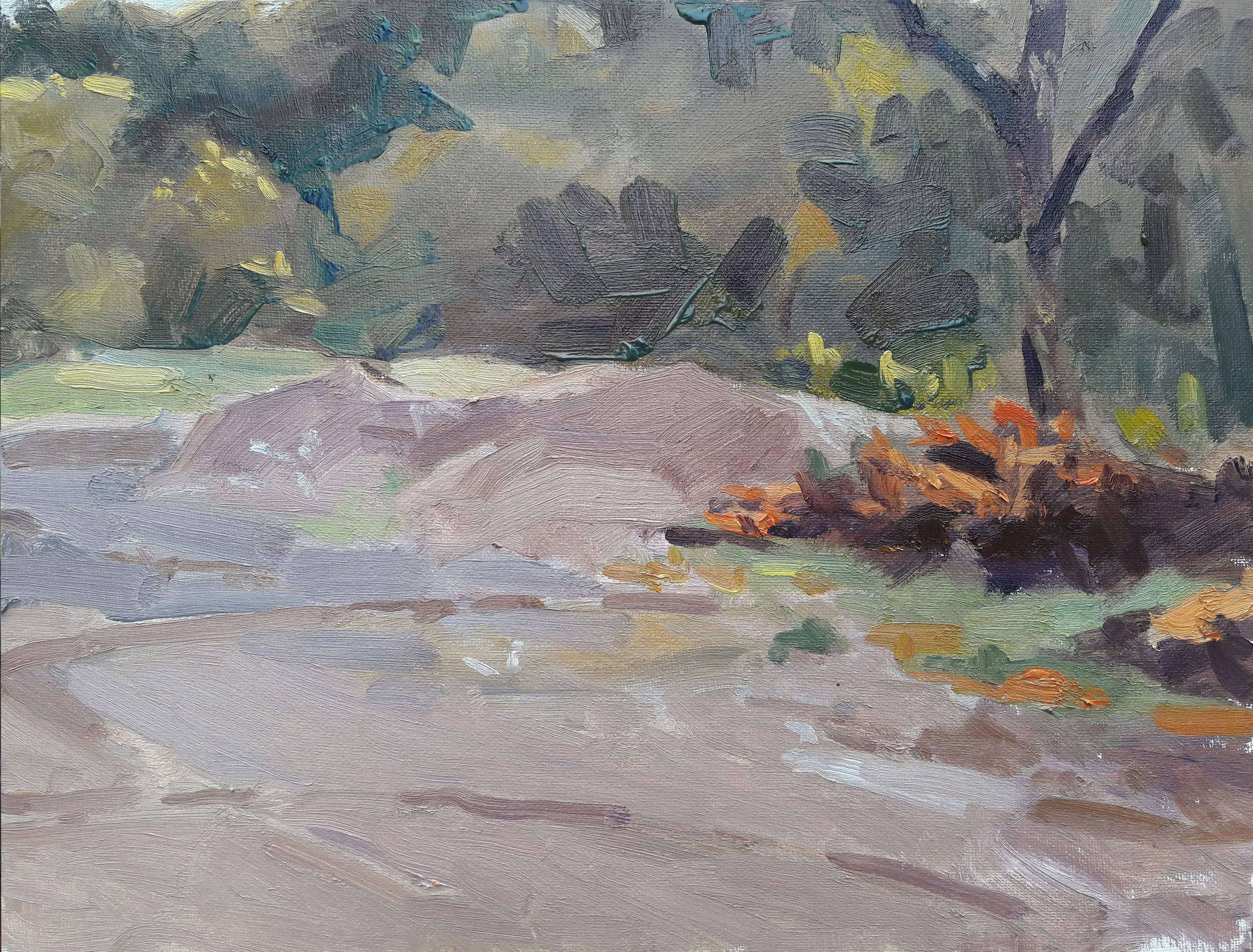
No offensive vertical brushstrokes on the ground to spoil the effect. I know a little more than I knew two years ago.
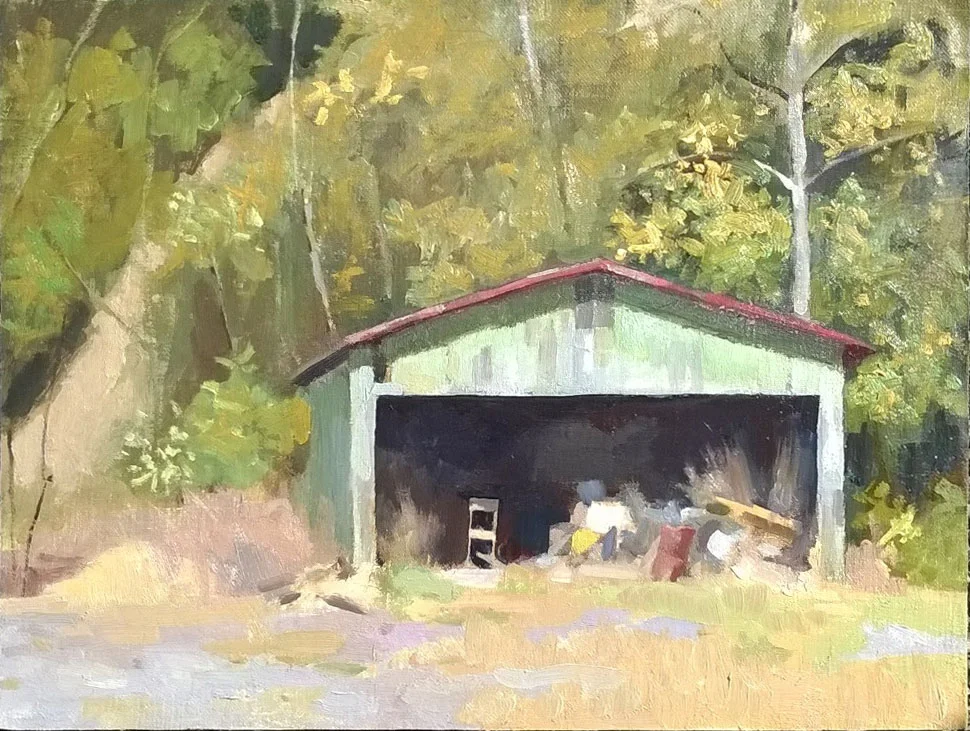
There's one more problem which stuck out to me in the 2015 opus, a problem that may not have been egregious had the picture been bigger. Take a look at a detail of the junk seen inside of the shed:
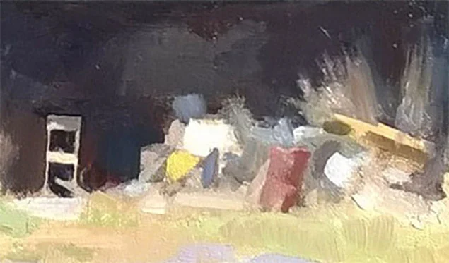
One might think that in a small picture you can get away with less detail. But a small picture invites the viewer to look close at its surface. This roughly drawn mass might have looked fine in a larger canvas, but here it is quite unsatisfying.
All told, the 2015 Green Shed opus was an honest attempt, honest enough that its problems are hard to ignore. A year later, I would decide to return to that spot and try again.