Stepping on Phthalocyanine
A couple of posts ago, we discussed the possibility of cutting Sevres Blue with its complement, to tamp down its explosive tendencies. I tried it this afternoon. A marvelous rack of clouds faced me, descending to an area four or five degrees above the horizon in which the massed clouds beyond the resolution of my eyes turned the area into a band of pale violets and roses. I squeezed out my normal palette: Rose Madder, Cadmium Red Light, Cadmium Yellow Medium, Yellow Ochre, Cadmium Lemon, Cobalt Blue and Ultramarine. in between the Cadmium Lemon and the Cobalt Blue i left a few inches. In this area, I squeezed out Permalba White, Flake White and the Forbidden Mystery Ingredient.
That Mystery ingredient was an experiment. I have no Cerulean worth using. I thought I would try the solution I proposed a few days ago, some Sevres Blue — a phthalocyanine color about as subtle as Napalm — mixed with a little Burnt Sienna. Burnt Sienna is an orange of very low intensity. Ideally, a mixture of the two will tamp down the intensity of the Sevres, enabling it to hit the notes found as the sky descends towards the horizon, but without infecting the entire canvas with its explosive power.
Mr. Tom Dunlay counseled me that others had tried the same solution, without success. He said that one ought to bite the bullet and purchase Old Holland’s Cerulean Blue. I don’t lightly ignore his counsel, but I wanted to try and see if I could get what I wanted out of the materials I already own.
After several months of painting exclusively on kraft paper, coated with shellac, i decided on an 11x14” piece of oil primed linen, glued to a panel, and rubbed with burnt sienna and turpentine to cut the brilliance of the white primed linen, and provide a more sympathetic surface into which i could paint.
it was a lovely experience. Before we look at what i did then, let’s look at what i did earlier that day, on a piece of cheap cotton, glued to a cardboard panel and rubbed in with a little ultramarine.
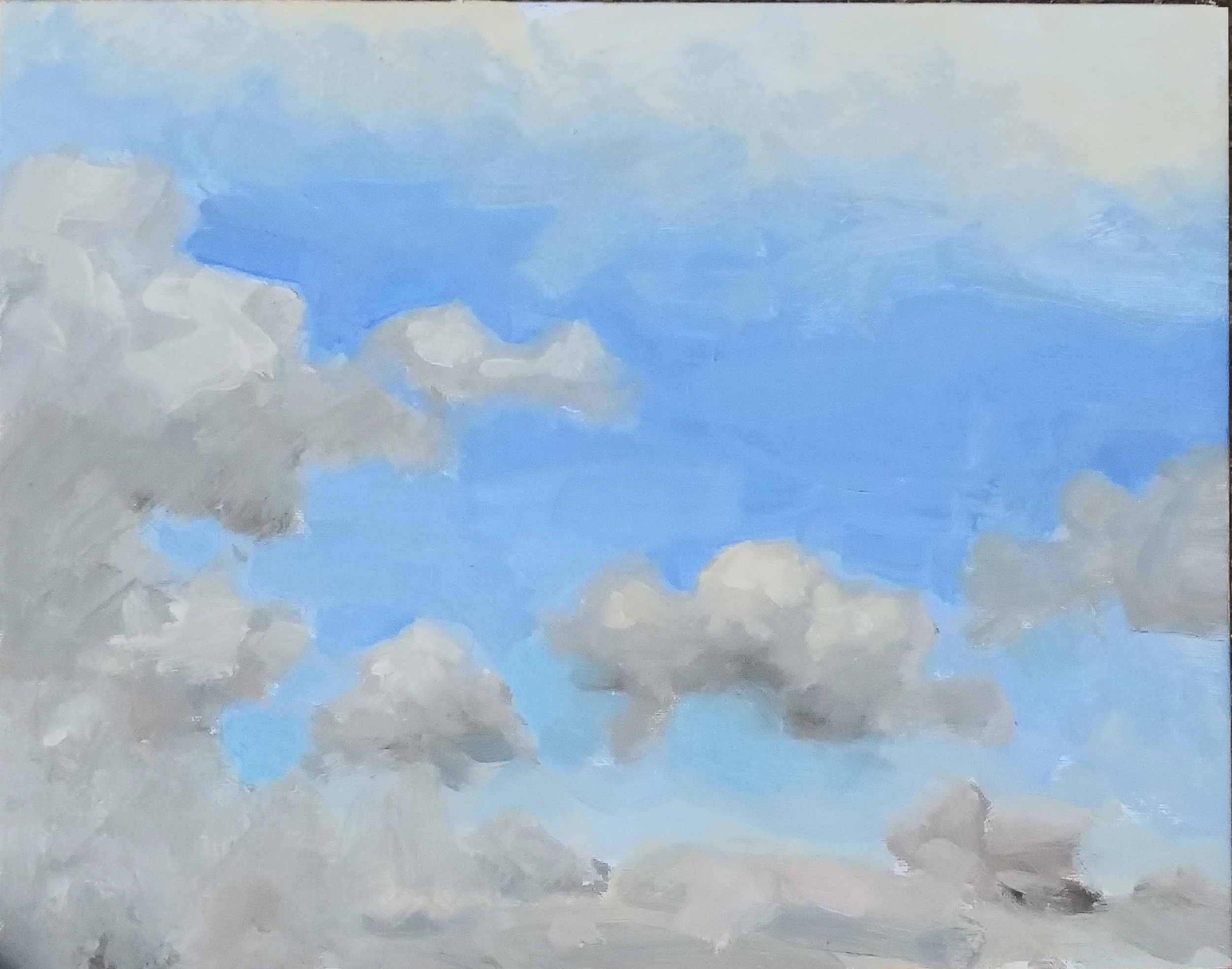
This was a surface upon which I could draw with a sable brush dipped in a mixture of Ochre and Ultramarine. (The shellacked kraft paper permits no such line drawing; it’s too dark, and too slippery.) the idea was to draw the cloud shapes as clearly and accurately as possible, and then paint into this map-in with a loaded brush. the procedure defeated the problem with shellacked paper, namely its resistance to clear, specific line drawing.
it’s not too bad a sky study. i may bring it out again in a few day, and paint over it the trees, telephone lines, and rooftops which overlapped the cloudscape.
A couple of hours later I headed out again and tried to do homage to a rack of clouds in Newtown, using that 11x14” linen panel.
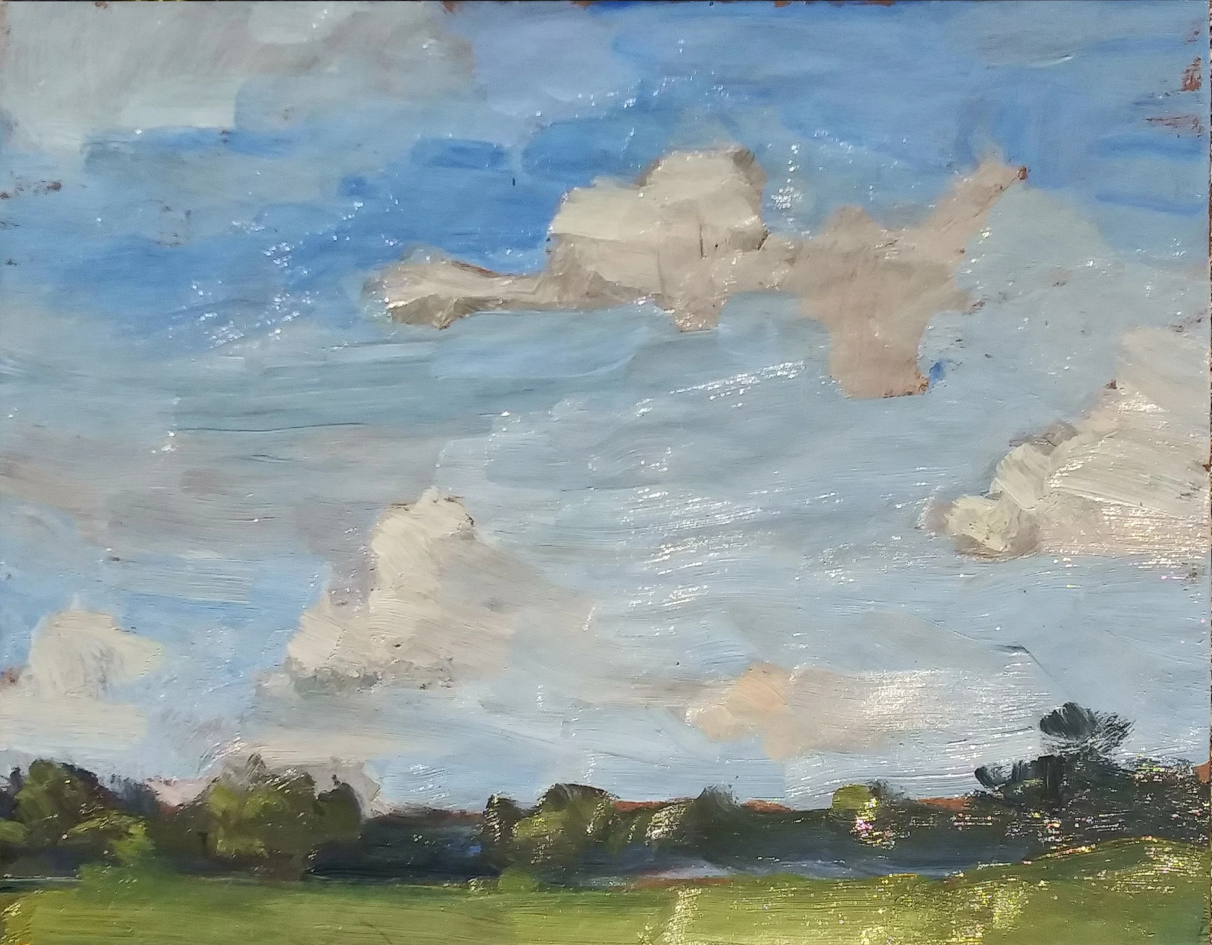
The lower half of the sky is the area into which Sevres cut with Burnt Sinna was painted. Sevres no longer dominates the scene. Sometimes the term “stepping on” is used for the practice of reducing the brilliance of a color by adding some of its compliment. You “step on” cadmium red by adding a bit of viridian. Here, the idea was to step on the Sevres by adding the Burnt Sienna.
For some time I’ve admired David Leffell’s stiff life work, particularly how he is able to rough in the background passages of his pictures with brushstrokes which summarize, rather than describe. I tried to do the same thing here with the ground plane and the trees.