One Method For Painting Cloudscapes
A lot of people ask me how I go about painting sky sketches. Well, that’s not entirely true. One person once asked me. So now, by popular demand, I will describe the process, at least as I currently do it. The method may change entirely once I learn more.
The sky does marvelous things. It reminds me of pouring a double shot of cream into a cup of hot coffee. The two liquids gradually mix in a series of patterns which are a lot like what clouds do, and this is not accidental. Cream is cold, coffee is hot, and the two liquids waltz around each other in much the same way that cool air and warm air do, thus producing the movement we see in the sky.
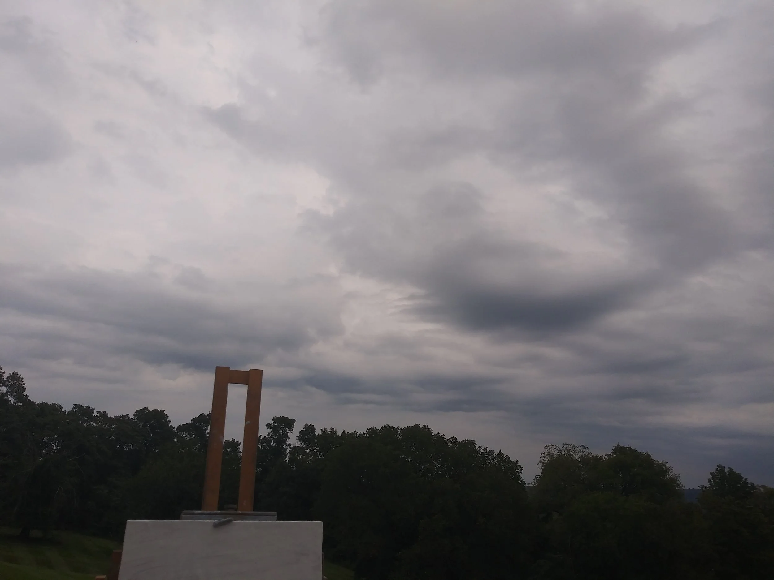
This particular scene interested me because at the lower right, the clouds and the distant hills onto which they were pouring rain became one; the outline of the hills was lost. You can’t see this in the photograph, but it was very plain to the eye.
That lost outline of the hill at lower right just screamed “rain”. I thought it was a terrific little bit of visual business.
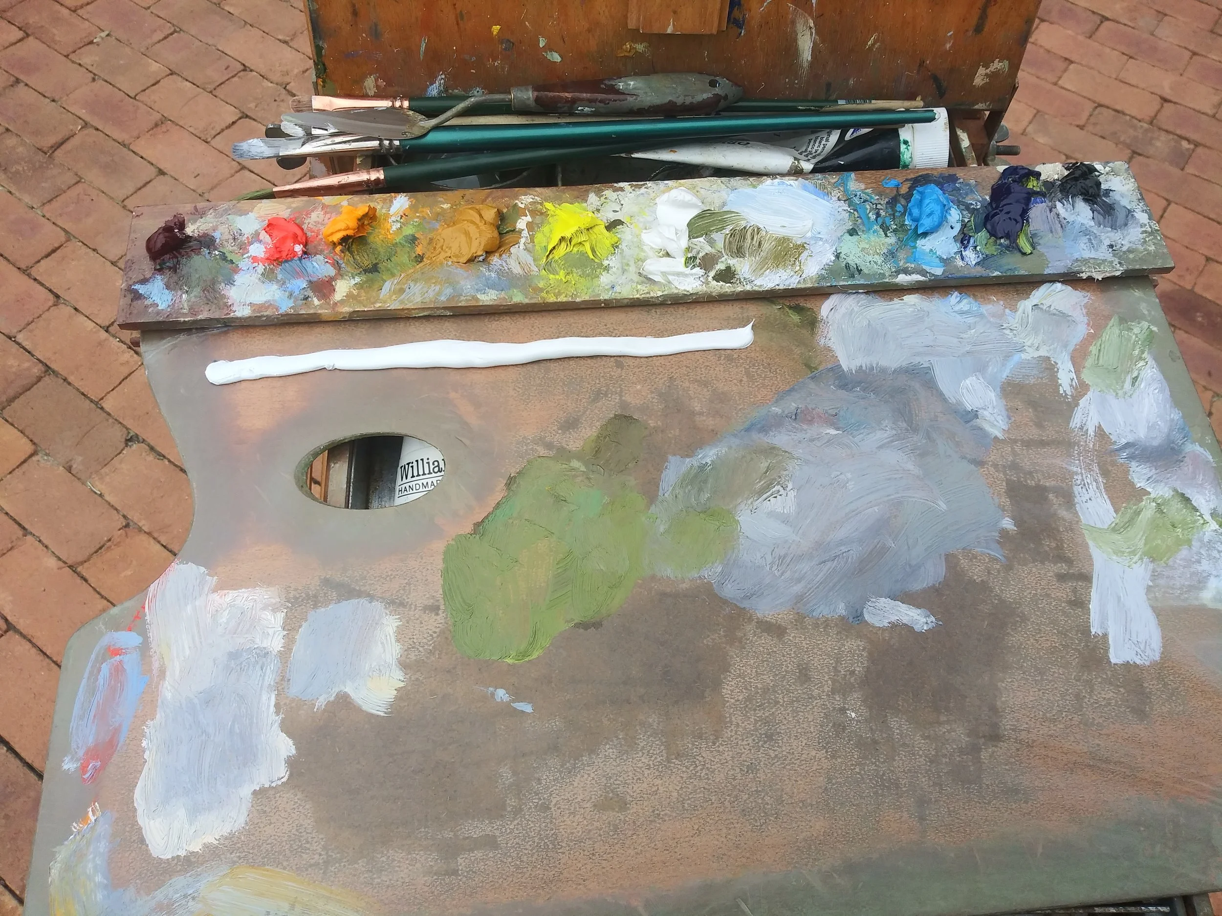
These are the tools I favor. The brushes are bristle flats of various sizes. For this sort of work, the #8 is my favorite. The palette is Permanent Madder Deep, which is kind of like Alizarin Crimson, but without Alizarin’s almost radioactive tinting strength; Cadmiums Red Light, Yellow Deep and Lemon; Yellow Ochre; Flake White; Sevres Blue; Ultramarine; and Ivory Black. One can get drummed out of the Impressionist Union for allowing black on one’s palette, but if you’re scrambling to paint clouds, it’ll get you where you want to go faster than you could without it.
And that long piece of white at the top of the palette is a Titanium based product called Permalba. Why two whites? Permalba is much better for painting skies rapidly; its creamy texture permits very loose, long paint strokes. If painting with flake white is like carving in marble, using Permalba is like using clay. When we look at how the sky was painted, the stuff’s advantages will be clearer.
Here’s a snapshot of the sky i decided to paint this afternoon. What interested me was the churning dark clouds, and especially the area near the horizon where a lovely pink sky area was visible. I would have to radically alter the trees and ground plane, because my center of interest would have been covered had I left things as they were.
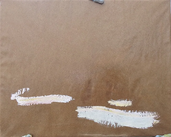
So here’s how I began. Because these pale pastels were what the picture was really about, I decided to establish them first thing. My normal procedure, and most people’s, is to paint from dark to light. But here these light area wanted to be laid down first. The use of a dark substrate — kraft paper sized with shellac and taped to an 8x10” piece of cardboard — also invited me to begin with my lights.
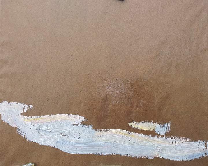
I finished the lay-in of the low portion of the sky. Although I intended to fill a lot of the lights here with trees and ground plane, I deliberately painted past the horizon. This is a common procedure in painting anyway, “painting through”: you paint your lights past their real edges, and then describe those edges with dark paint.
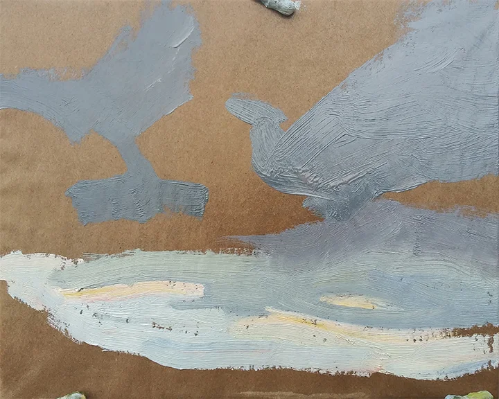
The picture was maybe two minutes old at that point. Now I mixed the gray tones for the dark clouds above and began painting them in. I call them “gray” but they’re actually very dull blues, greens, reds and yellows, very close in value to each other, and so low in intensity that we perceive them as grays. For example, the lighter gray just above the lights is a green which gradates into a blue. The darker patches above are blues and violets, all very low in intensity.
One reason impressionists don’t like having black on their landscape palettes is that with the presence of a black ready to hand, the painter might simply mix it with white, rather than recording the subtle variations of the darks: a reddish dark, a yellowish dark, a bluish dark. But if you’re prepared not to get lazy with it, Ivory Black is a wonderful tool.
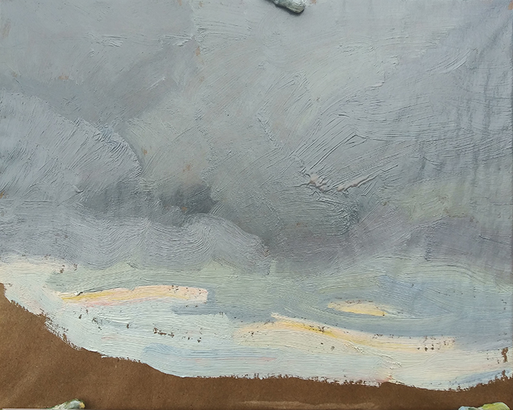
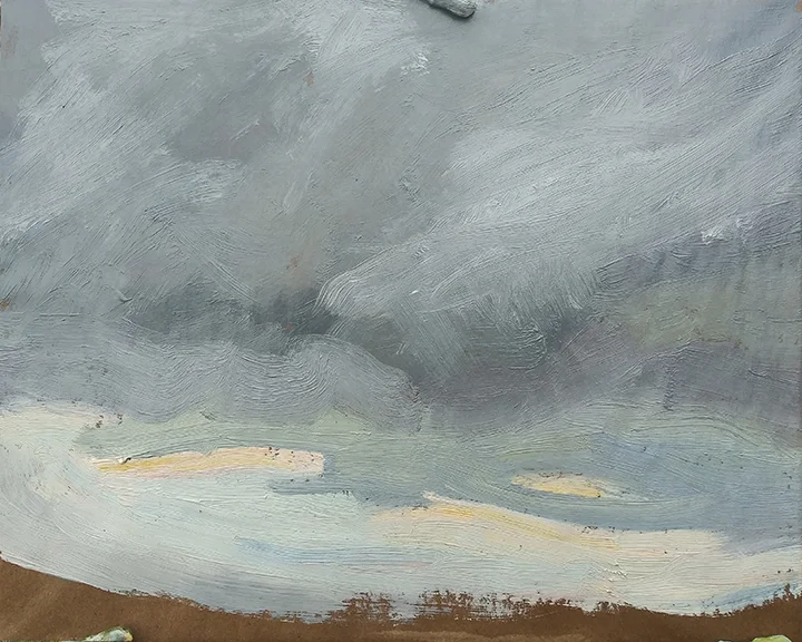
Another couple of minutes and the dark clouds were laid in. This can be adjusted to any desired degree, but now the whole sky has been painted in. This means that its values, chromas and hues can be evaluated and, where necessary, corrected. The churning sensation of the dark clouds still must be suggested, but this is a far easier task now that the big areas of the picture have been roughed in.
The completion of any picture, whether a full-blown painting or a sketch like this, is a matter of correcting mistakes. But till the canvas is covered, it’s very hard to recognize mistakes. Now it’s been covered, except for the ground plane and trees, whose value is already approximated by the dark substrate.
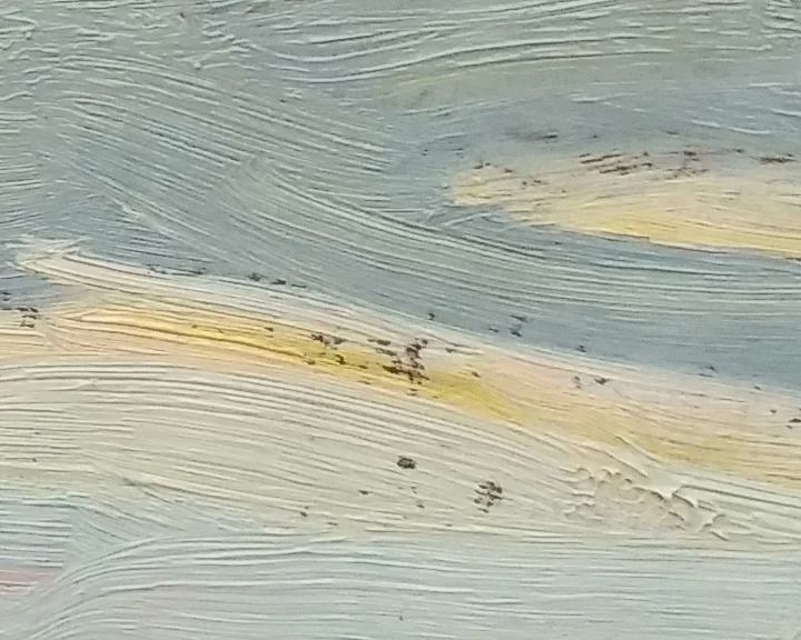
In this closeup of the previous image, you can see how broadly the sky has been painted in. The #8 flat bristle brush, loaded with colors tinted with Permalba, nicely describes the sensation of the churning sky. A sable brush’s strokes would not be so visible. Those strokes add to the sensation of atmosphere.
In general, one always ought to mix the best color one can, lay it down solidly, and leave it alone. Don’t futz with it; lay it down and leave it alone. if it has to be changed, you can change it. But noodling with your painted passages for no particular reason only weakens them. Paint, laid on cleanly and left alone, has a nice sense of freshness to it, which if you’re smart, you won’t mess with.
Well, let me modify that a bit. The gray murk of the sky needed to be messed with, to try and capture the churning of the dark clouds. Now with a bed of wet paint to work into, I was able to attempt this, lightening some areas and darkening others.
We’re maybe twelve minutes into the picture at this point. What I saw when I began is very different from what was there now. But the same kinds of things were happening. The swirling clouds, tumbling over each other, were what I tried to capture.
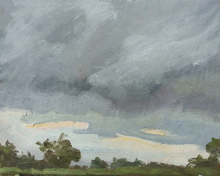
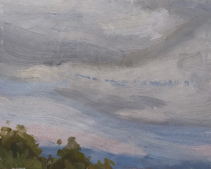
In a sketch of the sky, not a great deal of ground plane and tree detail is needed; just enough to place the sky in a context. All of these shapes were taken from what lay before me, but their size and placement was changed. Again, the star of the picture was the light area above the horizon, so obscuring it with trees would have been foolish. Fifteen minutes of deliberate, focused work. It’s not what you’d call a fully realized work of art, but it certainly evokes this particular afternoon in this particular locale.