The Evolution of Photography for Television
I’ve never seen Hill Street Blues. During the first years it aired I didn’t own a television. When I finally did, I tried, but the labyrinth plots and the huge cast of unknown characters seemed more of a nuisance than an invitation, and I passed on the opportunity.
A few years later when the show’s stepchild NYPD Blue came around the situation was different. I still had a TV, and also a wife with taste. She began following the series, and I began following her example. The adventures of Andy Sipowicz and his colleagues were the Muzak of our lives until the show ended its run in 2005. We loved it, and when we cut the cable and began getting TV off streaming last year, we decided to revisit the adventure. We’re currently up to Season 8. It’s worth rewatching, in my humble opinion.
So I began wondering if that earlier Steven Bochco brainchild Hill Street Blues might give us similar pleasures. Unlike me, Lisa did watch Hill Street on its original run, but she was game. We couldn’t find it anyplace for free, and we’re not quite curious enough to pay money for it. But I did check into YouTube to see what they had. There are quite a few full episodes available there, in indifferent image quality, but free nonetheless. I gave it a whack.
Weirdly enough, I found myself unwilling to give it even an hour of my life. I had more important things to do, and more seductive ways of entertaining myself. I was a while realizing what it was that immediately so disappointed me in the 1980s series.
I never saw St. Elsewhere or L.A. Law or Bay City Blues or even Cop Rock. But NYPD Blue had made a Bochco fan out of me, and yet for some reason this early series was immediately unwatchable. When I realized what it was that bothered me, it touched on a point which may possibly apply to other areas of the arts, and which also may shed some light on the relationship between evolving technology and the creative process. But please. I invite those who do know something about this stuff — and I am thinking of tough and insightful critics such as New York film critic Michael Sargent; the brilliantly articulate Arlen Schumer; perennially good-hearted curmudgeon James Romberger; legendary comics editor Scott Allie, whose understanding of TV production enabled him to turn filmed features into great comic books; my sister Madeleine Robins, who has spent six decades explaining to me practically everything that I know, and much that I do not yet know, and whose dozen published novels and scores of short stories certainly qualify her as a world-class authority on storytelling; and especially my Emmy-winning brother-in-law Danny Caccavo, no stranger to the ins and outs of post-production for television — to chime in here, and if necessary, tear what follows to shreds. You guys are smart, and I’d like to get smarter.
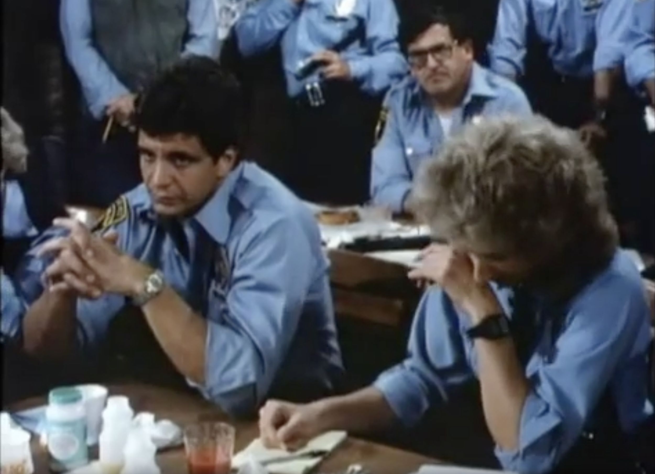
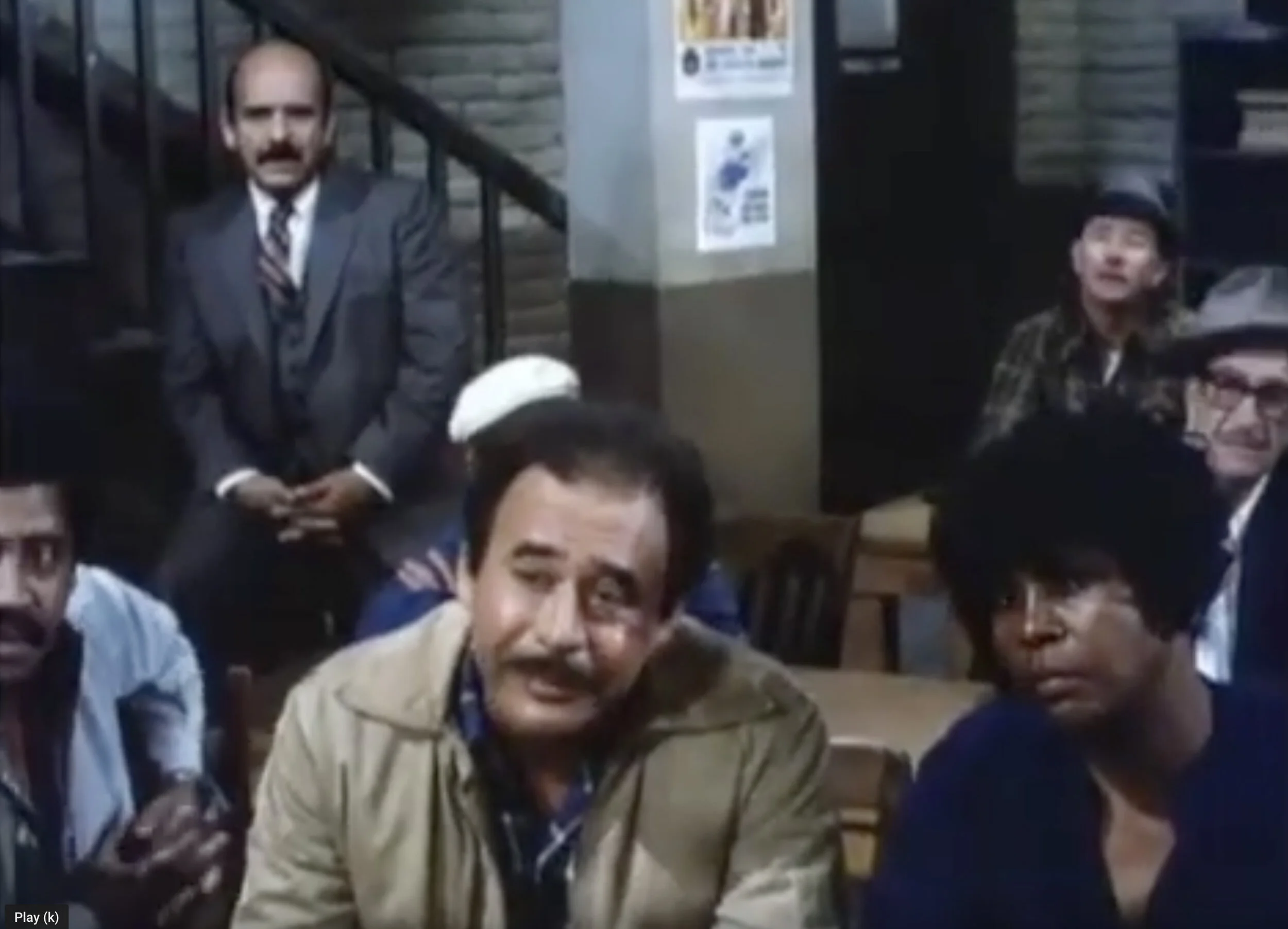
What bothered me about Hill Street Blues was its cinematography. Take another peek.
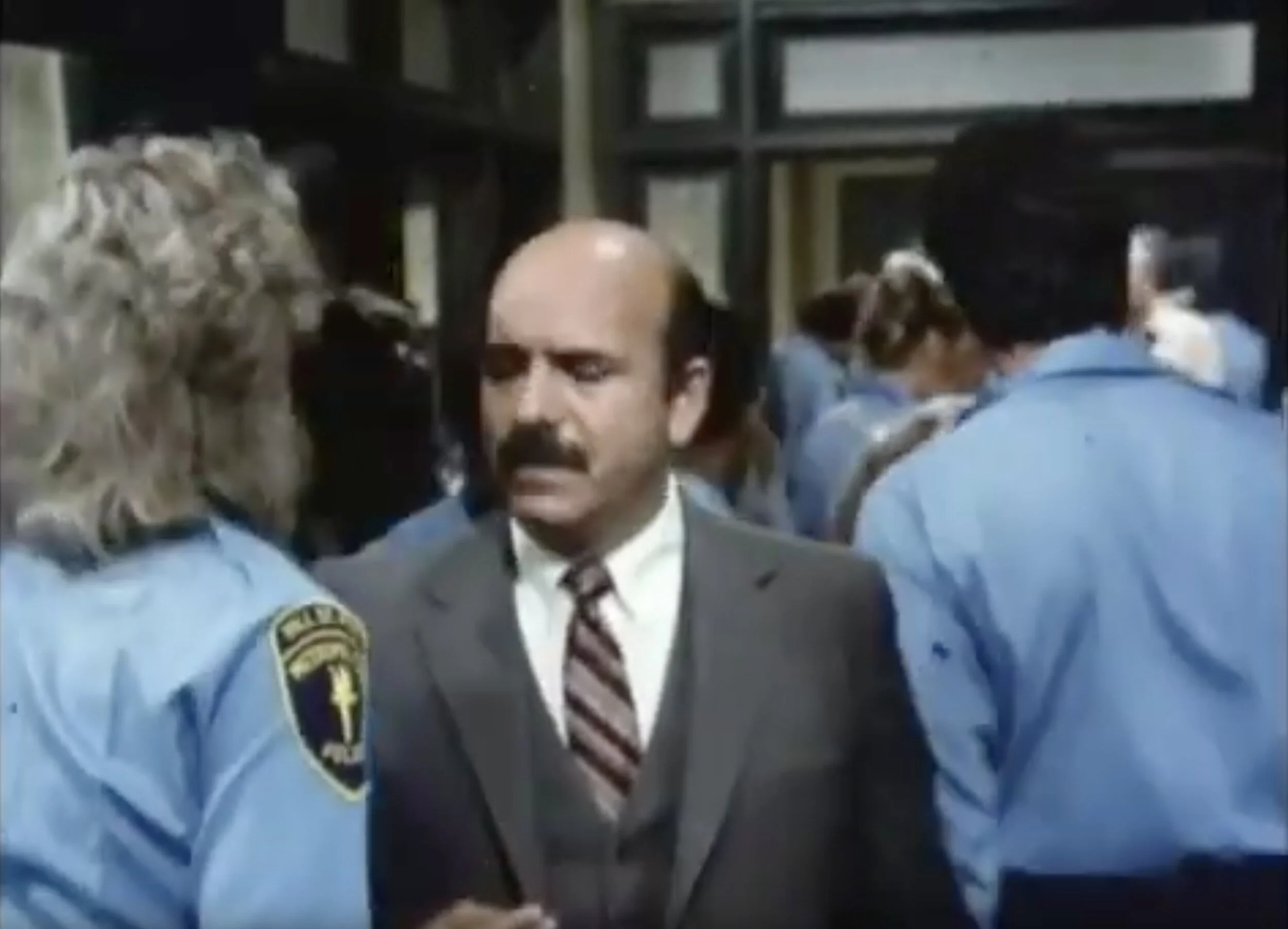
The lighting here is absurdly bright and clean. It could have been an episode of The Mary Tyler Moore Show or Rowan and Martin’s Laugh-In. Comedy lighting. It was not invented for television, but it was pervasive in television. The low-resolution screens didn’t allow for much in the way of elliptical imagery; everything had to be crystal clear. Insiders called it “The Aaron Spelling Look,” because that sort of sharp-focus, brightly lit photography hit its apotheosis in the nighttime soaps Spelling churned out in the 1980s. Spelling himself went on record that he didn’t absolutely want there to be no shadows or nothing ever out of focus, but he said he spent a great deal of money constructing and dressing the sets for his shows, and he damn well wanted all of that to appear on screen. The above image is not quite so clean and clear, but it also could not be mistaken for a real police station, or a real anything, except a real sound stage.
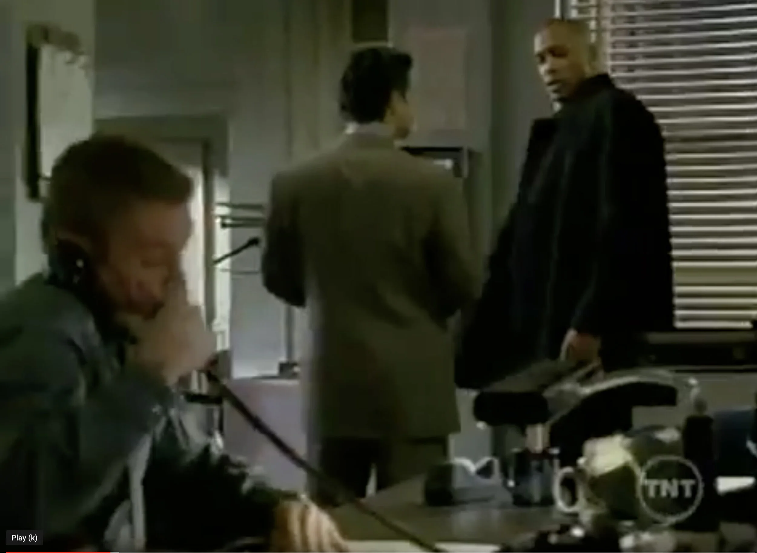
A decade and some change later, the cinematographic landscape had changed a bit, and show runner Bochco came forth with his 1990s answer to the cop show.
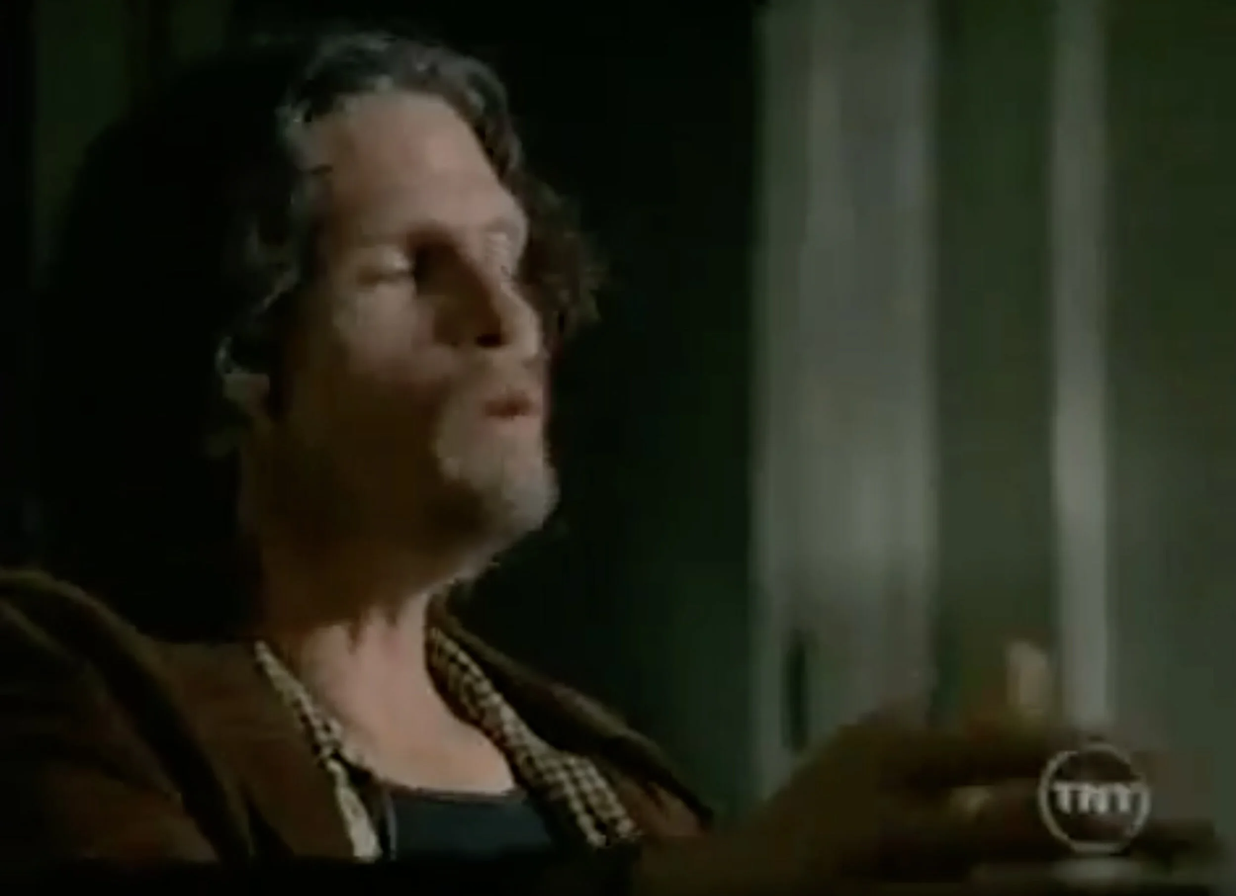
On NYPD Blue, the light was subdued, made to look accidental. Obviously it wasn’t; the series interiors, like those of its predecessors, were played on sound stages, with lights mounted on catwalks far above the false walls. Perhaps in a few years an image like this will look as ridiculous to the eye as the previous one, shot forty years ago. But it was this change in the style of cinematography that made Hill Street a hard sell to me; it purported to be realistic, but every image screamed fakery.
Look at the highlight on the man’s head on Hill Street. Look at the pool of light that surrounds him. There’s nothing accidental about this, although perhaps it looked that way for its time.
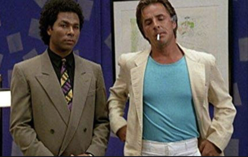
You know, maybe I missed the chance to try out my visual prejudices and suspension of disbelief on Hill Street, but I was definitely around for the above specimen of eighties culture, and I adored it. But criminies, find me lighting like that anyplace outside of a movie studio and I’ll sell you the Tamiami Trail.
Does this mean that Hill Street’s Director of Photography William Cronajer or Miami Vice’s Dion Beebe were just formulaic hacks? Absolutely not. The color palette of the former seemed bent on the color blue; the latter made earth colors pariah. This was serious stuff for episodic television. The imagery in both shows was innovative and exciting. Without actually sitting through a few episodes of Hill Street, which I would like to do, I will stipulate that the visual styles of both shows well served the storytelling, which is all that photography should aim to do.
But there’s no getting around the verisimilitude absent in the 80s shows, and far more fully realized in the 90s Bochco series. This was not solely a matter of the decade: the lighting in episodic TV in the 1990s, for the most part, far more closely resembled that of the 60s and 70s than what we saw in NYPD Blue. So the question remains, how did Steven Bochco obtain a look in the later show that escaped him completely in the earlier show, and also escaped the producers of most other episodic TV of the 1990s? There are several reasons that are clear to me. Danny, Madeleine, Mike, James, Arlen, Scott, maybe you can add a few more to what follows, or debunk what I say here. Please jump in.
One difference was Steven Bochco’s comparative track record in the earlier and later periods. By the 1990s he was a proven commodity, and surely had more sway with the networks over what would get on screen. If this meant a grimmer palette and uneven lighting on the sets, Bochco got what he wanted, along with the legendary, and silly, nude scenes.
But maybe the biggest difference was the change in the image quality possible on a TV screen. NYPD debuted quite some years before digital television was standardized, but the writing was on the wall, and Bochco must have realized that the sort of surreal clarity demanded in TV cinematography was about to go out with the horse and buggy. With the kind of detail and vividness about to be possible on the plasma screen, perhaps he felt that a lot of that vividness could be sacrificed for the sake of storytelling, of ambiance, of mood.
It’s certainly not like Stephen Bochco invented realistic film lighting in 1993. You can take that one back to the 1920s if you want, or even earlier. Closer to home, the sort of naturalistic lighting attempted on NYPD Blue was absolutely nailed a quarter century earlier, when Owen Roizman shot The French Connection on interior and exterior locations in New York, using very little artificial light, and capturing the heartbeat of Manhattan in a way no one had ever done before. But Bochco’s contribution was to bring this sort of thing to the small screen, perhaps in anticipation that the new viewing media would allow more and more playfulness, and less and less spelling things out.
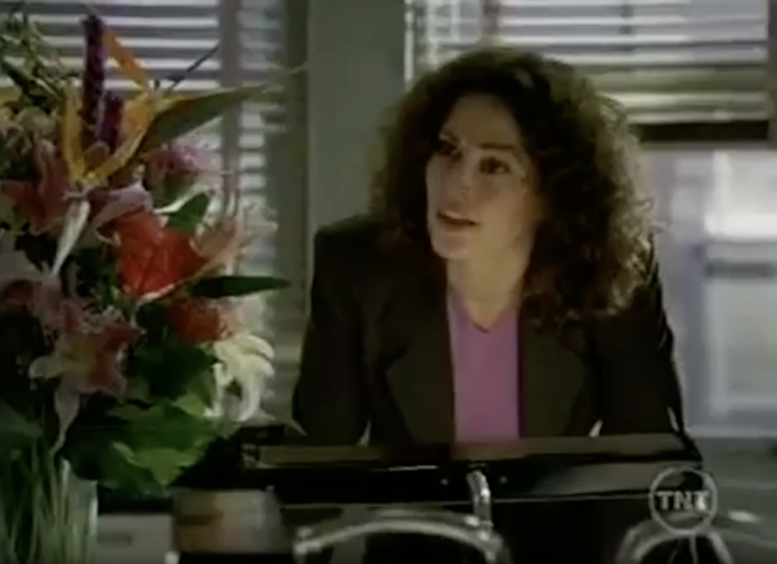
This is the sort of image Joan Crawford or Bette Davis might destroy a cameraman’s career over. I’ve never worked in film, but I’ve heard stories. (Arlen? Mike? Madeleine? Danny? Scott? James? Am I blowing smoke here?) A strong leading lady could get a director of photography fired for a shot like this. Actresses were supposed to look terrific in every shot, every frame, even at the cost of the story. Bochco didn't get the memo? Or was storytelling the priority, the altar upon which all other concerns were sacrificed? Kim Delaney’s career didn’t collapse over this image. At 58 she’s still getting work. Maybe some of this was because she trusted the producers who hired the cameramen?
Is this literal reality? No, but it’s a far closer suggestion than Bochco could get away with in the 80s, and I would submit that much of the reason for this was that TVs, even before it all went digital, could spell things out more clearly to begin with. So why not lose some edges and allow a little more chiaroscuro than was permitted a few years before?
There’s another possible reason for NYPD’s grittier visual style. In order to produce the sensation of New York City on a series mostly shot in Burbank, they shot a lot of footage of NYC street scenes, and mixed it in with the exteriors filmed on Warner’s backlot. A visual style had to be devised for which both the generic street footage and the backlot stuff, as well as the sound stage interiors, would work nicely together. The answer seemed to be to key everything to the generic footage. It was all shot in a style evoking the sensation of what were essentially home movies, done with a sense of carelessness on the streets of Manhattan, on 35mm film.
I do not presume to pass any judgment whatsoever on Hill Street Blues. I am only saying that as one used to the later product, I was surprised and disappointed by the earlier, probably unjustly. I’ll give it another chance. What I am suggesting is that cinematography is an extremely powerful element of storytelling, and so much so that it made what was probably a very real and honest comment on the human condition look passé to me, for no good reason except that I did not own a TV in the early 1980s.
And if you happen to make your living shooting motion pictures, you surely don’t need me to remind you that nothing is more important than telling the story. Absolutely nothing.
Oh. One more thing…
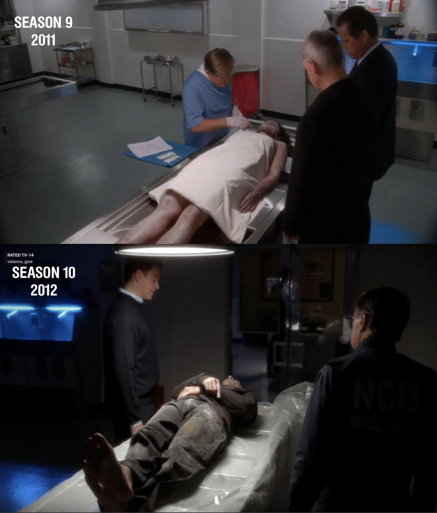
In the comments below, Marcus Adams points out that this sort of uber-natural lighting can be taken a bit too far, and he cites the change in the visual style between the 9th and 10th seasons of NCIS. Above is the image he used as a case in point.

