ASYSTOLE, or the Art of Designing Type for Comic Books, Part 2
Now that we've hopefully cleared up my misunderstanding of Richard Starkings, John Roshell, and Comicraft regarding their philosophy of type design for comics, I'd like to go into the things which I felt needed to be addressed when I got around to following in their footsteps, turning my own hand lettering style into type which could be used in the all-digital environment in which comics are made these days.
Let's look at the problem using as a case in point a technical term used by doctors and those who examine EKG charts. It's a lovely word for a difficult problem, when there is no detectable heartbeat. As problematic as that situation is, the word itself brings to light some problems for those of us who wish to design type which suggests the way a craftsman with a pen shapes letters. But before we get around to the craftsman with the pen, let's look at the word as seen through the medium of the long-forgotten manual typewriter.
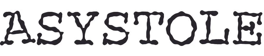
The typewriter, due to the technical limitations of its early design, could not allow the various letters of the alphabet to occupy different amounts of horizontal space. Upper case, lower case, I or W or even a period, all of these were assigned exactly the same amount of horizontal space. This is referred to as Mono Spacing. Mono Spacing is at its least offensive in an all upper-case environment, such as is seen here. There are two S's, both identical.
Both the sameness of spacing and the sameness of identical characters were problems which I, and everyone else who wished to design type for comics, wanted to overcome, as these do not resemble the work of a human being holding a pen. Such a person can never shape the same letter exactly the same way twice, even if he wants to. And he certainly does not assign all glyphs the same amount of horizontal space.
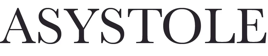
This brings us to the next step forward, although it predated the typewriter by 400 years. This is Baskerville, one of the great classic type faces of the Western world. In the era of moveable type, each character of the alphabet was a separate piece of metal, and could occupy as much or as little horizontal space as was needed. There was no situation where every character was the same width.
But because these pieces of type occupied a given width, characters couldn't be brought closer together, even if the eye felt that such a compression was necessary. For example, the pairs AS, TO and LE look fine. But SY, YS, ST and OL all feel, at least at this magnification, like there is an undue amount of white space between characters.
It is a testimony to the brilliance of the early type designers that this problem is almost undetectable in a printed block of text, although italic alphabets can seem wrong to the eye. The reason for this is obvious: slant a character and you're adding white space, if there is no way to subtract from the distance between that character and its neighbor.
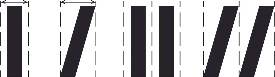
The two Roman I's can sit a comfortable distance from each other, but if we slant them, they must be further from each other.
It is, in fact, a testimony to the genius of the great type designers that italic alphabets were not only made and used, but that the presence of extra white space, rather than looking clunky, actually had a look of great elegance. In the opinion of many, myself included, the single most beautiful font ever designed in our alphabet is Caslon Italic. Even today, with all of our technology, it's never been equalled.
Still, having an inviolable quantity of white space on either side of each character of the alphabet remains a problem to the eye. When the so-called "hot type" machines appeared in the second half of the 19th century, their advent brought no solution to that problem. Each hot type character still had its own width. Nothing could bring two characters closer together except for proofs, a razor blade and rubber cement. I was a teenager before a practical solution to this problem came to be, namely photo lettering. The technology of the late 1960s enabled characters to be optically moved close together or far apart. Page through a magazine or book cover from the 1970s to the mid 1980s and you're bound to run into examples of this technology.
But in the meantime, if you wanted to do a decent looking comic book, you had to hire a human being. Fortunately so, for me and a few others, who were able to make a tidy living with Speedball pen points, rapidographs, and india ink.
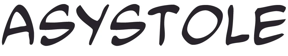
This is the second type face I ever designed, based on my own hand lettering. It has many of the same problems as the Baskerville example above. Each character has its own horizontal quantity of space, but to the eye it looks wrong. Here the culprits are SY, YS, ST, and TO. No human being with a pen would have made these errors, but in the early days of optical type, they posed a formidable problem.
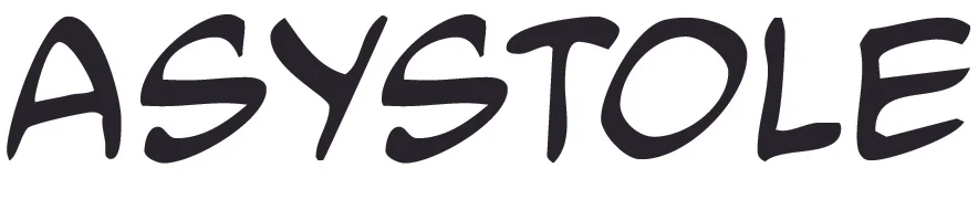
Here is a solution, known as "kerning". While "spacing" applies to the amount of horizontal space assigned to each character, "kerning" applies to pairs of characters. Kerning is a series of exceptions. The designer, in effect, says, "The width of the upper case S is so many units except when the next character is a Y" or "The width of the upper case S is so many units except when it follows a Y", and so on. Kerning enables characters to be spaced farther apart or, more often, brought closer together with certain other characters. Above is the same word, typed in the same font, but with kerning enabled. It's not perfect, but it's easier on the eye.
My father came of age in the era of hot type, and never entirely accepted the rather sterile look of photo typesetting. Even into the late 1980s there were hot type machines in operation, and Pop often hired them to obtain effects not possible in the photo lettering of the time. He was certainly aware of kerning, and had done more than his share of such work with a razor blade and rubber cement. But an extended list of kerning pairs added to the computer memory requirements of a type face. When I began designing type, Pop and I discussed the problems inherent in the task of kerning. His advice was to identify maybe 100 pairs, take care of them, and let the others attend to themselves.
By this time, Pop had lost his vision to macular degeneration. I couldn't show him the problems of only 100 kerning pairs. It's like eating one salted peanut. The need just snowballs.
Modern computers can handle a gazillion kerning pairs, assuming the designer has the patience to identify them. But there are also lot of other cool things that modern computers can do, which brings us to the Holy Grail of comic book type design. But I guess that'll have to wait for Part Three.