ASYSTOLE, or the Art of Designing Type for Comic Books, Part 3
I spoke cryptically about the Holy Grail of digital type for comic book lettering. It's simple enough, at least from my own point of view: make the stuff look handmade! This is not entirely a matter of caprice, or of the stubborn prejudices of a guy who did handmade comic book lettering for a quarter of a century. Rather it's a matter of unobtrusiveness, of doing everything possible to help tell the story. Comics are drawn by human beings, with pens and brushes which produce lines of varying weight. Lay mechanically perfect letters on top of that and the effect is jarring or funny, but not harmonious. When Al Feldstein took over Mad Magazine from Harvey Kurtzmann, one of his editorial decisions was to replace hand lettering in the magazine's movie and TV parodies with typeset copy in oblong balloons. It was a good move: it was intrinsically funny, because of the dichotomy between the dynamic pen line of Mort Drucker or Al Jaffee or Jack Davis, and the mechanically perfect type and balloons. It calls attention to itself. It screams, "I'm kidding, I'M KIDDING!!"
But me, when I make comics, I'm not kidding. I want to help tell a story. I want the artist and writer to look as good as possible, because the better they look, the better the storytelling experience for the reader. And the last thing I want is Mad Magazine. I want handmade, and if I can no longer sell handmade lettering in today's digital environment, I damn well want the stuff to look handmade.
So let's take a peek at real handmade, and notice a few very charming qualities about it, which helped to tell some of the best stories comic books have ever had to tell.
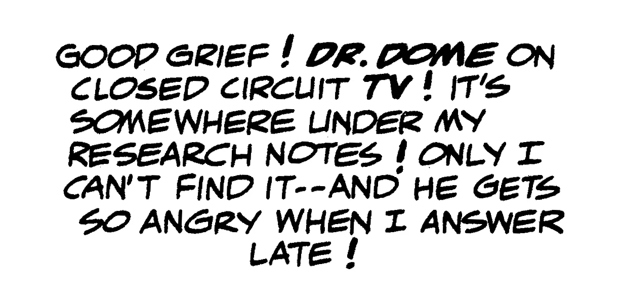
Here is a bitchin' sample of hand-made comic book lettering, from what I consider to be one of the most perfectly lettered comics ever published. It is from Plastic Man #1, cover dated November-December 1966, lettered by the great Gaspar Saladino. It was a very funny story, written by the eternally goofy Arnold Drake and drawn by Eli Katz, whose nom de plume for comics was Gil Kane.
The story's funny, and so's the lettering. Even the balloon shapes were funny, as I'm sure you'd agree if I'd shown them. Gaspar was lettering more than a dozen comics every month at this point in his life, and most of them were quite serious — as were his letterforms. But here he fell into the zany mood of the story, and you can feel it at a glance.
That's charming characteristic #1 of handmade lettering: its letterforms reflect the mood of the story.
This falling in with the mood is tough in digital work, and I've made little attempt to chase after it in type design. Crafting a usable font family takes months, and it's really not practical, given the other production values I insist on in designing type, to have "funny" families and "serious" families. I've tended to let the story and art provide that sort of atmosphere, and hoped that my letterforms reflected that mood, even though they're precisely the same for funny stories and serious stories. I do have a few goofy type families, and I occasionally use them, but for the most part, one family is used for everything.
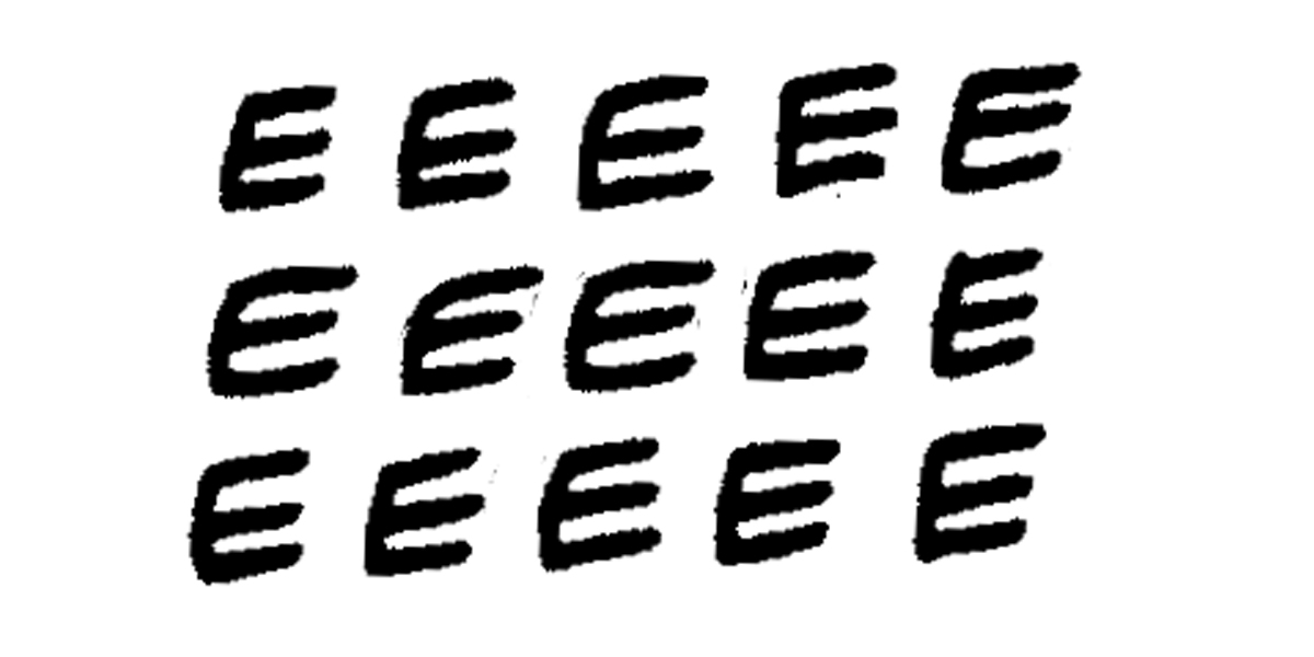
A closeup sample of the most ubitiquous character in the English language, the letter E, will spotlight another characteristic of hand lettering:
In English, the letter E appears, on average, about every seventh letter. In other words, 14% of all letters in the English language are E. The block of copy shown earlier has 111 characters, of which 15 are the letter E, which more or less conforms to the rule. Other characters appear often, but they run a distant second, third, fourth and fifth to E.
These fifteen Es all carry a familial resemblance, particularly in the line weight of Gaspar's beloved FB6 pen point. But they're all clearly different one from another, and this is charming characteristic #2 of handmade lettering: the 26 letters of the alphabet, no matter how often each appears in a block of copy, never precisely repeat themselves.
In my quest to replicate the look of hand lettering, one experiment I tried was a body copy type face with dozens of variant versions of each letter of the alphabet, plus a proprietary word processing program which would randomly substitute one sample for another. The program, designed by a friend of mine in return for a steak dinner, was quite something to watch in action. I'd take a comic book script, open it up in the program, and wait ten or fifteen minutes. The program literally chose, at random, one of dozens of versions of each letter of the alphabet and each piece of punctuation, for each appearance of each letter or punctuation mark.
The font family I used was based on a series of thousands of samples of each letter of the alphabet and each piece of punctuation. I lettered Buffy the Vampire Slayer for Darkhorse comics for many years, and one day the company sent back hundreds of pages of overlay lettering I'd done for the strip. I almost threw it all away before realizing that it could help me out in designing type. I went through the vellum lettering, selecting dozens of versions of each letter. These samples were cleaned up and made into a type face which the random-substitution utility could work with. Presto. If a block of copy had 36 E's, 15 R's, 18 S's, and so on, the font and the substitution program ensured that nothing ever repeated.
It all worked visibly, on the screen. The ten or fifteen minutes it took were very entertaining to watch, particularly if you had a drink in your hands. It worked. It looked handmade. My quest was over. My life was complete. Characters never repeated. There was only one problem:
It looked awful.
Before I realized this, I introduced the new technology to my various clients with great fanfare. No one said much about it, until I used it for a wonderful Vertigo miniseries, and afterward heard from the editor, who was perplexed. She wanted to know why my lettering looked so amateurish all of a sudden.
At first I was pissed off. Who was she to complain? For the first time in four years, the company was getting lettering that looked handmade. But then I looked at the books I'd used the technology on, and had to admit that handmade wasn't everything.
I apologized profusely, and relettered the books that'd been published conventionally, in time for the trade paperbacks. The editor is still a friend, although I can't understand why.
But I had learned a painful lesson about charming characteristic #3 of handmade lettering: the 26 letters of the alphabet, even though they never precisely repeat themselves, must always look beautiful next to each other.
But exactly how do they look beautiful, in a way that my random sampled characters never could? The answer to that is going to have to wait a bit. In the meantime, take comfort that the problem got solved, even though it took my hernia surgery to help bring this to pass.

