ASYSTOLE, or the Art of Designing Type for Comic Books, Part 4
To understand how a myriad of alternate versions of each letter of the alphabet can look beautiful next to each other, we must consider how a human being might choose to alter the shape of letters as he draws them. This is mostly done to eliminate a lot of excess white space. Here's an example. our test word ASYSTOLE, typeset using the multi-character type family which I eventually developed:
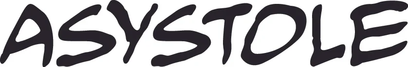
This is not the same as type simply kerned, i.e. with characters brought closer to each other or farther apart, based on the amount of excess white space of its neighboring character. Here, the letter S is actually reshaped so as to absorb some of the white space on both sides of the letter Y.
This mimics the work of a human being. Look back at our Gaspar Saladino sample once more:
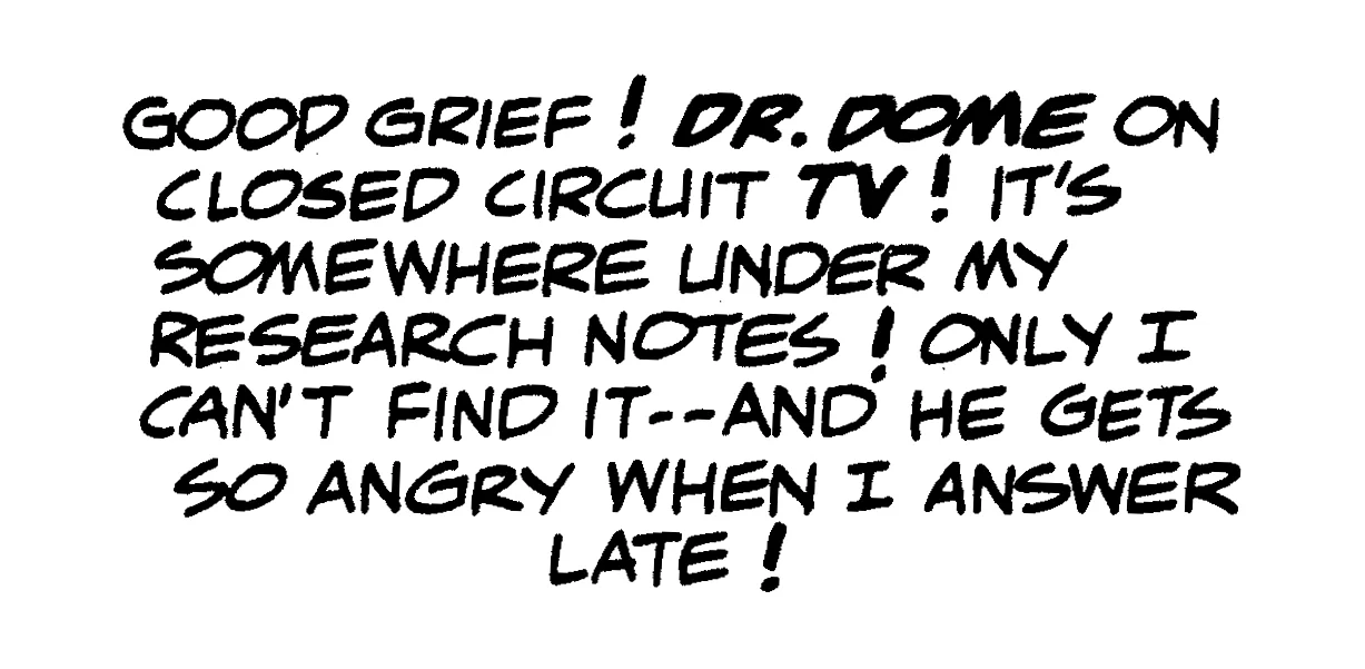
A lot of the paired characters here have no particular rhyme or reason for their altered shapes; Gaspar was clearly enjoying himself, and not thinking too much. however, a few pairs seem here involve the reshaping of characters to fit the proclivities of their neighbor. Here are a few:
In each of the five pairs seen here, one of the characters alters its shape to accommodate the shape of its neighbor. The diagonal bar of the R plunges forward, to fill some of the space below the curve of the C. The S's forward curve is extended to fill some of the W's white space. The R's diagonal bar again is extended into the white space of the Y. The lower curve of the C is held back, allowing the A to fill the space. And the center slat of the E is trimmed a bit, to make room for the backward curve of the S.
In the all-upper case environment used for comic books, we can divide every letter of the alphabet into one or more of three categories: inert, catalytic and passive. And in these three categories lies the means by which digital type can be made to appear handmade.
An inert character is one which is not affected by the shape of its neighbors, and which exerts no influence upon its neighbors. Like the inert gases on the periodic chart, these simply do not react with others. The inert characters are H, I, N and U. What all of them have in common is a simple vertical border on each side. There is nothing to cause a neighboring character to alter its shape, not does such a character have any reason to alter its own shape.
The catalytic letters are those which exert an influence on the characters next to them. Such characters are A, D, F, J, L, M, P, T, V, W and Y.
And the passive characters are those most prone to being affected by their neighbors. These are B, C, E, G, K, O, Q, R, S, and Z.
The reason our sample word ASYSTOLE illustrates this point so well is the presence of the strongly catalytic Y surrounded on both sides by the extremely passive S. Like a sycophant, the S changes its behavior under the influence of the domineering Y.
Other words which illustrate this are EVERY, REMEMBER, and ACT. In these, a passive letter is bullied by its catalytic neighbor:
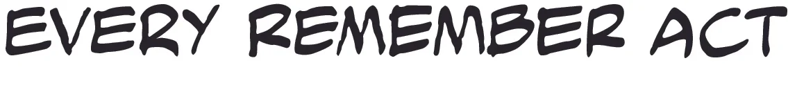
Note particularly how the first E in EVERY takes on some of the shape of the V which follows it. The two EMs in REMEMBER are affected in the opposite fashion by their neighboring Ms. Similarly, the bottom curve of the C tucks under the white space of the T. C is far and away the most passive character in the alphabet. Any other letter can push it around. A C can even be reshaped by a neighboring apostrophe or comma.
Here lay the answer to my dilemma of the thousands of variant characters not looking right next to each other: develop character pairs (or triplets, quintuplets, or whatever), taking care to have the letters involved behave in the above fashion.
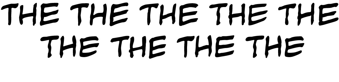
Variety could also be introduced, by providing multiple versions not only of the letters of the alphabet, but of some of their more common groupings. For example, the triplet THE is very common in English, so why limit oneself to just one THE when you can have nine of 'em?:
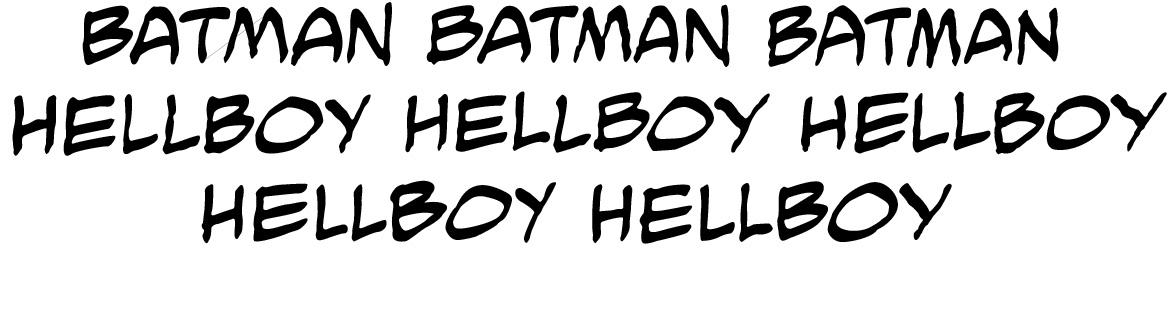
And if you're lettering the same character every month, why not see to it that his name will never appear the same way twice?
Around the time our previous President was inaugurated, I was laid up for a week after hernia surgery. It was a pretty serendipitous time: I used it to concoct every character pair I could think of. In the years following, the font was constantly under revision: whenever i ran across a situation which seemed to call for a new ligature, I'd stop and design one.
Nine years and more than 3,000 ligatures later, the font family is still under construction, and still getting very heavy use.
Probably not smart to spill my secrets like this, but I'm hoping nobody reading this is dumb enough to follow in my footsteps. It's a pretty heavy price to pay, just for the privilege of faking out people into thinking it's all still handmade.
I also managed to cook up a means of making balloons and sound effects look handmade. Maybe we can talk about it sometime.